Showing posts with label weathering. Show all posts

Friday, July 24

+ inload: Mud and grime – oil washes +

+ Developing Gatebreakers with oils +

The existing marines look forward to some additional support.

+ With the paint blocked in, the Gatebreakers look bright and clean – lovely for parade ground troops, but not so fitting for soldiers in the midst of desperate warfare during the Dark Millennium:


+ As described in the tutorial in an earlier inload [+noosphericinloadlink embedded+], I used a matt spray varnish to protect the acrylics, then slathered burnt umber oils over the figures, as shown below. +


+ Whereas before I had worked either on an individual model basis or in groups of two or three, I experimented here with larger groups. This was a test for leaving the oil in place for slightly longer, something that'll inevitably be necessary when working up the Land Raider, again shown in an earlier inload [+noosphericinloadlink embedded+]. +


+ I used white spirit and a cotton bud (Q-tip) to gently wipe away the oil from surfaces, working in consistent downward strokes where possible. Very relaxing. The Dreadnought is a resin model, so I can cautiously suggest that the technique works for that in just the same way. I'd be particularly careful to ensure that resin is well-primed to avoid contact with the white spirit, but that's not based on anything beyond a hunch. +


+ ...and that's where I left them overnight. The morning light [visref: above] shows the glossiness has begun to disappear as the oils oxidise. They're still slightly tacky to the touch, but once they've had a full day, I think they'll be alright to varnish. It's then onwards to tidying and highlighting. You'll notice that I've left a bit more oil on these ones than the previous batch. I felt I had slightly over-cleaned the earlier marines, and ended up adding in more shading later on. Now I've had a chance to practise, I'm more confident that I can successfully overpaint with acrylics, so I left some more dirt and marks to work up and develop further. +

Tuesday, July 23

+ inload: Rise of the God-machines +

+ Sons of the Temple: Legio Nikator +

+ All hail the god of machines! + 

Following a weekend of gaming, painting and building enthusiasm, progress continues on the Titans of my Legio. + 


+ I've really been feeling my way around these models; diving in and out and developing areas in isolation. Quite an organic approach, which has advantages and disadvantages. +


+ The panels of off-white were fun. Once a flat surface was achieved and allowed to dry, I drew a brush loaded with sepia ink and flow improver downwards, leaving these attractive streaks of weathering. While wet, I rinsed and dried the brush to lift out pooling areas to avoid backruns. +


+ Bright and colourful and cartoony! The chainfist panelling is unweathered; showing how the armour looks before I go in with the inks and so forth. I used this area to test out the Legio symbol, a hand grasping a crown. I worked freehand, adjusting as I went, so it's not quite right here. I think I'll sketch in onto the carapaces first to make sure it's more symmetrical. +


+ The pauldron and head here show a little highlighting and weathering, while the carapace has received another layer. Building it up gradually like this allows me a bit of control over how weathered the final result appears. +


+ A rear shot shows how some panels are more developed than others. I think I need to incorporate more of the white areas here and there. I'm also in two minds on whether to build up heat glow etc. around the exhausts. +


+ A detail from another work-in-progress Reaver, this kneepad was a fun bit of freehand, based on heraldic 'furs'. Tempted to expand the use of this – perhaps on the carapace of one? +

Wednesday, October 24

+ inload: Leman Russ Battle Tank +

+ Shades of Father Ted +

+ Having pontificated at length in the last inload about using a paint scheme to unite disparate models [+noosphericinloadlink embedded+], I proceeded with panic painting for the event in Bristol... and ended up painting a tank the wrong colour. +


+ The Lovely Girl here was intended to go with the Catipürnan World-Turners and their associated PDF – the neutral black and white scheme I was outlining in the earlier inload. +

+ Not really paying attention, I ended up using (warm) sepia ink instead of (cool) Payne's grey. After working this in, the tank ended up looking like my Lamb's World vehicles [+noosphericinloadlink embedded+], and I guess muscle memory just took over. + 

WIP: The sepia ink granulated beautifully; helped along with some granulating medium.
+ Mainly an experiment in creating texture quickly, I wanted to give the impression that the Lovely Girl is an old mothballed tank, pressed into service by the local PDF. To achieve this, I created wells of sepia ink, Scorched Brown diluted to a watery consistency and Chaos Black, also diluted to a watery consistency. I then pulled the wells together in my palette, and added flow enhancer to the freely-mixing colours. +

+ This was then painted liberally over the surface with a 12mm (½in) flat brush. Working wet-in-wet, I rinsed the brush and used it to apply generous amounts of granulation medium, particularly to the flat surfaces. This medium causes the pigment particles suspended in the paint to clump up, resulting in a grainy appearance. It works best with media that naturally granulate, like sepia ink. +

+ I then rinsed and dried the brush, and used it to selectively lift off the wet paint/ink/medium mixture from the surface, by touching the clean dry brush to the tank's flat areas: the brush draws up the paint (just like loading your brush from your palette), leaving an area of clean highlight. +


+ The pict-capture above shows both the good and the bad effects this has. The speckled high-contrast finish produced by the granulation is most obvious around the hatch, and I think it's pretty successful here. The rear of the sponson, however, just looks a bit mucky. It's not a convincing illusion here. The engine block (on the right of the image, above the trailing part of the track) shows the effect of lifting out – the underlying colour is revealed once more. +

+ It also shows off some of the quick detailing – handprints, hazard striping and shading around the rivets. It's a bit crude, but not bad for a speed paint – in all, this took me around two hours from start to finish; so in terms of quick texture, I think I'll count this a successful experiment. +

+ In terms of painting it the right colour, not so much! +


+ Small details like hand prints – presumably a post-battle superstition adopted by the crew – go a long way to personalising a tank, and implies more detail than is actually there. Like the lenses on the turret, and the weathering scratches and dings, they help to break up a surface that can otherwise just look a bit messy or dull. +


Thursday, October 18

+ inload: Painting Plague Marines of Nurgle +

+ Painting the Death Guard +


'The living know that they will die, and many know that they will live with disease or other torment, yet they drive this knowledge into a corner of their minds and keep it pinned there with all manner of dreams and activity. Nurgle is the embodiment of that knowledge and of the unconscious response to it, of the hidden fear of disease and decay, and of the power of life which that fear generates. '
Realm of Chaos, The Lost and the Damned page 12

+ This extract underpins Nurgle for me. Like much from this roleplay-driven period of Games Workshop's past, it's a more complex and nuanced definition that explains some of the in-universe appeal of Grandfather Nurgle and his followers, despite their repulsive appearance. +

+ Nurgle is sometimes flanderised into a simple 'god of plague', but like all the Chaos powers, there's a huge amount of depth to explore. +

+ Plague Marines +


+ I'd been trying to motivate myself to paint more genestealers for an event a week on Saturday (eek), but just couldn't get going. I ended up painting this chap, just to lance the boil of Nurgly enthusiasm. Seemed to work alright, as once I'd done that, I was able to get cracking on the genestealer abominant. +


+ Lovely models, the new Death Guard. Size-wise they're akin to Primaris or truescale (i.e. Terminator-sized) marines; slightly shorter but bulkier overall. The proportions remain similar to the older models; I wonder if they were designed at the older size, and rescaled? Digital design would have allowed such tweaks at a later stage, and explain why (for example) the shins are so broad, and collar so large in comparison with the helmet. +

+ Either way, I don't think it really matters. By their nature these models are gloriously over-the-top, and the larger surfaces gives the painter something to get stuck into. +


+ This particular model was bought second-hand – he'd been nicely assembled and had received a simple paintjob (the now-standard light olive green) that I worked over to give him something more akin to the Horus Heresy-era scheme. It's using two colours I haven't used before, Citadel's Pallid Wych Flesh for the off-white, and Death Guard Green for the shoulder pads. Interestingly, this second colour is all but identical to Vallejo's Afrikakorps 773, from their Tank Aces range. #themoreyouknow +

+ I think buying some models second-hand is a great way to try new things out. Not only were these less than half the price of buying the same models new, but they also provided me with some additional challenges. Perhaps most importantly of all, buying pre-assembled means that you avoid any unconscious aesthetic choices I might have made in building  – avoiding certain components, for example. The proviso is that you need to ensure they're well-built; it's frustrating to be doing clean-up and repositioning on second-hand models, and it can become a false economy. +


+ Depth was added across the model using a wonderfully free and variegated combination of sepia ink and various Citadel washes, added both wet-in-wet and overlaid in glazes and pin washes. The ink adds a little welcome glossiness in place. The important thing to bear in mind is that they're meant to look worn-down and covered with the detritus of centuries of war, not a single layer of mud. It's important to keep the tonal contrast and pull the highlights back after shading.+

+ I've used the same dirty metal approach here as I have on my Iron Warriors infantry (and others – it's becoming my go-to technique for metals)  [+noosphericinloadlink embedded+]. +


+ The tentacles, horns and various grotesqueries that adorn the model have been treated fairly naturalistically here, but part of the appeal of this range of models is how I can be quite experimental with details and weathering – they really don't need to look uniform. +


+ I'm fairly pleased with the result. It's perhaps a bit too complex; I would have preferred some more open areas to contrast with the profusion of detail, and to demonstrate some smoother gradients and perhaps some freehand. The helmet's about the only space I was able to to this – even the knee pads have spikes and angles! +

+ Part of the reason for this was their second-hand nature – the previous owner had used two of the (very cool, admittedly) shoulder pads with sculptural detail, and retained a lot of the spikes and growth that I'll be clearing off my own. Those spaces will allow me to get the broader gradients and more controlled weathering – but that's for the future. +

Thursday, August 30

+ inload: Raising Coropedion +

+ Raising Coropedion +

+ The Bakka Campaign saw conflict between the Sons of the Temple and loyalist Army, supported by Astartes elements. +

+ Theoretical +

+ Choosing a scheme can be a bit intimidating; you can never be sure it'll work. However, that shouldn't stop you from trying. Always painting forces based on a scheme someone else has worked out misses one of the most fun parts of the creative process, and discourages you from writing your own material. Doing this can really tie you into the world you're playing in, and can be very rewarding. +

+ Generally speaking, I consider the following things when picking a scheme:
  • Tonal contrast – Generally speaking, your scheme should include both light tints and deep shades. This can be as simple as picking a light-coloured paint and a dark-coloured paint; or, as I've done here, two midtones that I will 'force' either way to get that contrast in.
  • Hue – Contrast in hue is also generally a good way to get impact. Complementary pairs – orange and blue, green and red etc. – are always effective. Picking too many colours can quickly get messy and hard to control, so I recommend you minimise the 'core' hues to two or three.
  • Ease of replication – if you want a consistent army, then something that requires lots of mixing and layering may not be practical. If it's a small group, the extra effort may be worth it.
  • Accents – Having a hue that stands out from your core colours (see above) is a great way to pick out important details and direct the eye. For this turquoise and terracotta scheme, I've gone for acid green – it complements the rusty-orange and contrasts with turquoise.


+ Try checking out the things around you. If you can find an animal or plant with a similar scheme, you know it'll work – in this example, the colours are similar to those of a kingfisher. +

+ It also offers a great chance to experiment. If you're unsure whether your scheme will work, use a spare model – I used some crew models [+noosphericinloadlink embedded+] to try out this turquoise and terracotta scheme before starting this Warlord Titan. +

+ Practical +

+ I really like these models, so I want to take my time and enjoy them. Part of the appeal of them is the scale, which lends itself to slight variance – entire plates might have been replaced or cleaned at different times, so slight variance in the finish can work really nicely. +


+ It's also a great opportunity to experiment. I've been using granulation medium on these plates – this is a colourless medium that you add to wet paint. It encourages the pigment particles to clump together, creating visual texture. It works best with inks, so I've been using lots of sepia here, and gradually building up the tone and hue. +


 + I think I've probably gone a bit overboard on the weathering/damage here, but that's what experimentation is about. I can always return to refine this later – but I may find that in the context of the whole titan, this detail works better than in isolation. +

+ The lesson, then, is to take the rough with the smooth, and move on. Don't let the perfect become the enemy of the good. +

Wednesday, February 21

+ inload: Textural painting +

+ Texture, impact and effect +
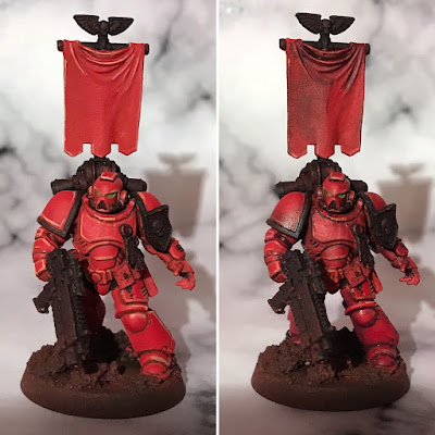
+ Working on these Blood Angels has given me a good illustration of a technique that I use a great deal in my painting. Have a look at the pict-capture here, which shows the same marine before and after what I call 'pre-shading'. +

+ Here, I used a mix of Liche Purple, sepia ink and flow improver medium; laying it onto the model before swabbing it off the raised areas using various tools – a clean brush, a bit of kitchen paper, and my bare thumb. +

+ The purpose of this stage is two-fold. Firstly, it enhances the tonal contrast. Squint at the image and you'll see that the armour plates on the pre-shaded marine (right-hand side) remain visually distinct as those on the earlier stage start to bleed together. This eventually helps to give the figure more impact, though it does rely on you working back in once the pre-shade is dry to develop the highlights and shades further. +

+ Secondly, and more importantly, it adds visual texture. You'll probably be familiar with greebling, which is covered nicely here: [+noosphreicexloadlink embedded+] and digital effects like bump-mapping. The second purpose of this painting effect is serving a similar duty as the 'time-damage' type of greebling covered in the False Machine blog entry: creating imperfection and suggesting teture. +

+ This visual texture is appealing because it implies greater complexity, holding the viewer's attention; helps to further push the illusion of scale; and also implies that there's something going on beyond the base of the model, giving it a sense of belonging in a scene, rather than being a model figure. It is a painter's story-telling tool. +

+ When to use it +

+ Once applied, you may well need to re-establish your highlights, and further deepen the shading proper; hence why I call it a pre-shade. It's a technique for the middle stages of painting. I establish my initial highlights and shading fairly quickly, apply the pre-shade, then use the effect of that to inform the remaining tonal work. +

+ Pre-shading works very well as a complementary technique to battle damage and weathering – in fact, it can very easily be used selectively (rather than over the whole model) to add grime or oil marks. The latter is particularly effective if you use a glossy chromatic black for a sheen. +

+ The ability to create visual texture on smooth surfaces, without creating physical texture, is also useful during the mid-stages of painting. It means that you can later apply overlaying washes and glazes without the paints pooling or gathering. A good example of this is on the banner of the marine:


+ On the left-hand side, it is clean, smooth and dull. The initial highlights and shading are stark and flat, giving an odd cel-shaded look. After the pre-shading has gone on, there is a sense of texture which helps to 'sell' the piece as fabric. There's subtle mottling, which suggests age and staining, and there's generally more for the eye to see. The highlights are softened (but not eliminated), and the shading deepened and enriched. It's worth pointing out that this technique works best when applied topically – that is, in particular places – and then drawn out and blended away with your brush, rather than applied over the whole area. +

+ Of course, as with every technique, pre-shading needs to be a tool to use when you want the effect. Using a pre-shade will flatten highlights, mute colours, and create visual complexity – compare the initial highlights on the stages above. Those effects are precisely why I use pre-shades, but if your taste is more for cleaner lines, smooth panels and vibrancy, it's not a useful tool. In 40k terms, I'd suggest that it's better suited to more grimy figures – Imperial, Chaos and orks – than to armies like Eldar, Tau and so forth. It would also work well for Tyranids, going a long way to getting an organic, natural feel. +

+ What colour? +

+ The precise colour of the pre-shade is irrelevant – for yellow I use a red-brown, for example; for blue I use a purple – it's more important that the tone is darker than the midtone. +

+ With that said, I tend to use harmonious colours (those close to the original colour on the colour wheel), as using complementaries – those opposite it on the colour wheel – will neutralise the hue. Since the effect is already dulling, this can make your models look too gloomy and murky. +

+ The complementaries of red are orange and purple. I used purple here because it gave a cooler effect, enhancing the idea of distance (owing to aerial perspective) and creating a low-key effect. +


+ The result +

+ Here's a before and after of the whole squad, which shows the effect more strikingly, as it's closer to how the unit will be seen; smaller, at tabletop distance. +


+ The cleaner, crisper effect here is appealing visually. The red is warm, the smooth texture is restful. Here, the Blood Angels look like noble figures, straight off the parade ground, or out of a propaganda film. It's nice, but not what I'm after. +


+ After the pre-shade is applied, the colour is cooled and muted. Details around the helms, torsos and knees start to pop more, creating areas of interest and complexity. There's more of a sense that the Angels are in battle; picking up a slight griminess without overt damage. +

Tuesday, September 10

+ inload: Tone, chipping and edge highlighting +

+inload: Tone, chipping and edge highlighting+

+I don't pretend to be a great painter – I'm a journeyman. I do like to think my work is generally high tabletop standard, though. On those occasions when I really push myself – and when the numinous painting gods are smiling – I think my work is getting fairly good. This is in no small part due to three factors:

  • +The online community: While I'm a newcomer to the blogging scene, I have been following wargaming fora like The First Expedition, The Ammobunker, Warseer, Dakka Dakka and The Bolter and Chainsword (amongst others) for many years; participating more or less actively as my painting and wargaming enthusiasm waxes and wanes. Every week I see something cool, new and interesting. The great thing about participating in a community is that for every idea you give, you get a dozen back.

  • +The real world: With real life responsibilities building and less time to waste, I've found myself able to focus and plan better. My projects are now rolling, rather than with an artificial deadline. Related to this, the group of friends I game with semi-regularly (check out PCRC.org.uk for some amazing stuff) are also hugely important in pushing my painting on – they're generous to a fault with inspiration, give great constructive critique and the games we do play (not hugely often) always enthuse me. There's nothing like playing with jewel-like models over gorgeous terrain to fire the inspiration.

  • +Practice: I've been painting models for well over twenty years now, and each time I push myself I go a little bit further. There really isn't a substitute for muscle memory, brush control, and good old fashioned experience.

+Techniques used on Brother Agonistes+

+Tonal work+

+When I decided to paint an Imperial Fist, in their bright yellow armour, I knew that it would give me a great opportunity to make use of a full tonal range to create a striking figure. To me, the technical aspects of a figure are secondary to the mood and atmosphere. Nothing is more important to creating that than good tonal work. 


The arrow indicates the direction of light.
+This image shows the unmarked shoulder pad of the marine, with the tone running from a muted mid-yellow in the direction of the light source to a deep red-brown in the shadow. The same transition is visible on the other armour plates; it shows up very clearly on the yellow.

+To achieve this, I started with the midtone, then added the brightest highlights towards the light source, then added the darkest shades away from the light source. I worked armour section by armour section, ensuring that the appropriate amount of the highlight and shade were added to each – the stomach for example, is shaded by the arms, chest and boltgun, so more shadow was used here, nearly covering the midtone. The top of the helmet, in contrast, is directly lit, so it's virtually all highlight there.

+I've picked the pauldron to concentrate upon here because it's a good illustration of a plate that's neither in direct light or shadow. Here the highlight covers the top fifth, the shadow covers the bottom fifth, and a fifth is covered by the transitions between the midtone and both the highlight and shadow areas. Critically, two fifths – or the largest portion – remains the basic midtone hue.+


+Edge highlighting+


+In order to give the impression of size, it's important to slightly exaggerate the tonal contrast on a miniature. This is because the effects of distance – recession and atmospheric interference – can't occur naturally, and so must be simulated. As a result, there are some edge highlights added in appropriately lighter tones. I keep these as subtle as I can (though my brushwork is not particularly fine), and – critically – adapt the edge highlight colour to the particular area.


+Argh so many errors+
+ The power pack here shows this nicely – there are loads of craggy bits and hard angles! The bits to the sides of the central fan 'exhaust' are in the light, so they have quite bright edge highlights to exaggerate the shape.

+ The lower part of the power pack has edge highlights added using the midtone mix, because these are not directly facing the light source.

+ This same midtone is used as the edge highlight on his arseplate (probably not the technical term).

+ I'll be the first to admit hes far from perfect! I've got the tone wrong on the bottom part of his left thigh (this should have been much darker), and as I mentioned above, by linework could be a lot finer and smoother. Still, I hope the theory behind the technique is useful.+


+Chipping+


+I like weathering my models. After years of trying to get my models clean and gemlike, I finally realised that I didn't enjoy painting like that. I prefer my miniatures to look involved in their setting, and part of that is adding atmosphere to the piece. I aim to achieve this my adding texture and depth to flat surfaces; tricking the eye into seeing texture where it is not.


+For the chipping on the paintwork, I tore a piece of foam from an old blister pack and picked up a little brown and grey on it. The excess was dabbed away and the foam touched on the surface lightly to create a random effect. Where the effect was very heavy (such as on the knee), I tidied it up and added depth by adding a bright highlight.

+The critical part of this to create realism is to place the chips appropriately. The image to the left shows that I have concentrated upon areas of wear – the kneepad, wrist and front of the hand. 

+Keep it subtle! Overloading the model with weathering makes it look messy.

+Keep it coherent. While the effect should concentrate on the appropriate areas, don't leave everything else completely clean, or it'll look subconsciously odd. In this example, you can see some dirt on the boltgun, wrist and his helmet. This helps to tie the composition together as a whole.+

+++