+ Painting the Death Guard +
'The living know that they will die, and many know that they will live with disease or other torment, yet they drive this knowledge into a corner of their minds and keep it pinned there with all manner of dreams and activity. Nurgle is the embodiment of that knowledge and of the unconscious response to it, of the hidden fear of disease and decay, and of the power of life which that fear generates. '
Realm of Chaos, The Lost and the Damned page 12
+ This extract underpins Nurgle for me. Like much from this roleplay-driven period of Games Workshop's past, it's a more complex and nuanced definition that explains some of the in-universe appeal of Grandfather Nurgle and his followers, despite their repulsive appearance. +
+ Nurgle is sometimes flanderised into a simple 'god of plague', but like all the Chaos powers, there's a huge amount of depth to explore. +
+ Plague Marines +
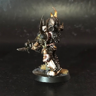
+ I'd been trying to motivate myself to paint more genestealers for an event a week on Saturday (eek), but just couldn't get going. I ended up painting this chap, just to lance the boil of Nurgly enthusiasm. Seemed to work alright, as once I'd done that, I was able to get cracking on the genestealer abominant. +
+ Lovely models, the new Death Guard. Size-wise they're akin to Primaris or truescale (i.e. Terminator-sized) marines; slightly shorter but bulkier overall. The proportions remain similar to the older models; I wonder if they were designed at the older size, and rescaled? Digital design would have allowed such tweaks at a later stage, and explain why (for example) the shins are so broad, and collar so large in comparison with the helmet. +
+ Either way, I don't think it really matters. By their nature these models are gloriously over-the-top, and the larger surfaces gives the painter something to get stuck into. +
+ This particular model was bought second-hand – he'd been nicely assembled and had received a simple paintjob (the now-standard light olive green) that I worked over to give him something more akin to the Horus Heresy-era scheme. It's using two colours I haven't used before, Citadel's Pallid Wych Flesh for the off-white, and Death Guard Green for the shoulder pads. Interestingly, this second colour is all but identical to Vallejo's Afrikakorps 773, from their Tank Aces range. #themoreyouknow +
+ I think buying some models second-hand is a great way to try new things out. Not only were these less than half the price of buying the same models new, but they also provided me with some additional challenges. Perhaps most importantly of all, buying pre-assembled means that you avoid any unconscious aesthetic choices I might have made in building – avoiding certain components, for example. The proviso is that you need to ensure they're well-built; it's frustrating to be doing clean-up and repositioning on second-hand models, and it can become a false economy. +
+ Depth was added across the model using a wonderfully free and variegated combination of sepia ink and various Citadel washes, added both wet-in-wet and overlaid in glazes and pin washes. The ink adds a little welcome glossiness in place. The important thing to bear in mind is that they're meant to look worn-down and covered with the detritus of centuries of war, not a single layer of mud. It's important to keep the tonal contrast and pull the highlights back after shading.+
+ The tentacles, horns and various grotesqueries that adorn the model have been treated fairly naturalistically here, but part of the appeal of this range of models is how I can be quite experimental with details and weathering – they really don't need to look uniform. +
+ I'm fairly pleased with the result. It's perhaps a bit too complex; I would have preferred some more open areas to contrast with the profusion of detail, and to demonstrate some smoother gradients and perhaps some freehand. The helmet's about the only space I was able to to this – even the knee pads have spikes and angles! +
+ Part of the reason for this was their second-hand nature – the previous owner had used two of the (very cool, admittedly) shoulder pads with sculptural detail, and retained a lot of the spikes and growth that I'll be clearing off my own. Those spaces will allow me to get the broader gradients and more controlled weathering – but that's for the future. +


No comments:
Post a Comment
+ submission exloadform: inload [comments] herein +