Showing posts with label techniques. Show all posts

Thursday, February 6

+ inload: Oil dot filters +

+ Toll the Great Bell Twice! +

With push of button, fire the engine and spark turbine into life. +

+ Metalica walks. The sacred unguents have been applied and the necessary sacrifices offered up to the Machine Spirits of five Engines. Bar a few relatively quick details, the painting is all done, and it's time to start preparing for tabletop battle... +

 +++

+ [Insert heavy metal song pun here +]

+ Precision strike: cutting it close +

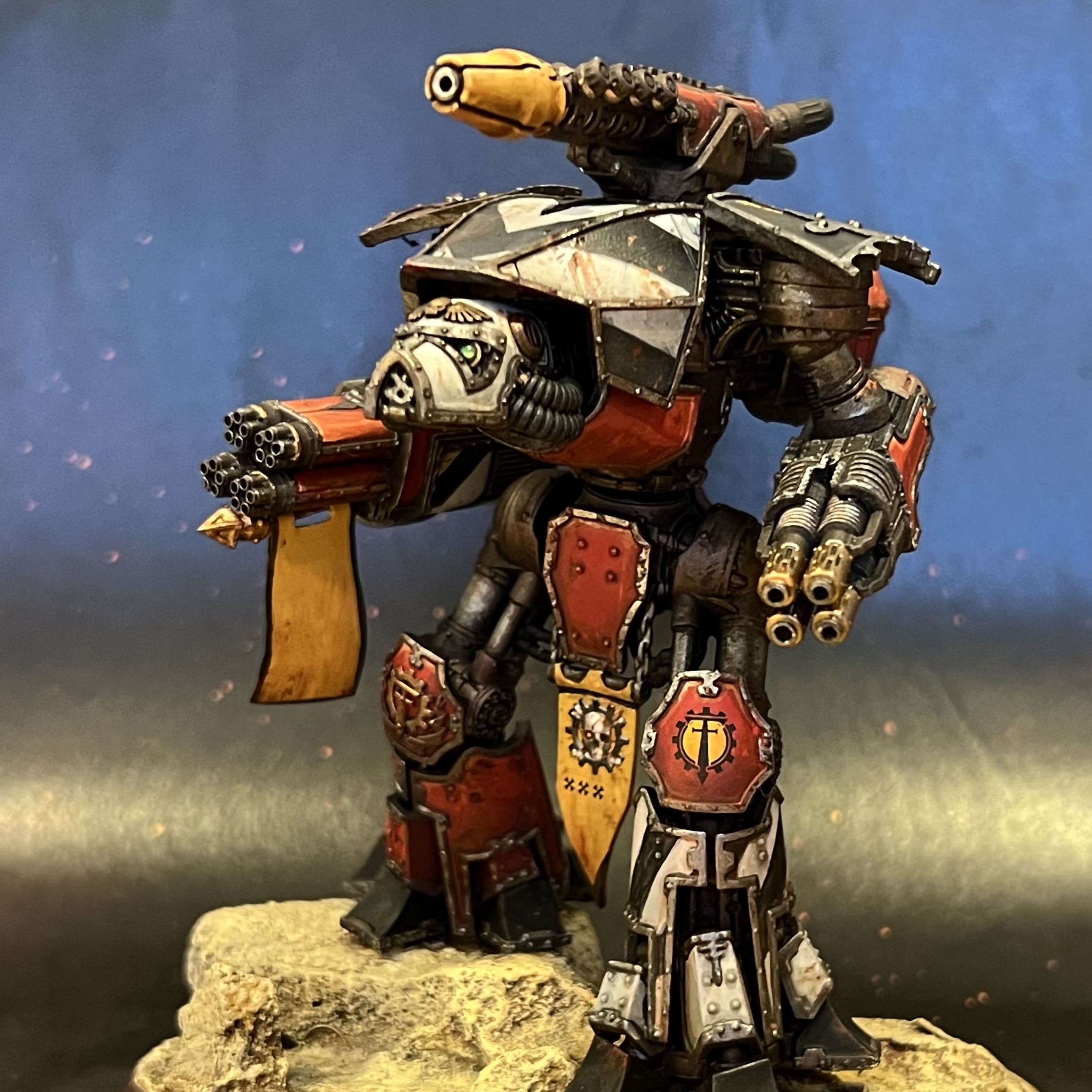
Two days to go, and as you can see above, the oils are on and drying. The nice thing about oils is their long working time. There's no rush, and no stress (well, no additional stress about timings!), so you can gently tick through the session, and find them perfectly workable at the end. I used a couple of techniques here: oil dot filters, and washes. 

The washes are done almost exactly as with acrylics: thin the paint down and apply with a brush. The main difference is that I suggest you use rather less oil paint than you would acrylic paint as they'll take much longer to dry. Oil dot filters, however, are a new technique to the blog, so here's the rundown:

+ Oil dot filters +

The purpose of this technique is to add interest and subtle variance to a flat area, creating a sense of scale and texture. The result is a little like a glaze, in that you are aiming to work over the area evenly (rather than to avoid/fill recesses, for example). It differs from a glaze in that you're not aiming for a flat colour, but rather a variegated result.

I started by squeezing out pea-sized amounts of burnt sienna, raw sienna, Winsor lemon, cadmium red, and lamp black oils onto a palette, then used an old split brush to stipple lots of small dots of the various colours over each Titan in turn. The paint was used neat, and the brush was dry. Rather than rinse it between colours, I simply wiped the excess away to keep the brush dry.

Once that was done, I swapped to a goat hair fan brush [+noosphericexloadlink embedded+], as these are relatively cheap and sturdy. I loaded this with thinner (I used Sansodor [+noosphericexloadlink embedded+]).

I then slowly and steadily drew the fan brush directly downwards over each panel in turn. This draws the oil paint downwards from each dot, softening and creating gentle streaks. At the bottom of the area, lift the brush away, wipe it on a cloth, and repeat until the effect is as you want it. The more brushstrokes you use, the more oils will be drawn away. The key is to work steadily and evenly, and always in one direction.

+ The finished result – compare this with the pre-oils version below. +

+ Strike to enlarge. +

+ Oil filter keynotes +

  • Ventilate  Throw open a window. Odourless or not, solvents in the respiro-sacs aren't very good for you. 
  • Cede control  When stippling, don't worry about an even effect or coverage. Slight variation across the surface looks more natural and pleasing. Likewise, having some dots containing more paint than others will give variety of tones in the streaks.
  • Adapt  Remember that the Titan is not locked in the pose you've chosen, so look at the panel and decide on the direction before working straight down to the base. Rainfall and similar weathering will carry dirt and grease straight down whever possible, so consider where 'down' is likely to be for the majority of the time.
  • Vary  You can also do oil filters in circles or more random directions to add interest to flat areas.

+++

+ The Maniple +

Here're a few hard-earned shots of the maniple as it currently stands:

+ Old Three Skulls +


+ Ferratus Tertius +


+ Fors Clavigera +


+ Praeterita Carnivorus +


+++

+ What next? +

I also worked a bit more on the nameplates from Obsidian Forge last night, too. Thinking more on it, I could have used oils... but given the time pressure, I decided to stick with my comfort zone of acrylics. These have been worked up with a combination of washes and drybrushing. I'd like to polish them up a little further, but as they're functional already, that'll depend on how the rest of the 'stretch goals' go.


 And to close, as I have the shots and haven't shared them, here's a close-up of the eye lenses on Steel Hammer (pre-oils in this shot)...


... and one of the back of the Titans, to show off how lovely and clean they were before I got stuck in with griming them up!


Tuesday, April 2

+ inload: Tips for painting Epic-scale models for Legions Imperialis +

 + Lesson from painting Epic models +


+ I thought I'd scribble down some notes on painting Epic models;  perhaps they'll be helpful to you – or at least let you avoid my mistakes! +

+++

+ Detailing Epic models +

+ Theoretical +

+ Epic-scale models present different challenges to larger scales, and offer a good lesson in simplification. The new Epic Legions Imperialis models are quarter of the size of their 40k counterparts, and unlike older Epic models, are minimally adapted to the new scale, without the exaggeration of the Epic 40,000-era amodels, such as the Dreadnoughts here [+noosphericinloadlink embedded+]: +

Even in death I still serve (as an example of stylistic changes in sculpting).

+ Techniques and approaches that work at 40k don't necessarily translate well. Subtle highlights and shading get lost or look muddy, and if you try to replicate what you did for your larger models, you're effectively painting with a brush four times the size you'd use for their larger counterparts. +

+ I've found it better to take a step back and re-assess. Depending on the effect you want, of course, the key points I'd flag when swapping to Epic scale are:
  1. Lost light  Small models reflect less light – so need to be treated differently.
  2. The crowd effect  As a mass, Epic models show less individuality than their 40k equivalents. Differences clear at 40k scale might be lost entirely for Epic models at table distance.
  3. Space for variation  Mass models are more visually coherent, so variations in painting and finishing offer opportunities for personalisation that won't 'read' at typical distances.

+ Practical +

+ Lost light +
+ Highlighting on models is intended to simulate the amount of light reflected from the full-scale object – that's what makes a model look like something big at a distance, rather than small and close up. +

Highlighting and shading on the Rhino add visual texture and detail that make the surfaces look more distant than the flatter planes of the base-coated Thunderhawk.

+ In other words, a full sized Space Marine would need no highlighting, because the surfaces would naturally reflect the right amount of light. A 40k-scale model requires you to artificially exaggerate the highlighting and shading through use of paint. +

+ At quarter of the size of the 40k Space Marine, the contrast between light and dark areas of an Epic model needs to be pushed that much more to get a similar visual impact. +

Of note is that this might not be the style you want – loss of detail and reduction in saturation and contrast are real world signifier of distance, thanks to aerial perspective. As a result, you might want to simulate this for a particular effect – in which case you need to steer clear of edge highlighting and surface modelling.

+++

+ This is where techniques suitable for 40k don't necessarily translate. The reasons for this vary by technique. To take layering as an example, each layer of paint you add is proportionally four times thicker; the brushstrokes four times more obvious. This means you should be careful with the number of layers – you might not notice it on a 40k scale tank, but an Epic one will start to pick up texture four times faster. +

+ The answer to this? At its most simple, use a light touch. The good news is that because the areas you are covering are smaller, it's easier to get good coverage with fewer layers. Be sparing, and avoid overworking things. +

+++

+ Surface tension is another consideration. Whatever the size you're working, the surface tension of water is going to be consistent. When using thinned paints, you'll need to adapt to working in small areas. At Epic scale, there are fewer large, smooth areas, and relatively more greebling that means fluid paints won't necessarily behave in quite the way you're expecting. +

+ You can use flow improver medium to help adapt to this (I recommend this anyway), but it's also important not to treat this change as inherently problematic. It's as much an advantage as anything, as the smaller surfaces mean less puddling and pooling. +

+ Contrast paints really come into their own here, and while I've only used Black Templar for these models, I thoroughly recommend their use for Epic in general – they're ideal for turning all the points above into advantages, naturally giving richer, more saturated and cleaner results than on 40k models. +

+++

+ The crowd effect +

+ What do I mean that Epic-scale models show less individuality than 40k-scale models? Simply that at typical working distances, Epic-scale models are far less visually distinct from one another, which you should be aware of. The combination of there being more of them, and each individual figure or tank being smaller (and thus giving less space for conversion work than their 40k equivalents) means that they'll tend to blend into one another more. +

+ Uniformity isn't necessarily a bad thing – indeed, massed ranks of similar models is a key part of the appeal of Epic scale gaming. Nevertheless, it's worth being aware of it both for display and for gaming reasons. +

+ The image below shows my Salamanders infantry. See how quick you are to identify the various different types in relative close-up:

+ Included here are Tactical stands, Missile Launcher Devastators, Terminators and Command stands. +

+ ... and again, at roughly half the size; something closer to tabletop distance. +

+ Included here are Tactical stands, Plasma support stands, Missile Launcher Devastators, Terminators and Command stands. +

+ As I hope this demonstrates, at table distance all these different types tend to blend into one another. You might, of course, rather like this – the sea of infantry is definitely a look I favour – but if you want immediate identification, consider exaggerating the differences. You might paint plasma weaponry in a more strongly-contrasting accent than at 40k scale, for example. +


+ Gun casings are a good place to add an eye-catching marking, or even paint different types of weapon with different colours. This would probably look a bit too obvious at 40k scale, but Epic-scale can stand a little less consistency in such details, in favour of being easier to 'read'. +

+++

+ Markings are also worth thinking about. Space is at a premium, and  since you have so many more models, identification becomes more important. The work-in-progress armour below shows models prior to the markings being added. +


They're perfectly servicable, and you could happily game with them at this stage, but markings will both add character and help draw the viewer's eye. This is beneficial whether you're intending them for display or gaming. For display, such details stop the eye drifting over the mass (the crowd effect) and serve as visual punctation. For gaming, markings will help you and the other players to identify particular detachments or formations – particularly useful to spot where one group starts and ends. +

+ As a nod to a 2nd edition Space Marine article and the artwork to The Battle for Armageddon boxed game, I'm intending to use the symbols from a deck of cards for my army. This will also be handy on the army list, as I can put the relevant symbol next to the infantry each group of Rhinos is carrying – little touches like this can help speed of comprehension and avoid misunderstandings. +


+ Make sure they're readable! This test model shows the importance of checking things and practice. Just about visible here are 'club' symbols. For a 40k-scale model, I think they'd work well, clear but not too over the top. For these Epic models at table distance, however, the markings are nothing more than blobs. For future models, I'll take up much of the top hatch with the appopriate symbol. +

+ When choosing symbols, I suggest that you keep things clear and simple. Numerals, letters, Codex markings... all will work well. +

+++

+ Space for variation and personalisation +

+ The flip side of things being lost at small scale is that you can have lots of fun with extra detailing, if you want! As there's less stuff at the right size, and a smaller range overall, there's less opportunity for easy kitbashing than at 40k scale. +

+ That's not to say it's impossible, of course. As with any army, it's worth spending a little time personalising your characters – as with the Captain here, who's had a weapon swap and his Mark VI helmet exchanged for a Mark II one from a spare Rhino gunner. +


+ However, such details are almost certain to be lost – even to an interested observer – unless you point them out. Does this make them not worth doing? Of course not! Such customisation is fun – and that's really the key thing to take away from painting Epic models. They're quick, and fun, and surprisingly different from painting 40k-scale models. +


+ The scale does necessitate some compromises. The banner here, for example is a simplification of the 40k-era 2nd Company banner (as my army's themed around the Second War for Armageddon) – and while I've taken more time on this stand than the others (eye lenses on the models, for example), I've consciously avoided getting sucked down a rabbit hole of trying to superdetail such tiny figures. While it's possible, it's beyond my current skill level, and my priority is to get a gaming army together. +

+ This picture also shows another good example of simplification: the Salamanders' Chapter badge – visible on the Tactical stand on the right-hand side of the picture. At this scale, it's clear that it's a super-simplified version of the icon – but even this is unnecessary.  +

+ Decide before you begin what you want to simplify; and whether you want to include such detail at all. There is no shame at all in a simple approach – as we've seen above, you can spend a great deal of effort in gilding the lily, and creating detail that will be seen only vanishingly rarely, even on the display shelf. +

+ In summary, my advice is to concentrate on that mass of figures – get the impact through simplicity and leaning into the inherent advantages that Epic scale gives you. +

+++

+ The Corsair Gambit +

+ Time is closing in for me to complete my Salamanders in time for this event, but painting is progressing. Above you can see the first three Predators of Destructor Squadron, which I polished off after getting a bit bored with batch painting the remaining tanks. +


+ The list from this inload [+noosphericinloadlink embedded+] details what needed to be done; so here's an update:

+ Completed since +
  • One additional stand of Terminators
  • Two stands of Assault Marines
  • Support: Four Dreadnoughts
  • Support: Four Dreadnoughts
  • Battle Tank: Three Predators
  • Transport: Eight Rhinos
+ Still to do +
  • Air Support: Thunderhawk Gunship
  • Bastion: Four Tarantulas
  • Battle Tank: Six Predators
  • Transport: Five Rhinos.
  • Transport: Five Rhinos.
  • Three objectives
+ Aside from the objectives, which are primed at best, the remainder has had the black and metalwork picked out, and is ready for washes, highlights and detailing. I'm hoping to have that all done after Wednesday night, giving me a day's grace in detailing. +

Tuesday, November 3

+ inload: Blood Angels Chaplain +

+ Chaplain Savonarola (Amaliel 7:13)+


Blessed is the mind too small to doubt.

+ Imperial aphorism +


+++


+ Theoretical +

+ Unlike most of this project, the inspiration for this Chaplain came not from the Games Workshop Studio army of WD139, but from the Dave Gallagher artwork that graced the cover of the Warhammer 40,000 Compendium (and which inspired my Captain Tycho conversion [+noosphericinloadlink embedded+]). One of the supporting elements in this painting is a curious silver-coloured Chaplain. +

+ It's a very distinctive look that I don't think has turned up elsewhere, but works really nicely. It's particularly suitable for the Blood Angels, I think, as it complements the golden armour of their heroes and champions and contrasts with the black armour of their Death Company. +

+ Appearing as it did at the back end of Rogue Trader, the image differs from the black-armoured Chaplain of the studio army and elsewhere; but it's such a striking look that I wanted to include it. +

+ Of course, this raised the question of whether to tackle it with non-metallic  metal (NMM) techniques – as in the original artwork – or with metallic paints. The former would have worked well alongside my Captain Tycho, where I used a NMM approach; while the latter would sit better alongside the rest of the army. +

+ Unable to decide, I split the difference and decided to experiment, using metallic paints alongside non-metallic paints to create a halfway house. +


+ Practical +

+ I was not at all confident that this would work, but gave it a go anyway – that's the only way I know to improve! When approaching a model like this, I find it helps to start with some safe elements – those bits you can do easily. Here, I painted the robe. Having something like this finished or blocked out is reassuring when the experimental areas go through the (almost inevitable) stage where they're a bit crap looking. +

+ I started the silver itself with a base of Fenris Grey (one of the old Foundation paints) mixed with Payne's grey acrylic ink. This gave a nice, deep, cool underpainting. +


+ I then overlaid this with a mix of Iron Warriors acrylic paint, and both Payne's Grey and White Pearl acrylic ink. The latter is material I bust out when I need to dilute metallics. It's effectively a clear carrier of metallic flakes, which means that it doesn't alter the hue of what you're working on. This allows you to thin metallic paints without losing the metallic effect; and also lets you give non-metallic paints a sheen. +


+ The effect is pretty clear here in this shot of a later stage. I've worked up through various metallic paints including Chainmail and Stormhost silver. All had White Pearl acrylic ink added, to ensure smooth transitions. However, even the lightest tint of GW's metallics are slightly grey, so for the final touches I took a photograph of the figure under a spotlight, then used a mix of Instar paint's Arctic White and White Pearl acrylic ink to copy the reflections. This let me create the forced highlights that you can see. +

+++

+ And so to the finished figure. He was turned around in an evening; and I'm pretty pleased with the result. I'll certainly call it a successful experiment. Omricon suggested the technique might suit Stormcast, too; which is a good idea. +


+ Figures painted completely with metallics can look a bit unfinished, so I made sure to include some other textures, such as the cloak lining, purity seals and weapons. +


+ The half-seen three-skull motif on the shoulder pad and torso is visible nicely here. It was applied with dilute Payne's grey ink. +


+ This close-up demonstrates how the metal and non-metal areas interest. +


+ Polishing this figure off (ho ho) means it's just the Librarian and Land Speeder left. +


Monday, August 17

+ inload: Fixing frosted varnish +

+ Ysaak Rama +


+ A chaplain, to lead the Gatebreakers in their upcoming battles. A minor head and weapon swap from the Indomitus box, I opted to paint him with the green and yellow of the Chapter, rather than the black of the Codex. He's not quite finished yet – the chest symbol, leatherwork, boltgun and spiky shoulder bit need more work, but he's pretty much there. I'll post him up with some additional background when he's complete. +

+ He was a bit of an experiment. With the rest of the Gatebreakers, I've painted the oil wash over flat colour, then highlighted afterwards. I wanted to try doing the highlighting prior to the oil wash, just to see what would happen. In short, it seems to work fine – I think the Chaplain above looks about the same as the other figures; the oil wash doesn't impact the highlighting too much. +


+ Single figures – particularly personalities – are good to experiment with, as there's always a ready excuse for any slight inconsistencies. I think I will sharpen the final highlights a bit further, just to add a spot more impact and contrast; but I'm counting the experiment a success. +

+ Fixing spray varnish fogging +

+ Talking of experiments, spray fogging, also called blushing, frosting or misting, is something that I've been slightly dreading since I've started using spray varnish for the figures. It occurs when the particles of condensation are trapped – this can be due to sudden changes in temperature (for example, spraying onto a figure that's markedly colder or hotter than the area in which you're spraying), or high humidity. +

+ I have thus far avoided spraying on very humid nights, but having read up on some solutions to the problem, I thought that I'd give it a go. Let me be clear; I was hoping he'd come out fine from the spray, but was prepared in case it did result in fogging. +

+ Spoiler: it fogged:


+ The good news is that the solution is the holy trinity of hobby tips: cheap, quick and easy. You can simply paint a little sunflower oil over the surface. Here, I've oiled only the cloth, to show you what happens. +


The glossiness fades quickly. The image at the start of the inload shows the same figure the morning after. Don't gloop it on: you want as thin a coat as possible. I'm guessing that the frosting effect is caused by tiny texturisation scattering light, so a thin layer of oil smooths things out. +

+ I suspect that any oil will have the same effect – though better would be something like artists' linseed oil or walnut oil, which will have been more thoroughly sterlised. The important thing is that you choose a drying oil (that is, it polymerises). Olive oil or mineral oil will never dry, and the former will go rancid. +

+ With that said, the amount you're using is tiny, and if you're sealing it with varnish afterwards anyway, it likely won't have any adverse effect (at least, none more so than using any other organic material, like lichen on a model's base). +

+ Next! +

+ Having tried out the oil trick on the cloth, I wanted to see whether the oil paint I was using would have the same effect. The answer seems to be 'yes', which isn't entirely surprising, as the oil carrier of the paint will be doing the same thing as the sunflower oil. I think the most important thing here is that the process seems to work even when the oil paint is thinned to a glaze consistency with thinners. +

+ Anyway, I can't really recommend that you experiment like this, but I hope that the examples above are helpful. I'll keep you updated on whether the effect returns, or anything unexpected happens. +

+ More building +

+ Besides painting Rama, I cracked on with the Eradicators (unconverted, and headless, since I'll do everything else in one fell swoop)... +


+ ...and a Rift Team; the Gatebreakers' rather enforced approach to duties usually undertaken by Terminators. With vanishingly small numbers of Terminator plate, these boarding specialists bear heavy breaching shields and power mauls, their armour reinforced with additional plating and flame-damping flak-aprons. +

+ These additions are designed to provide additional protection to soft armour areas, while also preventing small arms fire from bypassing the Astartes. This is important because Rift Teams are typically deployed at the head of auxiliary boarding parties – made up of Naval security, Chapter serfs or other non-enhanced warriors. +


+ Having the means to effectively interdict firepower to their allies allows them to set up a defensive foothold in enemy ships, allowing other Gatebreakers to be deployed to relieve them. Rift Teams are positions of high value and their members held in high regard. Gatebreakers frequently compete for the honour of serving in a Strikeforces Rift Teams, despite the obvious dangers. +


+ I also finished the dreadnought, but more on him in a future inload. +

Tuesday, August 4

+ inload: Castaway +

+ Castaway +


Breccia. Little to recommend it beyond its mineral riches. Low flora, high gravity. You'd wake in a panic, stars in your vision. Breathing felt like an animal was squatting on your chest. Infinite drifts of microscopic dust necessitated airlocks and bulky rebreathers almost everywhere; and still your spit would be terracotta. 

The inhabitants? Homo sapiens rotundus. Kinsmen, or thronglings, to themselves. Squats, to you or me. 

A prickly, short-tempered and belligerent people, they seemed to have picked up and internalised the oppressive atmosphere of the planet. It was pure happenstance that I'd made landfall – I'd had to abandon a starcraft following a disagreement with naval security, and my hastily-secured shuttle required some repairs. 

I met Castaway in the cold dock. He was a visitor too, and slightly more agreeable company than the masked Breccian natives. I say visitor, but survivor's probably closer to the truth. A greenskin crusade had reportedly broken over his homeworld – itself in some backwater sub called Antona Australis – and he'd found himself unable to return. 


We met as I attempted to find some way off the rock. Castaway had much the same idea, and over the local brew, Brunski, myself and he concocted a plan of sorts. Like most of my acolyte's plans, it started with persuasion and ended with lasers. Suffice to say we emerged minus a shuttle, but plus a curiously handy engineer.

+++

+ Faces of the Gatebreakers +


+ Painting things on sprues is a very weird experience, but novelty's a good way to keep your interest up. It also allows for quick and easy comparison, which is handy both for achieving uniformity (for the helms) and diversity (for the bare heads). Regular inloaders will have heard my witter on about painting skin beforehand, but if you're interested in a little more theory, this inload includes some thoughts on getting variety into skintones [+noosphericinloadlink embedded+]. +


+ The Gatebreakers take this a little further: their wide-ranging recruitment methods mean the Chapter is hugely varied in skintones, so having them all on sprue allowed me to really have fun jumping around. Top left of the image above was built up from an ochre base (Averland Sunset) with Army Painter Mummy Robes (a lovely creamy brown-tinged white). A wash of Seraphim Sepia and some pink hints gave a nice smooth result. For the very dark skintone on the top right head here, I used a base of dark brown (Rhinox Hide) and green (Vallejo Flat Green), and added orange (Fire Dragon Bright) as I highlighted up. The fresh scarring was achieved with Vallejo Flat Red and Vallejo Off-white added to the mix. The same flat red was used to add warmth to the cheeks, nose and lower lip, too. +

+ The head on the lower left combined Averland Sunset and Rhinox Hide, and was then highlighted up with Off-white before being glazed back down with washes of Seraphim Sepia. The head on the lower right was painted over a Rhinox Hide layer, using increasingly light mixes of Vallejo Flat Red, Off-white and Averland Sunset. +


+ Once I got a bit bored of painting faces, I swapped to painting metallics and laying oils over the varnished green and yellow areas. These need a bit of cleaning up tonight, and then I'm onto highlighting and assembling. Nearly there! +

Friday, July 24

+ inload: Mud and grime – oil washes +

+ Developing Gatebreakers with oils +

The existing marines look forward to some additional support.

+ With the paint blocked in, the Gatebreakers look bright and clean – lovely for parade ground troops, but not so fitting for soldiers in the midst of desperate warfare during the Dark Millennium:


+ As described in the tutorial in an earlier inload [+noosphericinloadlink embedded+], I used a matt spray varnish to protect the acrylics, then slathered burnt umber oils over the figures, as shown below. +


+ Whereas before I had worked either on an individual model basis or in groups of two or three, I experimented here with larger groups. This was a test for leaving the oil in place for slightly longer, something that'll inevitably be necessary when working up the Land Raider, again shown in an earlier inload [+noosphericinloadlink embedded+]. +


+ I used white spirit and a cotton bud (Q-tip) to gently wipe away the oil from surfaces, working in consistent downward strokes where possible. Very relaxing. The Dreadnought is a resin model, so I can cautiously suggest that the technique works for that in just the same way. I'd be particularly careful to ensure that resin is well-primed to avoid contact with the white spirit, but that's not based on anything beyond a hunch. +


+ ...and that's where I left them overnight. The morning light [visref: above] shows the glossiness has begun to disappear as the oils oxidise. They're still slightly tacky to the touch, but once they've had a full day, I think they'll be alright to varnish. It's then onwards to tidying and highlighting. You'll notice that I've left a bit more oil on these ones than the previous batch. I felt I had slightly over-cleaned the earlier marines, and ended up adding in more shading later on. Now I've had a chance to practise, I'm more confident that I can successfully overpaint with acrylics, so I left some more dirt and marks to work up and develop further. +