Showing posts with label Warlord Titan. Show all posts

Thursday, May 22

+ inload: Legio Maximal background and the Warlord Titan 'Consequens Indevitatus' +

+ The Wages of Sin +


+ In which we look at a Lucius-pattern Warlord Titan, scribble down some notes on Legio Maximal, and consider whether to fight Eldar or Orks first. +

+++

+ Who are the Legio Maximal? +

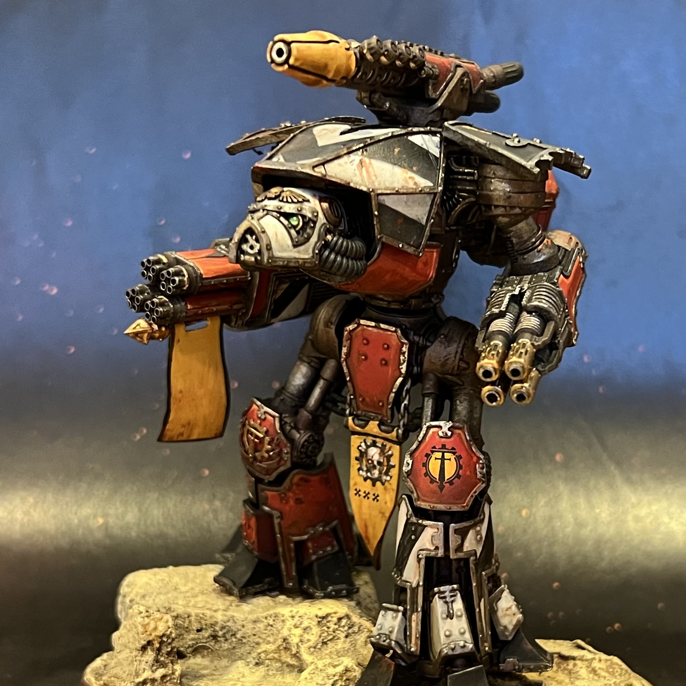
The Vigilants (Legio Maximal) are the brainchild of the Adeptus Titanicus and Legions Imperialis podcast Maximal Fire – hence the name – who ran a contest to explore the background of their Titan Legion, and their surrounding domain. My entry seemed to catch their imagination, and I was lucky enough to win a lovely pile of loot! 

A YouTube video on the background for the Vigilants, or Legio Maximal, can be found on the Maximal Fire Podcast channel in this vid-link [+noosphericexloadlink embedded+] (go subscribe!), but if you prefer written content, here's the text:

Thursday, February 6

+ inload: Oil dot filters +

+ Toll the Great Bell Twice! +

+ With push of button, fire the engine and spark turbine into life. +

+ Metalica walks. The sacred unguents have been applied and the necessary sacrifices offered up to the Machine Spirits of five Engines. Bar a few relatively quick details, the painting is all done, and it's time to start preparing for tabletop battle... +

 +++

+ [Insert heavy metal song pun here +]

+ Precision strike: cutting it close +

Two days to go, and as you can see above, the oils are on and drying. The nice thing about oils is their long working time. There's no rush, and no stress (well, no additional stress about timings!), so you can gently tick through the session, and find them perfectly workable at the end. I used a couple of techniques here: oil dot filters, and washes. 

The washes are done almost exactly as with acrylics: thin the paint down and apply with a brush. The main difference is that I suggest you use rather less oil paint than you would acrylic paint as they'll take much longer to dry. Oil dot filters, however, are a new technique to the blog, so here's the rundown:

+ Oil dot filters +

The purpose of this technique is to add interest and subtle variance to a flat area, creating a sense of scale and texture. The result is a little like a glaze, in that you are aiming to work over the area evenly (rather than to avoid/fill recesses, for example). It differs from a glaze in that you're not aiming for a flat colour, but rather a variegated result.

I started by squeezing out pea-sized amounts of burnt sienna, raw sienna, Winsor lemon, cadmium red, and lamp black oils onto a palette, then used an old split brush to stipple lots of small dots of the various colours over each Titan in turn. The paint was used neat, and the brush was dry. Rather than rinse it between colours, I simply wiped the excess away to keep the brush dry.

Once that was done, I swapped to a goat hair fan brush [+noosphericexloadlink embedded+], as these are relatively cheap and sturdy. I loaded this with thinner (I used Sansodor [+noosphericexloadlink embedded+]).

I then slowly and steadily drew the fan brush directly downwards over each panel in turn. This draws the oil paint downwards from each dot, softening and creating gentle streaks. At the bottom of the area, lift the brush away, wipe it on a cloth, and repeat until the effect is as you want it. The more brushstrokes you use, the more oils will be drawn away. The key is to work steadily and evenly, and always in one direction.

+ The finished result – compare this with the pre-oils version below. +

+ Strike to enlarge. +

+ Oil filter keynotes +

  • Ventilate  Throw open a window. Odourless or not, solvents in the respiro-sacs aren't very good for you. 
  • Cede control  When stippling, don't worry about an even effect or coverage. Slight variation across the surface looks more natural and pleasing. Likewise, having some dots containing more paint than others will give variety of tones in the streaks.
  • Adapt  Remember that the Titan is not locked in the pose you've chosen, so look at the panel and decide on the direction before working straight down to the base. Rainfall and similar weathering will carry dirt and grease straight down whever possible, so consider where 'down' is likely to be for the majority of the time.
  • Vary  You can also do oil filters in circles or more random directions to add interest to flat areas.

+++

+ The Maniple +

Here're a few hard-earned shots of the maniple as it currently stands:

+ Old Three Skulls +


+ Ferratus Tertius +


+ Fors Clavigera +


+ Praeterita Carnivorus +


+++

+ What next? +

I also worked a bit more on the nameplates from Obsidian Forge last night, too. Thinking more on it, I could have used oils... but given the time pressure, I decided to stick with my comfort zone of acrylics. These have been worked up with a combination of washes and drybrushing. I'd like to polish them up a little further, but as they're functional already, that'll depend on how the rest of the 'stretch goals' go.


 And to close, as I have the shots and haven't shared them, here's a close-up of the eye lenses on Steel Hammer (pre-oils in this shot)...


... and one of the back of the Titans, to show off how lovely and clean they were before I got stuck in with griming them up!


Tuesday, February 4

+ inload: Titanic metals +

+ Sound the warhorns +

+ As you'll see, things have progressed. I've completed the trim and metals on three of the Titans (and discovered Runelord Brass, a pot of which has lurked at the back of my painting drawer for years, is an amazing colour for adding some subtle variation here.

I'd hoped to have things set for the oils to go down tonight, but with two still outstanding, I'll finish the other two before doing them all in a batch on Wednesday. That will – Machine God's mercy-be-granted – have them finished and dry ready for the weekend.

That will leave me a day's grace to polish up the 'stretch goals' of the various objectives and banners. +

+++

+ Mea Culpa – the perils of storing things in too many different places +

I had a bit of a [+CASCADE-MEMFAIL+] moment when I thought that I had ordered the wrong terminal nameplates from Obsidian Forge [+noosphericexloadlink embedded+]. Champion that he is, Fraser at Obsidian Forge  read the post and immediately offered to print up a quick plate in time for me to get painted up for the weekend – what a result!

As it happened, however, when he looked back through things to ensure he was getting the name correct, he found the plate alongside the others in the digital file for my initial order... and after a bit of digging around I discovered that I had ordered it, he had supplied it – and I'd simply started painting the wrong one [+SCRAPSHUNTERRORABORT+].

So, a happy ever after to that tale, and I thought it the least I could do to share my sheepishness here and encourage you to pick up some plates (or other cool stuff) from Fraser at Obsidian Forge!

+++

+ Enough of plans, what got done? +


After painting the last outstanding weapon (Fors Clavigera's Barrage Missile Launcher) in the same way as the rest of the weapons, I turned to painting the trim, using a combination of Citadel, Vallejo and Army Painter metallics. These were added as light layers on top of the existing dark metal established right back at the start of the painting process – thus if any bits were missed, darker metal will be revealed, rather than anything bright and eye-catching.

This has given the Titans a bit more 'pop' for the moment, and the plan is to use oils to integrate the very bright areas (trim, transfers etc.) while enriching things overall.

+++


The trim on Old Three Skulls goes a long way to bringing out some much-needed contrast and visual interest to the Titan, which was otherwise looking rather red and monolithic. In particular, the gold around the head and forward shoulders (unique to this Titan) helps to tie him in with the others, addinga bit of punch that the white gives the remainder of the Maniple.

You'll also spot on these Titans that the Moderati banners have been added, too. These are made from metal foil taken from the capsule of a wine bottle – simply cut out the shape you want with scissors and wrap it around a length of paperclip. 

+++


Rounding off the trio from last night is Ferratus Tertius – or Castigator Lacrimarus. You'll spot the Titan banner (between the legs) has had the transfers applied to evoke the original. All looks a bit flat at the moment, but some highlighting and weathering will bring some interest to these bits.

+++

Monday, February 3

+ inload: Last push for Beachhead +

 + Void translation – the Metalica Home Stretch +


+ Crunch time. The event, Beachhead 2025 [+noosphericexloadlink embedded+], is in five days' time, so it's time for finishing touches. I'm confident that I'll have a playable force – the pict-capture above is not quite up to date, so there's been more progress since it was taken. Nevertheless, there's still quite a lot that I'd like to have done before they march once more in anger. +

+++

+ Holding your nerve +

Still to do:
  • Trim and metals on Steel Hammer, Fors Clavigera, Praeterita Carnivorus and Old Three Skulls
    • This is the big one. I'd hoped to have all this done over the weekend. I need to get this done tonight, really, if I hope to get the oils on with half a chance of drying before the event.
  • Oils on all.
    • While this seems much larger, I think (hope?) this should be surprisingly quick.
  • Eyes on Steel Hammer, Fors Clavigera and Old Three Skulls
  • Moderati banners on all five, plus the big Legion banner on Old Three Skulls
  • Nameplates on Steel Hammer, Fors Clavigera, Ferratus Tertius and Old Three Skulls
  • Paint three objective markers for primary missions: Secure and Hold and Salt the Earth; three objective markers for primary missions: Asset Protection and Defend and Extract; Titan Honour Banner for primary mission: Honour thy Forebears; Two markers for secondary mission: Deny Them.
  • Paint two markers for Titan Hunter infantry stratagem.
Between you and me, I'm not entirely confident that I'll be able to polish off all the bells and whistles that I want to get done in time, but we'll see. The good news is that one of the big stages, varnishing, is complete – and that's critical, because it's very dependent on the right conditions.


Post-varnish (I used Winsor & Netwon matt spray varnish [+noosphericexloadlink embedded+]), the transfers now look much more integrated into the painting scheme, with the shiny carrier hidden.  Just compare the picture above with the one from this earlier inload [+noosphericinloadlink embedded+], and you can see how the legion symbol now matches the reflectivity (or lack thereof) of the rest of the paint.

+++

+ Steel Legion basing +

The teeny-weeny Steel Legionaries on the bases of Steel Hammer and Fors Clavigera have been painted up, too. This is a simplified version of my Steel Legion 7th Army force scheme, which is detailed in this inload [+noosphericinloadlink embedded+]. 

+ Eeeee! Adorable mini Legion +

Why focus on this tiny detail when there's still major stuff like trim to do? Well, as the old adage goes, the things that matter most are faces and bases. Painting these was also a handy way to get an idea of how long it'll take me to do my 'stretch goals' of the objective markers and Titan hunter infantry stratagem bases/markers. Happily, they were all done in half an hour or so, and the other bits will start a little further along than these because these needed a new basecoat after getting hammered with the drybrushing on the Titan's bases.

+++

+ Battle Builder nameplates +


A good example of adding a bit of punch and interest to the bases are the nameplates, which come from Battle Builder [+noosphericexloadlink embedded+]. This example was painted gold, the panel painted black, and then the name picked up with Citadel Averland Sunset, which was highlighted up at the top and bottom to Vallejo Mummy Robes. 

It proved a fairly quick process, which sometimes proves the advantage of some time pressure. I'd been umming and ahhing over how to approach them for ages, as I wanted them both to be easily readable from tabletop distance, but not pull too much impact from the Titan itself. In the end, I really just needed to trust the process and get on with it.

+ Beautiful Obsidian Forge nameplates – but I ordered the wrong name! +

There was one fly in the ointment, however: realising that the nameplates on one of the Titans, Ferratus Tertius, doesn't match the terminal plate, which reads Castigator Lacrimarus. I'd clearly had a bit of a [SCRAPSHUNTERRORABORT] and ordered the name of the Titan that didn't make it into the final list. I will have to have a think while I'm painting, as it's too late to order another...
+++

Thursday, January 30

+ inload: Varnish, transfers and acrylic paint +

+ Heraldry and battered metal boilerplates +


+ The casting of propitious runes and god-engineering stumbles onwards as the time creeps closer to the Beachhead deadline. Today's inload looks at transfers on Titans, including bimblings on varnish. +

+++

+ Titan Maniple +


They're getting there. Slowly but surely, every day brings completion that little bit closer. I just hope it's in time! One weekend and sixish evenings to go, and still plenty to do to get them as I want.

With that said, they're at least playable at this point, so let's push panic to one side and enjoy the last steps. This inload [+noosphericinloadlink embedded+] has struck-through text to indicate which steps I've completed since then, and as you'll see it's mainly the banners left to go – though those will be finishing touches done after the oils washes are in place.


+ Transfers in place on the shoulder, ready to be softened in and integrated. +

+++

+ Adding transfers: theoretical +

I've used transfers here and there on different models and units, but generally prefer to freehand markings, as I enjoy the focus it brings me. For this project, however, I wanted to shake things up and try something new – and combining transfers and oils is something that I've rarely if ever done.

Having decided I was going to do it, I then needed to choose whether to use the iconographic or hyper-realist designs from the Metalica transfer sheet. I was really torn on this. On the one hand, the simpler icons seem more akin to practical markings to be used on an engine of war... but the more complex, detailed versions are more akin to devotional artworks that might appear on religious icons.

Since a Titan blurs these roles, I decided that it made sense to use the simpler stuff for more practical purposes: squadron marking and faction equivalents, which would be consistently placed lower down the Titans, so allies can quickly assess things in the fog of war. More complex, realistic artwork would be reserved for higher up the Titan, where such finery primarily serves decorative and heraldic purposes rather than practical ideas.


+++

+ Adding transfers: practical +

The process of getting transfers on is fairly simple:

_i +Preparation+  Paint your model to a finish you're happy with (e.g. highlighted and shaded).

_ii +Protect+  Apply a varnish – I used Winsor & Newton Professional spray varnish (matt finish) [+noosphericexloadlink embedded+]. Gloss is probably better for this stage, as it creates a smooth, glassy finish that means the transfers lie as flat as possible. However, I didn't want to splash out for a second can of varnish, and I want a matt finish eventually.

_iii  +Wetting+  Cut out the transfer (including the backing) and dip into the water pot. Let it get soaked, then place it on your palette while it loosens itself from the backing.

_iv  +Solution+  Use a brush to paint Microscale's Microset solution [+noosphericexloadlink embedded+] over the area you want to apply the transfer.

_v +Placement+   Bring the transfer and backing up to the area, and use a clean damp brush to gently slide the transfer across into the correct position. Try to avoid any bubbles.

_vi +Patience+   Allow to dry thoroughly. The transfer will now be in position, but will look glossy and the edges will often be obvious.

+ Transfer in place after stage vi – note the reflection of the light, and the circular shape of the transparent backing. +

_vii +Repetition+   Apply a second coat of Microset, working outwards from the centre of the transfer, and leave to dry. The solution softens the transfer and helps it adhere to the surface.

_viii +Integration+   Once completely dry, use a clean brush to apply Microscale's Microsol solution [+noosphericexloadlink embedded+] over the transfer. This partially dissolves the transfer, helping it to settle onto the surface and look painted on.

_ix +Sealing+   Once that's completely dry, apply a second coat of W&N spray varnish, and allow to dry to finish.

+++

+ All over bar the shouting +

That brings us to this stage (well, step 8), and as you can see, the transfers now look more settled in. Of note here is the effect that varnish has on the metallics – the matt sheen kills the reflectivity of the metallics. The result's not unpleasant, but it's worth bearing in mind if you've spent ages working on the metals. For these, they've deliberately been left as basecoats so that I can develop them later on.


It's worth noting that transfers and freehand painting aren't mutually exclusive, and nor are you restricted to the designs on the sheet. The example above is a very simple example of this – before the transfer on the left knee (right of picture) was applied, I painted on a yellow circle that would fit within the cog shape. Since part of the transfer is clear, the yellow shows through and looks like an integral part of the design.


Key to my plan is that the designs evoked (or even matched) the original inspiration – another reason why I went for the simpler, more iconic designs from the sheet for these parts.


For the larger areas on the Warlords – the big shoulder plates – I've instead gone for the more detailed versions. Still in two minds about the decision, but he who hesitates is lost, and all that. Steel Hammer, above, has this large Legio symbol on his shoulder, and a similar variant on the other side.


Old Three Skulls, being rather larger that the original, has received some additional nods to his name – a trifecta of skulls on the shoulder in the same arrangement as on the original's weapon banner, and three smaller yellow skulls running along the cockpit.

+++

+ Painting nameplates +

But it's not all transfers. I've also been doing some building and painting. First off, I built Fors Clavigera an alternative missile launcher to better evoke the Barrage Missile Launcher of the original.

The old models used the same weapons for carapace and arms (rather than having specific mounts for each), so as you can see below it's quite ungainly. I wanted to ensure it evoked the idea of the original, while having a similar feel to the other modern weapons.


I built it with a bits box dive. At the base is a magnetised Apocalypse Missile Launcher connector, so I can still swap it out if necessary. The mounting is from Battle Bling, and the larger parts are from the new Imperial Guard big artillery piece – one of the super-lascannons. This was trimmed down and carved into a shape to evoke the original. 

The upper armour is from a Reaver Power Fist – I cut the central part away and married them together, while the part with a cable near the front is a Reaver close combat weapon upper arm. Finally, the missile piece itself is a Leagues of Votann (new squats) piece, given to me by TrojanNinja (thanks!).


I sprayed and basecoated it, then popped it in place to see how it looked. You decide – does it look about right?


Elsewhere in the maniple, Praeterita Carnivorus (Carnivore to his friends) has had the armour and lenses of the cockpit painted, ready for oils and trim:


You'll also note here that I opted to add a yellow transfer rather than paint his groin completely yellow (as in the original). Just like the alterations to the carapace stripes, I thought this was a better, less distracting compromise between the original and the retrohammer remake.


And I also spent an enjoyable few minutes painting the chequers on Old Three Skulls' Power Claw:


This involved little more than thinned Scorched Brown paint, a fine-pointed brush, and time. I'm still in two minds on whether to continue the chequers over the 'knuckles' or not. What do you think?

+++

+ Painting nameplates +

I also started putting the base paint down on the nameplates. These are from Obsidian Forge [+noosphericexloadlink embedded+], and will sit on the magnetised terminals that I made for the force, so it's easier for both me and the other players to track which Titan is which.

The first stages I've taken to paint them are:

_i  Apply a brown undercoat – this gives a nice warm undertone.
_ii  Stipple Balthazar gold over the whole surface. Make sure you get a nice thin coat over the whole surface, including in the recesses within the text.
_iii  Work Seraphim Sepia wash into the recesses, leaving large areas clear.

+ End of stage _III +

More to come soon!

Monday, January 13

+ inload: Red for the Iron Skulls +

+ Painting Titans red +


+ Thought for the day: Words of praise will never perish; nor a noble name. +
+++

A weekend spent painting – mainly a bathroom, but also found some time for miniatures. Old Three Skulls here shows what I've been doing; namely shading and highlighting the red. This was an enjoyably painterly process, and involved making up a pot of Xereus Purple and Scorched Brown with plenty of flow enhancer and clean water. This made a very fluid paint that I could apply before wet blending it out. 


Once dry, I turned to highlighting. I based the mixes on Mephiston Red (matching the Colour Forge base spray I used), and added Azo yellow (Yriel yellow is a good equivalent) and Army Painter Mummy Robes to brighten. Highlights were added sparingly, as the overall tone should be nice and rich – I'm aiming to approximate the colours below across the maniple. 


This image is from the AT books, and shows the current look of the Iron Skulls: a much deeper, richer red than the WD-era models that are the inspiration for the project. Finding a balance between the two is fun. The red in the illustration is very rich, and I'll be relying on oil glazes to bring some of that warmth and vibrancy to the finished result.
+++


This shot shows a detail of the red at this stage. It's not as clean as an airbrushed effect, but to me that's a positive. I admire the cleanliness of airbrushing, but I personally like a bit more visual texture in the result as it adds both realism and a sense of age and presence. 

You'll note that the metals have got a a bit mucky during this process, and that's one of the reasons why I'm leaving them 'til near the end to polished them up. The other reasons include the fact that varnishing will knock them back anyway, and being raised, they're most likely to catch errant brushmarks during painting other things. By leaving them 'til near the end, they'll have built up a natural patina from washes, glazes, oils etc., and some highlighting will then add some depth. It will also allow me to tweak the overall tonal impact a bit – if the overall model has become too dark and moody, I can add some visual pop with lighter-toned silver.


+++

+ What's good for the goose is good for the gander +

Of course, it's all very well coming over all artsy for a standalone model, but if you want cohesiveness in an army colour scheme, you need to be able to replicate it. That's why I made a pot of the purple-brown shading mix, as it would let me get the same effect on all five models in the Maniple (and why I record the details here, as it will let me try to match it in the future!)


The curved carapace armour plate here on Carnivora shows the different between the highlighting on curves (more diffuse, not going to such a bright tint) and on the edges (where the paint marks are very fine and go to a very pale pinky-cream. The pink tinge will be reduced by a yellow glaze later at the oil stage, so painting like this requires you to hold your nerve a little and trust in the process. The glazes will also help to blend in the paint, reducing the harshness a touch.

+++

+ What difference does it make? +

All of this begs the fundmantal question – what's the point in shading and highlighting? The answer to that is a sense of scale. By exaggerating the tints and shades, we can simulate how light falls on a very large object, giving the illusion that this model figure is huge.

A pict-capture's worth a thousand inload-entry subpackets, so here's a before and after:


Hopefully you'll agree that the second picture looks less toy-like, despite fundamentally being the same.

The other point is demonstrative. It's nice to put some effort into something and have something to share – and having more visual interest means there's more to chat about. Flat colours look striking and effective, but beyond the impact of the scheme, leave little to chew over. The idea behind having a full gamut of tones is that it makes it easier for the viewer to picture the model in context – though as you'll see above, the flipside of this is losing some of that cleanliness and immediacy of the impact. I personally favour this earthiness, but there's no doubt the an airbrush or finer wet blending is the way to go if you want to retain cleanliness and vibrancy.

+++

Pontificating aside – I'm still very much a journeyman painter – I'll need to keep up the pace. Not long to go, and all the visual interest in the world will be spoiled if they're not at least somewhere nearer being finished!

The red shading is complete on all five, and the highlighting on three. I'll finish off the highlighting, then move on to the black and white areas.


+ Remember Jardingris! +


Thursday, January 9

+ inload: Metalica plans and preparation +

 + Toll the great bell once! +

+ Painting progress +

+ Sound the chime to rouse the Machine Spirits to wakefulness! +

+ I'll need to come up with a suitable Maniple name... +

When I decided to paint a new Titan maniple for the Beachhead event, I was aware that it was a pretty big task, and so it's proving! So... much... trim. 

The good news is that I'm finally getting to the end of the base painting. This has involved lots of subassemblies, of which I'm thoroughly sick; and so it's been a welcome milestone to be able to glue the [+SCRAPSHUNTERRORABORT+] things together at last, resulting in what you see here.

+++

+ Painting plans +

+ Here's my plan for getting these over the line. [+APPENDEDIT: I'll  be striking through bits that have been done since this inload was initially posted, so you can see my progress. +

_1  The next stage for all of them will be adding the black stripes to the white plates, and add some highlights and initial shading to the base coating. This will include panel lining, where appropriate. I'll use a purply-brown for the red, and a blue-grey midtone for the white.

Trying to visualise the eventual colour balance is a bit tricky – I know the oil washes and varnish will mute the colours somewhat, but I'm still having to force myself not to grime things up at this point. For this reason, the highlights probably need to be a bit brighter and pinker than looks right – as the yellow-tinged glaze/filter will warm it back up and bring it back to a neutral red. That's the theory, at least.

_2  After that, I'll add the transfers. Once those are in place, I'll varnish to protect the transfers – I'm still undecided on whether to use brush-on varnish to topically protect the transfers, or an overall spray.

_3  After that, we're onto the oils. My plan is to use burnt umber and raw sienna to bring some warmth, richness and visual texture to the large flat plates, and help the transfers sit in.

_4  I'll then switch over to the additional bits and bobs, so the oils have plenty of time (ideally a week or so) to dry/oxidise. These additional bits are:
  • Titan banners (between the legs)
  • Weapon banners
  • Terminal name plates – courtesy of Obsidian Forge [+noosphericexloadlink embedded+]
  • Three objective markers for primary missions: Secure and Hold and Salt the Earth
  • Three objective markers for primary missions: Asset Protection and Defend and Extract
  • Titan Honour Banner for primary mission: Honour thy Forebears
  • Two markers for secondary mission: Deny Them
  • Three markers (one Primary, two Secondary) for secondary mission: Glory and Honour
  • Six markers (one Shield, one Spear, two Alpha and two Beta) for secondary missions: Priority Assignment and A Matter of Honour.
_5 Polishing up the detail. This is basically everything else – but given a lot of the weathering, detailing and so forth will have been done previously, this should (touch wood) mainly involve polishing up the bases.

Quite a lot to do... Pass the brown paper bag for hyperventilation practice! I'll have to have a think about how I'll do the various markers.

+++

+ Specifics +

+ For quick reference and as an aide memoire, here are my notes for what specific details each Titan needs. +

This retrohammer project is an affectionate update, rather than a direct translation. As noted in earlier inloads, some of the weapon loadouts are now illegal or non-existent, so I'm having to make some concessions to modernity. The same will apply to the details of the painting. I want things to be recognisable, but also to take advantage of the larger, more detailed models. To that end, I'll be adapting bits here and there – these notes should flag the sort of decisions I'm making.


First up is Steel Hammer, Titan of Princeps Prime [sic.] Kurtiz Mannheim, who carked it during the Second War for Armageddon (whisper it low, but these are 40k-era Titans sneaking into a Heresy event).  As the only Titan without a studio equivalent, I've got a lot of freedom here. 
  • Black chevrons on shin, stripes on shoulders and above head.
  • Update left arm weapon – and redraft list! Shave points to bring in plasma?


Carnivore has had a name tweak to Praeterita Carnivorus. Evocative of the old name, but with a bit more over-the-top pomp and grandiosity of the modern game, it translates roughly to 'Past Carnivore', or 'Carnivore of things past' – a pun I couldn't quite resist. It's also a reference to the Victorian-era polymath John Ruskin, for reasons I'll expand on below. Praeterita was a sort-of biography; an elegy of a lost past – which seemed a fittingly pompous adjunct to this backward-looking project.

Here's the inspiration:

  • Paint left pauldron red.
  • Black chevrons on right pauldron.
  • Update right arm to laser blaster.
  • Black diamond and skull on right knee.
  • Black Opus Titanica symbol in yellow circle on right knee.
  • Yellow striped carapace – though I'm tempted to make this a three-colour stripe (white, yellow, black) to put a bit of space between this and the modern Fire Wasps scheme.
  • Yellow groin – perhaps with black transfer to avoid drawing the eye too much.
  • Titan banner (between legs) – black skull and two small black kill markings.
  • Moderatus banner (left arm): Legio symbol in centre on red field, surrounded by small black icons, surmounted by Opus Machina; all bordered in white and black chevrons.
  • Nail icon to add somewhere, along with reference to Lycurgus and Fortune.


Ferratus Tertius is the furthest along of the group, and has served as a bit of a testbed for things. I'm pleased with how he's coming along, though I am erring towards swapping out the Gatling blaster for something a bit more visually similar to the vulcan megabolter, like Battle Bling's cyclone mega-bolter [+noosphericexloadlink embedded+]. You'll note that I've painted the head white, rather than silver, for increased contrast. Heraldically, I reassure myself, it still reads as 'Iron Skull'.

Ferratus Tertius
  • Black diamond and skull on right knee.
  • Black Opus Titanica symbol in yellow circle on right knee.
  • Titan banner (between legs) – black skull and three small black kill markings.
  • Moderatus banner (right arm): Legio symbol in centre on red field, surrounded by small black icons, surmounted by Opus Machina; all bordered in white and black chevrons.
  • Repaint shoulder armour red.
  • Key icon, and reference to Odysseus to be added.


Fors Clavigera is my modern take on Clavigera/Ferratus Primus, and the reason for the John Ruskin nod. Fors Clavigera is a series of essays he published, which outlined his social economics and proto-environmentalism. 

The reference is the three 'Fors' by which the working man could influence things: force, fortune and fortitude – which are symbolised by Hercules' club; a nail (of Lycurgus – of Sparta fame); and a key (of Odysseus/Ulysses) respectively. 

The names of all three of these items are derived from 'Clava' – and so this is a good example of how you can dive into a cool but throwaway name and invest it with a bit more gravitas (or disappear entirely up your own rear end!). Incidentally, it also means that Clavigera is feminine, making this a God-Engine following the old naval tradition of referring to ships as 'she'.

Of all these titans, Clavigera is the one that I think least resembles the inspiration, and so I'm going to try my hand at converting a barrage missile (as seen below), and possibly replace the gatling blaster with an alternative.

  • Swap upper carapace for red; include white Aquilla.
  • Chainfist to be painted red.
  • Black stripes on shoulders.
  • Black diamond and skull on right knee.
  • Black Opus Titanica symbol in yellow circle on right knee.
  • Titan banner (between legs) – Opus Machina and five small black kill markings.
  • Moderatus banner (right arm): Legio symbol top centre on yellow field, surmounting black diamond flanked by Opus Titanicus symbols; all bordered in black.
  • Club icon, and reference to Hercules to be added.


At the other end of the column is Trismegistus the Great, affectionately known as 'Old Three Skulls', who is simply plodding along.


  • Powerfist to be painted with yellow and black chequers.
  • Black stripes on left shin (after strengthening white field and red trim).
  • Legio symbol skull on right knee.
  • Yellow Opus Titanica on left knee.
  • Titan banner (between legs) – to add?
  • Moderatus banner (right arm): Three black skulls on yellow field with red border.
+++