+ Painting Titans red +
+ Thought for the day: Words of praise will never perish; nor a noble name. +
+++
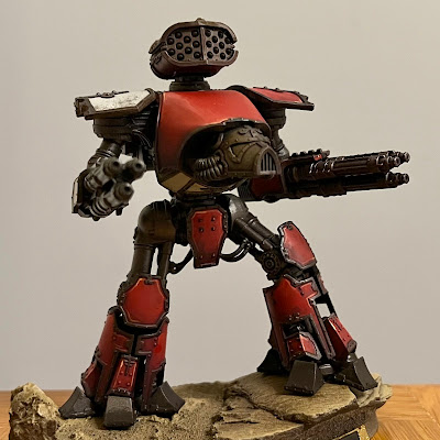
A weekend spent painting – mainly a bathroom, but also found some time for miniatures. Old Three Skulls here shows what I've been doing; namely shading and highlighting the red. This was an enjoyably painterly process, and involved making up a pot of Xereus Purple and Scorched Brown with plenty of flow enhancer and clean water. This made a very fluid paint that I could apply before wet blending it out.
Once dry, I turned to highlighting. I based the mixes on Mephiston Red (matching the Colour Forge base spray I used), and added Azo yellow (Yriel yellow is a good equivalent) and Army Painter Mummy Robes to brighten. Highlights were added sparingly, as the overall tone should be nice and rich – I'm aiming to approximate the colours below across the maniple.
+++

This shot shows a detail of the red at this stage. It's not as clean as an airbrushed effect, but to me that's a positive. I admire the cleanliness of airbrushing, but I personally like a bit more visual texture in the result as it adds both realism and a sense of age and presence.
You'll note that the metals have got a a bit mucky during this process, and that's one of the reasons why I'm leaving them 'til near the end to polished them up. The other reasons include the fact that varnishing will knock them back anyway, and being raised, they're most likely to catch errant brushmarks during painting other things. By leaving them 'til near the end, they'll have built up a natural patina from washes, glazes, oils etc., and some highlighting will then add some depth. It will also allow me to tweak the overall tonal impact a bit – if the overall model has become too dark and moody, I can add some visual pop with lighter-toned silver.
+++
+ What's good for the goose is good for the gander +
Of course, it's all very well coming over all artsy for a standalone model, but if you want cohesiveness in an army colour scheme, you need to be able to replicate it. That's why I made a pot of the purple-brown shading mix, as it would let me get the same effect on all five models in the Maniple (and why I record the details here, as it will let me try to match it in the future!)
The curved carapace armour plate here on Carnivora shows the different between the highlighting on curves (more diffuse, not going to such a bright tint) and on the edges (where the paint marks are very fine and go to a very pale pinky-cream. The pink tinge will be reduced by a yellow glaze later at the oil stage, so painting like this requires you to hold your nerve a little and trust in the process. The glazes will also help to blend in the paint, reducing the harshness a touch.
+++
+ What difference does it make? +
All of this begs the fundmantal question – what's the point in shading and highlighting? The answer to that is a sense of scale. By exaggerating the tints and shades, we can simulate how light falls on a very large object, giving the illusion that this model figure is huge.A pict-capture's worth a thousand inload-entry subpackets, so here's a before and after:
Hopefully you'll agree that the second picture looks less toy-like, despite fundamentally being the same.
The other point is demonstrative. It's nice to put some effort into something and have something to share – and having more visual interest means there's more to chat about. Flat colours look striking and effective, but beyond the impact of the scheme, leave little to chew over. The idea behind having a full gamut of tones is that it makes it easier for the viewer to picture the model in context – though as you'll see above, the flipside of this is losing some of that cleanliness and immediacy of the impact. I personally favour this earthiness, but there's no doubt the an airbrush or finer wet blending is the way to go if you want to retain cleanliness and vibrancy.
+++
Pontificating aside – I'm still very much a journeyman painter – I'll need to keep up the pace. Not long to go, and all the visual interest in the world will be spoiled if they're not at least somewhere nearer being finished!
The red shading is complete on all five, and the highlighting on three. I'll finish off the highlighting, then move on to the black and white areas.
+ Remember Jardingris! +


No comments:
Post a Comment
+ submission exloadform: inload [comments] herein +