Friday, May 26

+ conceptinload: Primaris, truescale and size +

+ Theoretical +

+ Vaguely apologetic babble +

+ Games Workshop are releasing a new range of Space Marines – the Primaris Marines – next month, and the first thing you notice about them is that they're bigger. Considerably bigger. Those poor benighted folk who have been doomed to read this blog can hardly have failed to notice that I build a lot of larger marines, and a couple of people have asked what my thoughts are. +

+ I've long been a bit wary of the terms 'truescale' or 'artscale' when describing my marines, as they've got some slightly snobbish connotation. I prefer to just say 'enlarged', as I've never wanted to imply that any model is wrong or better than another – as the old saw goes, 'one man's feast is another man's poison'. +

+ Nevertheless, truescale is probably the best-known term to describe the various methods of enlarging the standard marine kit to match the background and artwork more closely, so it's the one I'll use in this inload. +

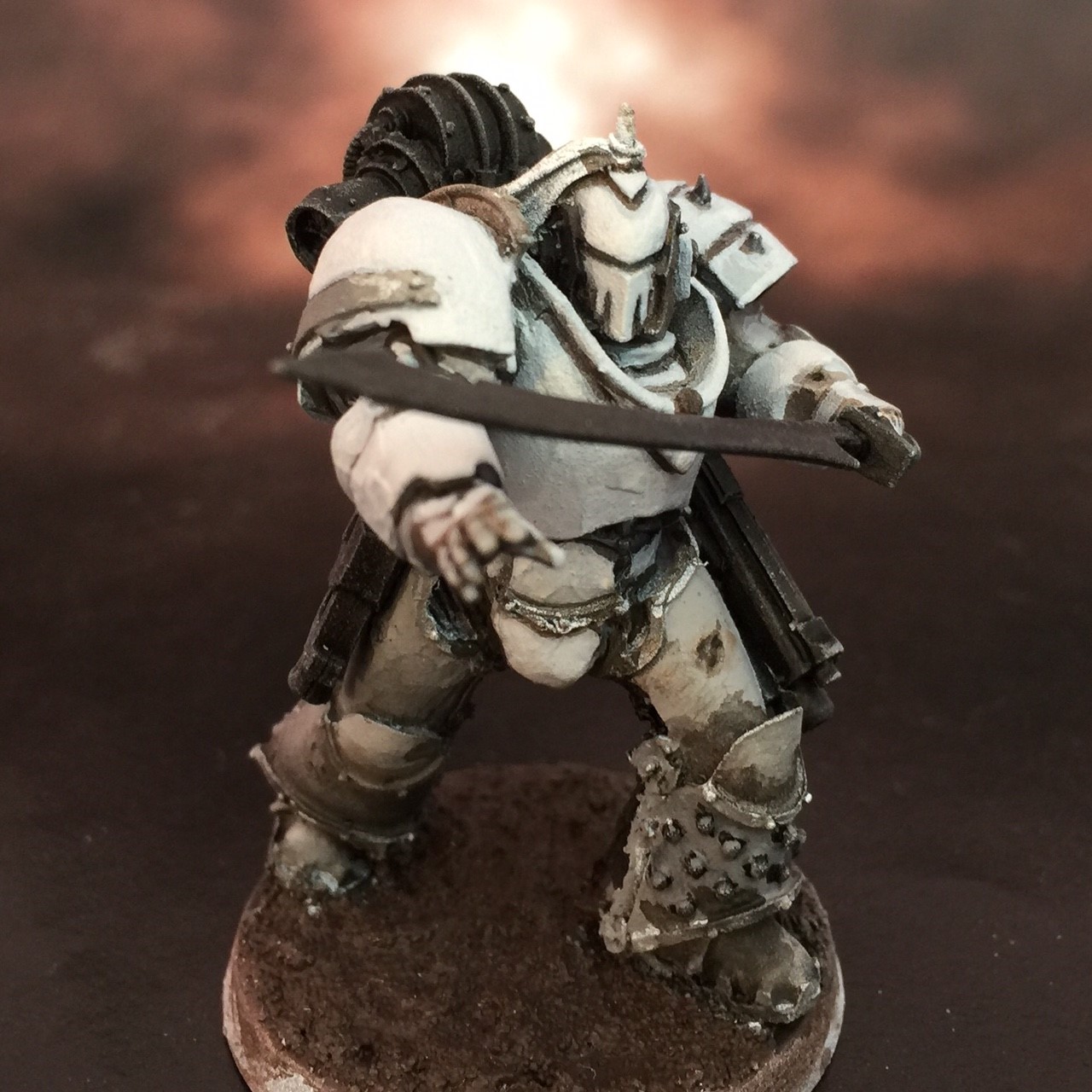
+ Along with a few other hobbyists, I've been converting truescale marines for a few years, and have always been surprised by the feedback I get on them – they seem to catch some people's imagination and they really like 'em, others have a real aversion – even anger, on one memorable occasion – to the truescale technique.  +

I find it unlikely that GW have never seen an example, as it's clear the staff keep an eye on the noosphere and forums etc., and there are quite a few hobbyists who have been plugging away at the technique. Anyway, perhaps something about the concept caught on at GW, as the new Primaris marines are much more imposing than the older models. +

+ First impressions +

+ First and foremost, I think they look great. The proportions of a lot of the elements from the standard marines that truescaling attempts to alter have been changed: The legs and torso are longer and broader; and the abdomen and thighs in particular have changed. These adjustments – which are fairly subtle – make the models look more imposing and closer to human proportions. +

+ As you can see in the crude pict-manip below, the proportions and height are surprisingly close in proportion to the Terminator-based marines I make: 


+ Scaling is based on the width of the bases, which I'm assuming are 32mm +
+ I'd certainly like to get my servo-augmetics on some to make some in-hand assessment and comparison, but by the looks of things, these'll fit right in alongside my existing troops. If anything, it's slightly peculiar to see quite how closely they fit; which of course is very pleasing – I'll have an army all ready to go. +

+ What next? +

+ Perhaps the best thing about this for me is that my truescale marines will now simply be 'marines', and they'll be a bit more anonymous on the table. This may sound a bit funny – after all, it's always nice if people are kind enough to admire your army – but I sometimes worry that the truescaling can seem a bit gimmicky, and detract from the impact of the army. +

+ Will I swap over to just using the Primaris marines? Likely not. While they certainly look promising for parts, I enjoy converting stuff too much to build almost anything straight from the kit! My immediate plans are to convert them to fit in one or more of my Age of Darkness armies – the Iron Hands, Iron Warriors or Ultramarines – but I do have a small hankering after a Blood Angels force set on Armageddon; an homage to the 2nd edition boxed set. This would, oddly enough, involve converting them back to Mark VI or VII! +

+ I am planning to pick up a copy of the new boxed set, so I'll do a review when I get the chance. +


+ The models certainly seem to be causing a lot of discussion; I'd love to hear what you think. +

Tuesday, May 23

+ inload: Cataphractii armour plate III +

+ Theoretical +

+ Coo, this is turning into a bit of a labour of love. Some rather unforgiving pict-captures below, but I'm broadly pleased with the detailing. The shoulder plates are not shown here, but I have smoothed those out to make them more anonymous, too. +

+ What's been done since last time? Well, a lot of minor polishing. The most obvious additions are the rivets, but there's also quite a bit of refinement in terms of detail and sharpening of edges. I'll do another pass of this to further tidy things up, and then it'll be largely finished. +

+ I've left the head as it is in order to make it as versatile as possible. In the configuration shown, any head can be added. The odd little half-heads that the plastic and resin Cataphractii use will need a little greenstuff filling, but it's much easier to fill than remove. +

+ Practical +

+ It was a pain in the [SCRAPSHUNT] to add the rivets, but they go a long way to suggesting detail. +


+ As mentioned, the turbine exhaust fans have been reinstated. I've placed them midway between the waist and the rest of the detailing in order to help the illusion of the proportions (rather than having them too near the original position, which would have make the chest look too short and the midsection too long). An arseplate has also been added. +


+ Next to Tithonus, we get a sense of the bulk and size of the Terminator. +


Friday, May 19

+ inload: Constructing Tactical Dreadnought Armour part II +

+ The forges burn hot... +

+ The Terminator I started yesterday continues:
 

+ Dry-fitted, I think he's coming together pretty well. I've filled out the legs, raised the torso slightly (you can see the gap between legs and body now)and begun adding some additional shaping on the torso. +


+ Quite an intimidating appearance, I think you'll agree. The reason for the oddly-spaced legs also becomes a bit more apparent – compare the be-loinclothed (yeah, it's a word) chap above with the stripped-back version below. +


+ While he looks a bit odd here, the proportions match the standard-sized models better – which ties back in with what I was saying in yesterday's inload about balance between looking proportionally correct and correct in-context. In addition, on a very practical level, there's space for the pteruges. +

+ Being able to retain some elements of the standard-sized models – head, weapons and, in this instance, pteruges, is what helps sell the altered proportions, rather than simply creating a differently-scaled model. +


+ The head can be swapped out. Currently it's got a fitting suited for the more usual Space Marine head fitting, so the flat-bottomed Terminator and Cataphract pieces sit a little too low. I think I'll make a 'booster' section for these for greater versatility. +


+ Still a little crude – I don't claim to be a master of greenstuff, but practise makes perfect – the details above and below shows the shapes tightening up on the torso, and the hooped detailing on the legs. +


+ Scale shots +

+ A couple of pictures showing the Terminator next to some power-armoured marines. I had a comment that the Terminator's torso was a fraction too short – and indeed it was, so I cut at the waist and raised it a touch, which I think improves the result. It's very helpful to get these comments at the early stages; it's easy to get too close to a figure and lose the overall sense. +


Thursday, May 18

+ inload: Constructing Tactical Dreadnought Armour +

+ Building Cataphractii plate +


+ I've built Terminators in 'true-scale' (though given the models from the upcoming new edition, that term might be pretty obsolete soon) before, but have never quite got them as I wanted them. I thought I'd give it another go, and decided to be more ambitious and tackle Cataphract armour, aiming to create a model closer to the original than my previous attempts, which had always been something of a compromise. +

Modern, 'Indomitus' Terminator plate, alongside an enlarged marine. Built c.2010


+ Theoretical +

+ Terminators offer more of a challenge than power armour when scaling them up. Not only are there fewer large models to act as a base – equivalent to using Terminator legs for truescale power armour – but those models are often expensive and require far more conversion to appear correct. A further challenge is that the already-exaggerated proportions of Space Marines are stretched to the point of disbelief. +

+ Now, I think basic Terminators look cool; and fundamentally I'm always more interested in 'cool' than 'realistic' when it comes to space war, but when making a conversion, viewers aren't going to be as forgiving as when they see a stock model. Unfamiliarity often provokes rejection – just look at the reaction resculpts or updates of new models get from manufacturers – and the very fact of presenting a conversion to someone is, in part, an invitation to critique. +

+ So, excuses made and out of the way(!), it's on to planning. A solid plan saves a lot of effort later on. I dug out my previous attempts and looked at what I did and didn't like:

A previous attempt – Erasmus Golg

+ My most recent attempt was the special character Erasmus Golg. He was working pretty well, but I rushed the end. As a result, while the legs were pretty much how I wanted them, the core of the body ended up too small. He's big, but not substantially bigger than the marines around him, and I wanted to get that sense of a walking tank. In addition, he looks a little wasp-waisted to me here. +

Built by the inimitable EdT
+ This version was created by a hobbyist called EdT, who sent him to me when he retired (hopefully temporarily) from the hobby. Again, I really like the limbs, and the bulk is starting to be there, but the design – based on the 'peahead' Exoarmour prototype – is not what I was after. +

+ At this point, I decided I'd go back to the root of things, and looked at the artwork, rather than miniatures. This proved very useful. Rather than looking at compromise solutions for parts, I just found something that I liked the look of:

+ I found this rather awesome image of Cataphract plate, by David Sondered [+noospheric inloadlink embedded+]:


+ This had everything I wanted: solid, believable proportions and a sense of weight. Combining the parts I knew were successful previously, I began work. +


+ Practical +

+ So, here's the start. This represents the basic bulking out of the figure, aiming to emulate the silhouette of Mr. Sondered's awesome artwork. The lower legs are from a second-hand Obliterator (for all its faults, Finecast is great for conversion work – easy to cut and solid enough to take a pin). The right foot (left in the pict-capture below) needed to be cut and repositioned, which proved to be a much easier job than I'd anticipated. +


+ The upper legs and groin are from a Privateer Press Khador Man O' War model – again, bought for a song on eBay, as the set was missing some parts. No matter to me! This shot demonstrates the first 'cool/realism' problem – namely, the spacing of the hips. There's no way a human would fit in there, but the silhouette works to suggest the existing models in a way that closer legs would not. This will be ameliorated to some extent by a small amount of bulking on the upper legs, and the addition of pteruges, but it'll still be apparent. +

+ At the end of the day, I'm content that some people will like my stuff, other won't. The core thing is that I'm happy with 'em – it's very easy to end up disappointing yourself and building something by committee, which takes a lot of the joy of creation away. +


+ The torso is heavily bulked up with greenstuff, but the underlying core is a Grey Knight terminator torso back with a Cataphractii back attached. I used a spare Forge World piece left over from another conversion, but it'd work just as well with plastic. The front is a Grey Knight terminator torso front – a small spacer is set between the two standard parts – and the curved 'hood' of the plate is made from the trimmed-down front of a Tartaros Terminator. This all probably sounds a bit esoteric, but it's all leftovers from my bits box. +


+ The back here shows crude bulking. Note I've used the edges and sides of the existing kits where possible – I find it easier to use these to create the straight lines, then blend the edge between them, than it is to sculpt the sharp lines from scratch. In any case, using the existing bits like this 'spreads out' the detail. You'll notice I've trimmed away the circular fans from below the pipes on the back – these will be reinsated later on to detail the greenstuff area and help the visual flow. +


+ The head is a temporary placeholder, used to make sure the placement is correct. The shoulderpads are similarly there just for sizing. That said, I quite like 'em – they look about the right size to me, so they may end up having their detail filled in and being pressed into service. + 

+ What next? +

+ Once the greenstuff has cured properly, I'll be going back to sculpt the detail – filling in the legs, adding a gorget and generally creating the distinctive banding and detailing of the armour plating. +

+ The following shots show him next to a few different models, to give a sense of scale and size. I checked him back and forth quite a few times while I was working – there's actually quite a slim margin between 'not big enough compared to the power armour' and 'ha-ha that's far too big'. +


+ I'd love to hear your thoughts on the model at this stage before I go much further. +


Wednesday, May 17

+ inload: The Immortal +

+ The Immortal +

'Rest? We were not made to rest; we go on, unflinching, unstoppable, unending in our strength. The Emperor did not make us for such mortal concerns as hearth and home, vanity or contemplation; we are his engines of war, his hammers, beating out the fabric of existence into a vessel fit for Mankind to inhabit.'
attr. the Primarch Ferrus Manus in The Shadow of the Gorgon, by Czel Atternas

Turn the eyes outward.

That is the only direction for peace.

Even then, it is only the cold comfort of stars – and one could easily find himself lost in those. Staring out from the Nereid, my thoughts wandered to a lecture on void warfare strategy that Legion Master DuCaine had given, not long after Ferrus Manus had been found. It had been intended as an honour, a demonstration that the worthy once-leader remained vital, remained a part of the Legion now he had been sidelined by the Primarch, his superior in every respect.

The lecture was simple. Childishly simple. 'Look between the stars. That is where the enemy will reveal himself.' he had begun.

It was the lesson of a Terran, advice borne from experience in spotting the enemy up-close; from a man born and raised with his feet rooted firmly on soil. We had waited for him to expound upon this, to reveal some insightful twist that applied such advice to the complex multi-dimensional warfare of space.

He had demurred. His lecture was close-sighted; the tale of a man slightly out-of-time and out-of-step with the movements of the Imperium, but who was allowed leeway for his capability elsewhere.

'The void is – famously – immobile to the eye of man. All the wheeling of the spheres happens across vast timescales; any apparent movement of the stars can be owed to atmosphere.'

As he went on, and it became gradually more clear that his lessons were embarrassingly shallow, I looked about at the impassive but unimpressed war-leaders and specialists ranged about, gathered out of respect to hear their sidelined Legion Master once more. Not one showed a flicker of approval or contempt; which to me seemed all the more damning. I had cringed inwardly.

Of course, who was I – who am I – to judge the Legion Master?

As I looked out over the blank starfields of this backwater void, I mused on his words. They had, after all, come in useful on occasion. Though he had no fondness of me – in truth, I doubt I registered on him beyond our shared homeworld heritage – I had a certain regard for him, above and beyond by dutiful obedience. Piloting shuttles relied mainly on instrumentation, but the mark I eyeball – or at least, my occulobe-enhanced base biology, I reminded myself – was still reliable for those occasions when instruments were out or needed to be damped.

On this occasion, his simplistic advice may have saved our lives. It was purely because I was looking outwards, lost in thought, that I did catch something moving. A wrinkle; a twitch.

'The void is – famously – immobile to the eye of man.'

I raced down the black wood of the stairway, barking at the Dead Reckoner to confirm our location while pointing a steelshod finger at the navigatrix to hold her attention. Her already star-pale skin blanched further, her eyes wide. The Watchmaster, to his credit, did not bluster or demand an explanation. Without seconds, the ship was wheeling about, its movement shown through the shadows and highlights on the glittering dragon-prow.


The Immortal, however, did his duty; barging me to the floor with his shield and pinning me to the deck with a heavy mag-enhanced stomp, his blaster aimed levelly at my bare head.

'Explanation, Brevet-Lieutenant.'


His words were seemingly without rancour, but I was a better reader of men than most of my brethren. There was more than surliness behind that blank mask; more than the over-literal and bullying application of his role as bridge guardian. On a more personal level, he didn't like me.

I guess not even the retreat from Isstvan was going to weld us all together.


+++

+ The Medusan Immortals +

+ Owing (I suspect) a great deal of inspiration to the Spartans, one of the Iron Hands' special units is the Medusan Immortals, a band of dishonoured warriors who throw themselves into the most desperate fights as 'forlorn hope' troops. I like the imagery, and the concept is at the heart of my May You Live Forever project [+noospheric inloadlink embedded+]: offering an alternative answer to the question 'how do the Iron Hands react to the death of Ferrus Manus?' +

+ The narrator, a born survivor, answers that by burying and refusing to confront facts; Medardus with contemplation and withdrawal. The Immortal, already dishonoured and ashamed, finds a sour glee in the belief that all of his Legion are now fundamentally as damned as he is. After all, the Immortal corps is intended to offer a slim hope of redemption – but what purpose does it serve if the judge is dead? +

+ The paint scheme is nigh-identical to that for the rest of the force – a tutorial can be found in an earlier inload [+noospheric inloadlink embedded+] – though I'm not so happy with the application here; I went overboard with the weathering and smeared a flattening grey-brown over the subtler highlights. Not everything goes to plan! +


+ The main difference is in the lack of honour marking and Legion detailing, for background reasons: his Clan markings have been replaced with the large X (neatly, the Tenth Legion's numeral also represents a crossing-out or negation), and his boarding shield is devoid of ornamentation beyond the massive slab of the Legion symbol. This leads the model to being even more muted than the rest of the force, only his volkite charger and eyes being picked out in grey-white. +

The grey scheme extends to the shield's inside screen – predictably, as the part of the model of which I'm most proud, this is, annoyingly, the least visible! 

+ The conversion was a minor variant of my usual Astartes conversions [+noospheric inloadlink embedded+]; using a torso plate from Games Workshop's Kataphron Servitors – kindly donated by my chum Lucifer216 – and a backpack from Forge World's Mark III techmarine. I was lucky enough to grab three of these in a second-hand bundle, so I'll be able to keep a little uniformity to any future Medusan Immortals I make for the force. +

+ I deliberately avoided using loads of bionics. I like the idea that Iron Hands in 30k go some way to cladding their bionics in power armour plate to further drive out and hide weakness. While I have used a few here and there, most bionics added before Isstvan are sufficiently advanced augmetics that they can be hidden. This enables me to show later injuries with bionics, as the resource-poor survivors are forced to make do with lesser equipment (e.g. on the narrator himself). +

+ This also leaves me with crude bionics available as a visual identifer for my Iron Warriors... +

Tuesday, May 16

+ inload: Iron Warriors on the workbench +

+ Work in progress +

+ There's not a huge amount to say about these beyond 'you can blame the PCRC'. Enthusiasm is a funny thing – I thought I was all set with the Iron Warriors, but give me a couple of giant robots [+noospheric inloadlink embedded+] and suddenly I'm all enthused again! +

+ As you can see, I've been on a bit of a building spree. As long-term followers of the blog (thanks all!) will know, I tend to jump from periods of building to periods of painting – mainly owing to the fact that my workspace gets cluttered with either paints or bits. Inevitably, as I start to clear up, I spot something and start fiddling around with that. I find it a nice spontaneous way to work. +


+ Breachers! Giant-shield-bearing robots (that's giant robots with giant shields) deserve some shield-bearing infantry to accompany them. As with the others in this inload, I should probably have photographed them when primed grey, rather than sprayed black, but you get the idea. There are ten here, including a vox-link bearer and a Basilikoi sergeant (front row, second from right), marked out by his spiky shoulder pads. +


+ A destroyer. I've been hoarding a load of jump packs for ages – being as rare and expensive in the real world as they are during the Heresy, I've been saving them up for... some mythical perfect project. After being earmarked for the Ultramarines, then Imperial Fists, then an Iron Warrior assault squad, I've finally bitten the bullet and decided to just use the [SCRAPSHUNT] things on a set of Destroyers, a unit type I've never explored, but one that I think fits with the Officio Monstrosa project nicely. +

+ I'm very tempted to magnetise these Destroyers' backpacks, so that I can swap back and forth between loadouts. I really like the idea of Destroyers running through Zona Mortalis games, so I want that option too. +


+ These two Basilikoi above, like the three Legion Tactical marines below, are reinforcements for existing squads. I've been working in a very organic, unplanned way with the Iron Warriors, building and expanding the force as I go. It's a nice way to work; there's no sense of things being incomplete. +


Monday, May 15

+ inload: Honour to the Dead +

+ Sergeant Aquila and Brother Septival +

'Hope is but the first step on the road to disappointment, brother. You can fight for hope if you wish. I will fight to bring honour to the dead.' 
Sergeant Tulian Aquila – from Honour to the Dead


+ I spent a pleasant – if occasionally frustrating – evening finishing off the Ultramarines detailed here [+noospheric inloadlink embedded+]. +

+ A bit like my Mark of Calth [+noospheric inloadlink embedded+] and Horus Rising dioramas, these are an homage to Gav Thorpe's short story Honour to the Dead, available as an audio drama [+noospheric inloadlink embedded+] or as part of the Legacies of Betrayal collection. These are slightly different in execution, as the others were based on Neil Roberts' artwork, whereas these have no artwork associated with 'em. +

+ This created its own challenges, as there was very little detail on the Ultramarines (who are, in fairness, playing second fiddle to the Titans and civilians in the drama). Aquila is mentioned as having dark hair, and you got a bit on their weaponry, but little else. As a result, I decided I'd use these marines as an opportunity to try out some ideas that I've wanted to explore, but that may not have fitted in with my existing army. +

+ Sergeant Tulian Aquila +

+ A project like this is an enjoyable excuse to re-read books and scour them for little hints that catch the imagination. A little research from Horus Heresy V –Tempest gave me some ideas on the standard Ultramarines markings. These weren't around when I started my marines, so it's nice to apply them 'from the book' for a change. +


+ As mentioned above, there wasn't a huge amount of specifics on the appearance of the characters. The challenge then became making figures that are identifiable as the characters, rather than being generic. I contacted Gav to ask whether he had any preferences and, lovely chap that he is, he came back with some helpful and interesting notes. In short, he'd intentionally left them fairly open, but was happy for me to pick a Chapter, which he'd add to his personal 'head-canon' – great to hear! +

+ Tempest gives some information about the Legion's disposition at the time of the attack on Calth, including which Chapters were where on (and off) the surface. Of relevance here, it states:

  • 17th Chapter, 18th Chapter, 23rd Chapter and 4th Chapter comprising those chapters whose order of battle included large numbers of armoured vehicles, especially the 4th, known as the 'Aurorans'. These chapters were assigned to muster in the largely uninhabited continent of Ithraca.

+ Given the location of the story – Ithraca (which Gav tells me was included in Tempest as a nod to Honour to the Dead, showing the inter-connected nature of the setting, along with the mutual enthusiasm and support of the writers) – it seemed that one of the Chapters above was the best bet, so I was all set to paint. However, the next paragraph gave me pause:

  • 20th Chapter and 21st Chapter - known informally within the Legion as 'The Eagles' and 'The Hawks', the 20th Chapter having trained extensively for void combat and the 21st being renowned for the skill of its pilots. These two chapters were assigned to security duties among the orbital platforms and docked warships in Calth's local orbit.


+ Tulian Aquila is also mentioned in The Returned, a 40k-era short story by James Swallow, in which it turns out he becomes the first Chapter Master of the Doom Eagles successor chapter. This was too good a detail to ignore, so I decided that the 20th were the final choice – the name made it too good to pass up. My rationale is that Aquila and his men were part of the 20th's shuttle security; conducting monitoring duties between Ithraca and the space docks, when the attack occurred. They thus got stranded on the surface, where the tale begins to unfold. +

+ As a reference to this, I incorporated the Doom Eagles' heraldry – a skull-headed eagle – into Aquila's armour as an honorific on his bracer; which you can see above. +


+ This rear shot shows the all-silver backpack, a Rogue Trader-esque element I wanted to incorporate. I think this looks pretty good; and subtle enough that I might extend it to some of my 15th/190th marines. +


+ Just to hammer the identity home, I added the sergeant's name on his pauldron. He is, after all, still a fairly anonymous figure. Note the use of the most recent tactical markings, detailed in Tempest. I've used a variant of the 40k-era markings on my other Ultramarines, so it's nice to have the opportunity to do something more official (for whatever that's worth). +

+ Brother Septival +

+ 'Ain't got time to grieve.' +

+ Ah, rotary machine guns. Is there anything simultaneously more awesome, more 80s and more impractical? I think not. Septival was, in great part, the motivation for this mini-project. I had no great desire for a squad of rotor cannons, but a one-off was too good an opportunity to miss. +

+ Whirr-dakka-dakka-dakka-dakka-dakka-dakka! +


+ Largely standard otherwise, Septival was a nice chance to use some of the new Heresy-era plastic bits – the head and forearm here are spares from the Betrayal at Calth and Battle for Prospero boxes. Expect to see more of these in future builds; they're really useful and considerably cheaper to source than the FW bits I usually use. +


+ Again, a nice silver backpack. The design of the Forge World Mark IV backpack is a nice homage to the common plastic ones I remember from my earliest games. +


+ To match the sergeant, Septival shares the same tactical markings and Chapter numeral; along with his name beneath. +

+++

+ What next? +

+ These two were the simplest of the set. It's going to be a lot harder to convert Gaius the third marine, Varinia the mother and Pexilius the baby, but that should make them all the more rewarding. If anyone's got any clever ideas for base figures for any of these , please do feel free to let me know in the comments. +

Thursday, May 11

+ inload: Opening scenes in Shallowell +

+ Shallowell + 

Events kick off in the mysterious town of Shallowell. I'm fairly sure LordBloodtheHungry, who's done the bulk of the work in creating the town and its inhabitants, is planning to post up a full report of the game. I'll post a link to that when it goes up, so this is really just a very quick overview.


A treat to play; we used the Mordheim rules. The scenario revolved around the player's warbands – Warmtamale's local inbreds, Omricon's merchant caravan, the ratcatcher's guild and my Witchhunters – arriving at the edge of Shallowell (hence the encroaching fields at the bottom of the picture) and finding a caravan under attack by goblins and bandits.


A closer look at just some of the NPCs, all built and painted (along with the scenery) specifically for the game.


Warmtamale's thieving yokels.


Omricon's merchants.


The scenario unfolds...

+++

+ Burning of Prospero +

+ It's taken me a while, but I've finally got most of the figures for Burning of Prospero built. I'm treating it as a self-enclosed game, so while I wasn't able to resist a bit of kitbashing and conversion, I decided against making the marines larger. It was a refreshing treat just to cut the figures off the sprue and start building! +

+ I'll post up the rank and file in a later inload, as there's a bit more to say about them in terms of what I've done, so for the moment, here's a couple of the stand-out leaders and elite pieces. +


+ Going for a song on trading and secondhand sites, the Ahriman figure is a really cool sculpt from both an aesthetic and technical viewpoint. Lots of thought has clearly gone into this iconic anti-villain. I've made a simple headswap as the original one looked a bit 'pudgy' to me, but otherwise he's simply off-sprue. Very clever arrangement of pieces; the Legion symbol on his right shoulder (left in the image)helps to hide the join. +


+ Custodes! Never thought I'd see the day that these were released; let alone in plastic, but I'm very glad they did. A really lovely set of models, with a great mix of dynamism and sense of their stalwart nature. Being an old traditionalist, I went with halberds all round (aside from the standard bearer, who in the interests of looking good, is missing a weapon entirely!) as this is the image I most associate with the Emperor's personal guard. +

+ I've deliberately tried to avoid assembling them to look cohesive, as their background suggests they shouldn't look as regimented as the Legiones Astartes: each Custodian is an individual, which should be represented in the model as much as the rules. +

+ In some ways, this method of release – as a particualrly desirable part of an box set – harks back to classic games like Titan Legions, which was the only way of getting the awesome Imperator Titan. I hope this style of release works for GW, as it certainly works for me. +


+ Surprise treat of the box for me was the Silent Sisterhood. The models were a treat to assemble, and even had the bits left over to convert Inquisitor Greyfax (another cool recent model, and a gift from Warmtamale) into a senior Sister of some sort. +

Friday, May 5

+ inload: Iron Warrior Breachers

+ Zona Mortalis operations +


+ To go along with the Iron Circle – reviewed here [+noospheric inloadlink embedded+] – I was inspired to build a group of Breachers. I'd been intending to build some for a while, as they're one of those troop choices that's both fitting for the period and the IVth Legion. +

+ Nothing hugely creative here; just the same approach as usual for me, though they are using some updated torsos with new detailing on them – I thought Mk III armour (as seen on the rightmost in the pict-cpature) would be particular fitting. +


Wednesday, May 3

+ inload: Painting white +

+ Painting the White Scars +


+++

+ The Legionary above, Dawasrung, who we saw in an earlier inload [+noospheric inloadlink embedded+], will fight as part of my shattered Legion project, May You Live Forever, a force themed around the battle of Dwell and mostly made up of Iron Hands. For obvious reasons, he's quite a change of pace from painting the black scheme of the Tenth Legion [+noospheric inloadlink embedded+]. +

+ Perhaps surprisingly, many of the lessons learned in painting black apply equally to painting white – After all, they're both example of working at extremes of the tonal scale. Black is at one extreme of the tonal scale, while white is at the other. In painting either, you find yourself restricted at one extreme, either in shading or in highlighting, as you struggle to find tones darker than black or lighter than white. This is the fundamental challenge of painting at the extremes of tone. +

+ I've touched on the similarities between painting black and white here [+noospheric inloadlink embedded+], but have never had a largely white example model to show. This should kill two birds with one stone, then – here's how I went about painting the armour on the White Scar Legionary above. + 


+ Painting white: Theoretical +

+ Getting a successful white requires us to start with a base coat that is not at an extreme of the tonal range – i.e. not pure white. By using a light grey, we have access to the tonal range for both shading (with darker tones) and highlighting (with lighter tints and pure white). +


+ As with any other colour, I like to start from a midtone. This is then shaded and highlighted in turn. Rather than starting with white, which would leave us nowhere to go for highlights, we therefore use grey as the midtone. The only complicated part of this is that our midtone needs to be relatively light in tone. This sounds like a contradiction in terms, but the principle is simple: it's one of key. +
Key: This is a term that describes the overall tone of the artwork (the figure, in this case). A 'high key' paint scheme uses tones that are all relatively lighter than a 'low key' paint scheme, giving a lighter overall effect.
+ The figure on the left uses a lower key scheme than the one on the right +
+ When painting anything, using a full range (gamut) of tonal values – from light to dark – will create the most impact. In a balanced key, this will run the gamut from black as the darkest to white as the lightest; but in a high key painting, you might only go down to a mid grey (or blue, or red) as the darkest tone. Similarly, in a low key work, you might only highlight up to a middling tone in absolute terms. +

+ The Blood Angel below is an example of a 'standard' key. The full gamut of tones, from pure white to pure black is used. However, because the majority of the figure is a midtoned (red), the extreme values are used only sparingly. +


+ The difference between absolute tone and relative tone within the scheme is the important bit. In the low-key example Iron Hand below, the majority of the figure sits near the very darkest tones. As a result, there's not much 'room' to shade, and similarly working up to pure white highlights would appear jarring (as in the too-bright Hand symbol on his chest). So, instead of highlighting up to pure white (at the absolute extreme of tone), we use a lower key palette where the lightest highlight is mid-grey in absolute terms. This would be lost on the balanced key example above, but works to highlight here because the mid-grey is relatively much lighter in tone than the black. In effect, in a low key model we're restricting ourselves to the bottom half of the absolute tonal gamut. +


+ Painting white is similar, but coming from the other direction. So, when painting white armour, we can use a high-key palette and work within the top half of the absolute tonal gamut. We won't shade right down to black, but instead work to a dark grey as the darkest tone. +

+ Painting white: Practical +

 1_ Having primed the model grey, establish the main tonal areas: paint the areas that will be dark using Abaddon Black, then paint the areas that will be white using a light grey mix of Charadon Granite and Vallejo white – the proportions aren't critical, but I used something like 1:10.

This is the base coat.
 2_ Mix Leviathan Purple and Seraphim Sepia together. These are complementary colours (opposite each other on the colour wheel), so when mixed, they produce an interesting chromatic grey.

Unlike painting black or other dark-toned colours, where washes can be applied liberally, when painting white you need to err on the side of caution. Splotches and blotches are jarringly obvious. Touch the mix  into the recesses only – work as cleanly as you can.
 3_ Dilute Charadon Granite with both water and flow enhancing medium until it is very meagre and thin. Wash this over the figure section by section, quickly rinsing and drying your brush and wiping it away from raised areas, leaving it just in the recesses.

This is the shading stage. In contrast with a standard key figure, where the deep shadows would be near-black, the shading on white is only really a mid-grey in absolute terms.
4_ Make a very light grey glazing mix of Vallejo white, Charadon Granite – something like 10:1 – then use flow enhancer to dilute it. You can use water, but it may split. Flow enhancer helps to keep things smooth and prevent things going blotchy. Working panel by panel, and area by area, build up the colour on the white areas with glazes, aiming for smoothness. This will take a number of layers: make sure they have time to dry between and, as you add each layer, think about the lighting. Don't aim for a flat effect – the parts nearer the light source should be lighter than those further away.

The trick is to bear in mind the key of the painting. Don't be tricked into thinking that the shadows won't be light grey – they will, because they're not absolutely dark, but relatively dark; and we're going to highlight the areas in the light further in a minute.
5_ Continue building up the layers of paint. The more you add, the cleaner and smoother the effect will be. Work slowly and gradually, but not obsessively. Trying to work out exactly how many layers to add will distract you from keeping the light source in mind. Instead of counting layers, practise getting your artistic eye in, and simply recognising when an area looks 'right'.

Look at the legs here – they don't look right in terms of tone yet. Even though we know they should be slightly darker than the parts in the light, they're too dark. Continue building up the layers here.

6_ Continue building up the tone. Here,the upper legs have been built up to look correct: compare the tones of the forward thigh with the trailing thigh. Even though the trailing thigh is in shadow compared with the advancing leg, it's still light in absolute terms: it's the contrast between light and very light that makes the effect work.

[APPENDNOTE: Really wish I hadn't used legs with studs for this demonstration – they were a pig!]

 7_ Continue working until you are happy with the white. At this stage, I consider the armour plate complete. Further glazes will simply bring the tones of the different areas closer together, resulting in a flat effect, which we want to avoid.

Note that the recesses remain the mid-grey shading built up in stage 3. It is important that you retain the shadows in order to provide the tonal contrast, and doing so is really the skill of handling the paint and brush. There aren't any shortcuts, but knowledge and practise will get you there!

Note also that in order to avoid these shadows being too stark, you need to work down to them from the midtone gradually – which is what the previous stages are about. Remember that you can always apply more glazing layers to adjust if necessary, but it's harder to reinstate the grey.


+ This completes the white armour, so you can paint the rest of the figure as you wish. Be careful not to accidentally work over your carefully layered white, however. This image shows quite clearly the perils of poor preparatory work – white is unforgiving and shows up the slight miscast/mouldline on the leg. One for me to bear in mind in future... +


+ Dirtying white +

+ As a bit of an extra bonus, I thought I'd add a way to warm and add interest to the white. The instructions above will give you a very clean result, but it's – to my mind at least – stark and antispectic. I much prefer a bit of grit and dirt on models, as it helps suggest a story and character. +

+ It's very easy to go overboard with dirt, and it's particularly noticeable on high-key figures because of the tendency to use the same tones of mud and dirt as you'd use on figures with a standard key. As we discussed above, it's the contrast between tones that makes things stand out, so if you're working in a high key, the weathering needs to be shifted up the tonal scale to avoid being too obvious. I'd also suggest that you need apply less in general – it's much more obvious than on figures painted with lower-key palettes, so a little goes a long way. +

+ A really neat way I've found of adding instant interest to white without picking out individual cuts and marks is with spot glazes of Vallejo's Smoke, which is a wonderful warm granulating sepia when thinned-down with water:


Spot Glaze: Unlike a normal glaze, which is applied evenly all over, a spot glaze (also called a pin wash) is applied topically. 
+ The figure above was  painted with very, very thinned-down Smoke. While it remained wet, I used a clean dry brush to lift the Smoke glaze away from raised areas, leaving it to warm and strengthen the shadows. +


+++