Showing posts with label diorama. Show all posts

Thursday, March 25

+ inload: Updating old models +

+ Remus Ventanus redux +


+ It's not frequently that I go back to old models to update them. There's always more to do, new ideas to explore, and there's also the not inconsequential risk of spoiling the old ones. +

+ No, usually I like to leave things as they were, as a record; or to create a completely new version, as with the second iteration of Roboute Guilliman. Apart from anything else, I like the idea that all the models we see are representations of a particular viewpoint in-universe. Everyone has a slightly different take on a character, whether that's an individual or the broader character of a force. +

+ Theoretical: changing figures +

+ Nevertheless, I do occasionally return to figures to change particular aspects. This is usually when I'm very happy with the majority of it, but a particular aspect has nagged at me. This was the case with Captain Remus Ventanus of the Ultramarines. You can read about the original diorama in this inload [+noosphericinloadlink embedded+], in which I explain how I converted a scout head. +


+ The updated version uses the head of the Sergeant Jovan anniversary figure. I used the rest in my Word Bearers force [+noosphericinloadlink embedded+], which provides a nice symmetry! The idea of replacing Ventanus' head has hung around for a while. I was pleased with the original [VIZREF: below]; don't get me wrong, but when I first saw the Jovan figure I thought it would be an improvement. + 

+ The original, for comparison +

+++

+ Practical: a delicate balance +

+ Stage one was painting up the new head. I did this on-sprue to give me something to hang onto – a technique I've not used much, but have been practising with my Gatebreakers [+noosphericinloadlink embedded+], as the armour on this army requires multiple layers of oils and acrylics, with varnishing in between. Since the heads don't, I thought it an unnecessary risk to keep the bare heads on, and have been painting them separately. +

+ In practical terms, I used the techniques covered in my step-by-step tutorial on painting faces here [+noosphericinloadlink embedded+], and decided to have a bit of fun with using a couple of Ultramarine-themed colours. I started from Calth Brown, and used Macragge Blue alongside Vallejo off-white and golden yellow. A hint of Vallejo flat red finished things off. +
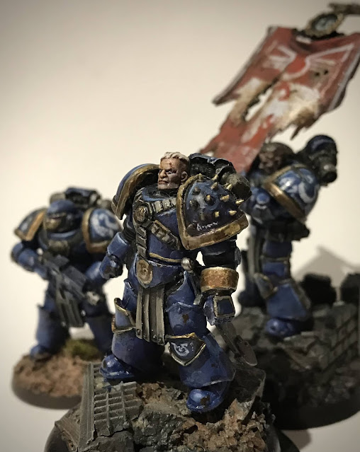

+ A bit of brute force and ignorance took the old head off, and I carefully trimmed down and cleaned up the join before attaching the new head. The set-up above shows how it looked. I was pleased for about five minutes, but then the traditional problem of updating models crept in. +
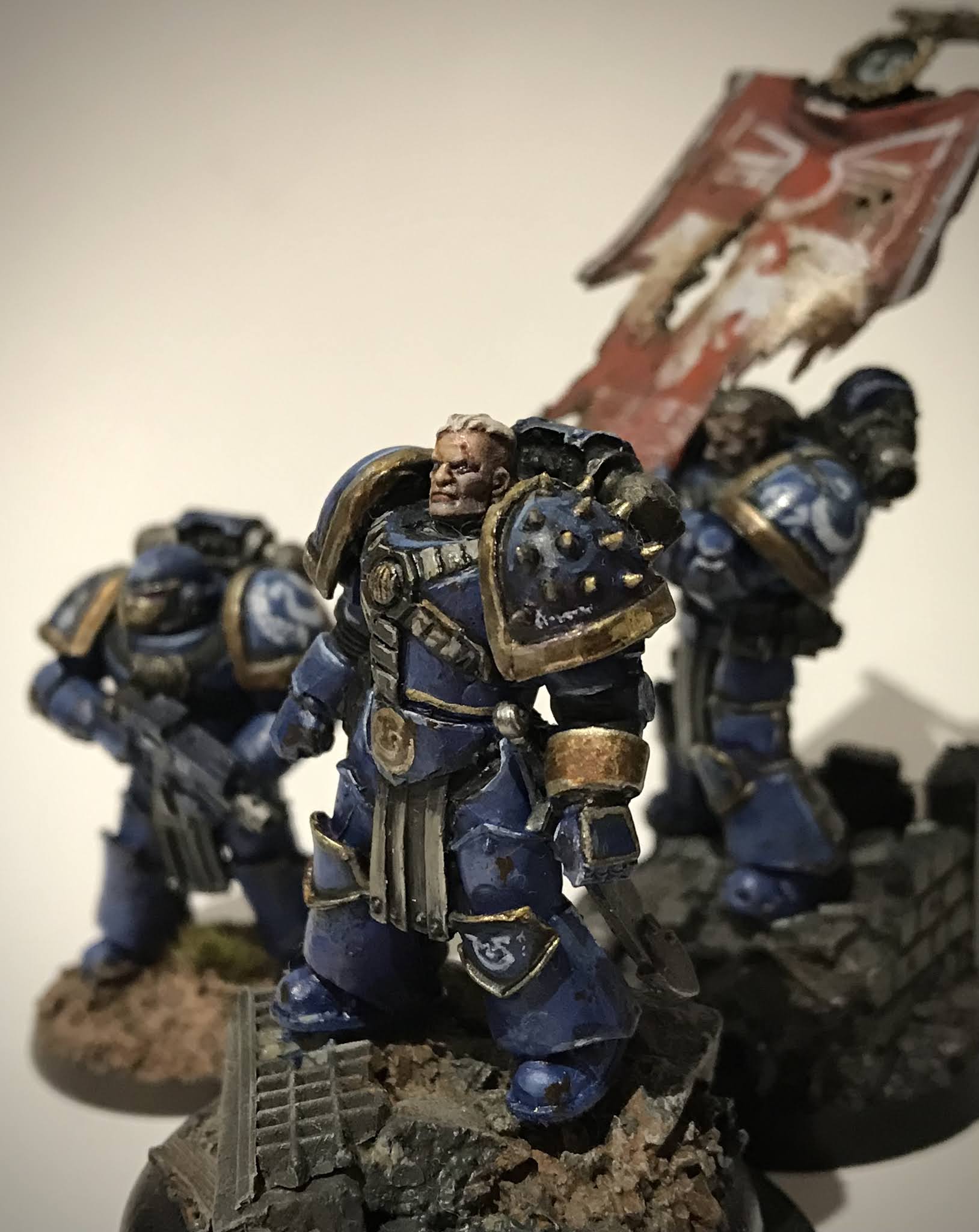
+ Your painting style – and ability – inevitably change over time. I'd used a loose, painterly style for my Ultramarines. This was partly an intentional decision to match the Visions of Heresy artwork that was my inspirational, and partly my limitations as an artist. Looking back on the figure, there were lots of bits that I'd do differently... and that started to nag at me. I knew I didn't want to completely repaint him. He's from a period of which I have fond memories, and in any case, repainting him would mean repainting the others (or that would nag at me more!), and so forth: 'mission creep'. +

+ In the end, I contented myself with a couple of minor tweaks. The first was a little tidying up of the cables around his chest. These had been particular loosely done [VIZREF: above], and I felt a little tightening would improve the look of things around the focal area without committing me to a full repaint, or markedly changing the style. Secondly, you'll notice the original stance, again shown above, is leaning back slightly. I removed him from the base and slightly carved down are where the front foot stands to sit the figure in a more balanced position. +

+++

+ The revised figure +


+ Here's the finished figure, set up as for the original diorama – itself styled after Neil Roberts' artwork for the Black Library novel Mark of Calth. Details of the individual marines are below: +


+ Sergeant Selaton +


+ Captain Ventanus +

+ Brother Genericus +


Monday, May 15

+ inload: Honour to the Dead +

+ Sergeant Aquila and Brother Septival +

'Hope is but the first step on the road to disappointment, brother. You can fight for hope if you wish. I will fight to bring honour to the dead.' 
Sergeant Tulian Aquila – from Honour to the Dead


+ I spent a pleasant – if occasionally frustrating – evening finishing off the Ultramarines detailed here [+noospheric inloadlink embedded+]. +

+ A bit like my Mark of Calth [+noospheric inloadlink embedded+] and Horus Rising dioramas, these are an homage to Gav Thorpe's short story Honour to the Dead, available as an audio drama [+noospheric inloadlink embedded+] or as part of the Legacies of Betrayal collection. These are slightly different in execution, as the others were based on Neil Roberts' artwork, whereas these have no artwork associated with 'em. +

+ This created its own challenges, as there was very little detail on the Ultramarines (who are, in fairness, playing second fiddle to the Titans and civilians in the drama). Aquila is mentioned as having dark hair, and you got a bit on their weaponry, but little else. As a result, I decided I'd use these marines as an opportunity to try out some ideas that I've wanted to explore, but that may not have fitted in with my existing army. +

+ Sergeant Tulian Aquila +

+ A project like this is an enjoyable excuse to re-read books and scour them for little hints that catch the imagination. A little research from Horus Heresy V –Tempest gave me some ideas on the standard Ultramarines markings. These weren't around when I started my marines, so it's nice to apply them 'from the book' for a change. +


+ As mentioned above, there wasn't a huge amount of specifics on the appearance of the characters. The challenge then became making figures that are identifiable as the characters, rather than being generic. I contacted Gav to ask whether he had any preferences and, lovely chap that he is, he came back with some helpful and interesting notes. In short, he'd intentionally left them fairly open, but was happy for me to pick a Chapter, which he'd add to his personal 'head-canon' – great to hear! +

+ Tempest gives some information about the Legion's disposition at the time of the attack on Calth, including which Chapters were where on (and off) the surface. Of relevance here, it states:

  • 17th Chapter, 18th Chapter, 23rd Chapter and 4th Chapter comprising those chapters whose order of battle included large numbers of armoured vehicles, especially the 4th, known as the 'Aurorans'. These chapters were assigned to muster in the largely uninhabited continent of Ithraca.

+ Given the location of the story – Ithraca (which Gav tells me was included in Tempest as a nod to Honour to the Dead, showing the inter-connected nature of the setting, along with the mutual enthusiasm and support of the writers) – it seemed that one of the Chapters above was the best bet, so I was all set to paint. However, the next paragraph gave me pause:

  • 20th Chapter and 21st Chapter - known informally within the Legion as 'The Eagles' and 'The Hawks', the 20th Chapter having trained extensively for void combat and the 21st being renowned for the skill of its pilots. These two chapters were assigned to security duties among the orbital platforms and docked warships in Calth's local orbit.


+ Tulian Aquila is also mentioned in The Returned, a 40k-era short story by James Swallow, in which it turns out he becomes the first Chapter Master of the Doom Eagles successor chapter. This was too good a detail to ignore, so I decided that the 20th were the final choice – the name made it too good to pass up. My rationale is that Aquila and his men were part of the 20th's shuttle security; conducting monitoring duties between Ithraca and the space docks, when the attack occurred. They thus got stranded on the surface, where the tale begins to unfold. +

+ As a reference to this, I incorporated the Doom Eagles' heraldry – a skull-headed eagle – into Aquila's armour as an honorific on his bracer; which you can see above. +


+ This rear shot shows the all-silver backpack, a Rogue Trader-esque element I wanted to incorporate. I think this looks pretty good; and subtle enough that I might extend it to some of my 15th/190th marines. +


+ Just to hammer the identity home, I added the sergeant's name on his pauldron. He is, after all, still a fairly anonymous figure. Note the use of the most recent tactical markings, detailed in Tempest. I've used a variant of the 40k-era markings on my other Ultramarines, so it's nice to have the opportunity to do something more official (for whatever that's worth). +

+ Brother Septival +

+ 'Ain't got time to grieve.' +

+ Ah, rotary machine guns. Is there anything simultaneously more awesome, more 80s and more impractical? I think not. Septival was, in great part, the motivation for this mini-project. I had no great desire for a squad of rotor cannons, but a one-off was too good an opportunity to miss. +

+ Whirr-dakka-dakka-dakka-dakka-dakka-dakka! +


+ Largely standard otherwise, Septival was a nice chance to use some of the new Heresy-era plastic bits – the head and forearm here are spares from the Betrayal at Calth and Battle for Prospero boxes. Expect to see more of these in future builds; they're really useful and considerably cheaper to source than the FW bits I usually use. +


+ Again, a nice silver backpack. The design of the Forge World Mark IV backpack is a nice homage to the common plastic ones I remember from my earliest games. +


+ To match the sergeant, Septival shares the same tactical markings and Chapter numeral; along with his name beneath. +

+++

+ What next? +

+ These two were the simplest of the set. It's going to be a lot harder to convert Gaius the third marine, Varinia the mother and Pexilius the baby, but that should make them all the more rewarding. If anyone's got any clever ideas for base figures for any of these , please do feel free to let me know in the comments. +

Wednesday, September 9

+ inload: Iron Warrior vignette – design and composition +

+ Wait, what's a vignette? +

+ In miniature modelling, the line between a vignette and a diorama is a fine one, and often blurred. Both aim to capture a moment in time, and involve one or more figures. I term something a vignette when it's looking at giving information about a character, and a diorama when the story is of equal, if not greater, importance. +

+ This vignette, from Golden Demon winner Ed Gladdis' blog, tells us a little bit about the Space Marine Captain – we get a sense of him being brave and inspirational, and the composition leads us to him. It's a closed space, with the lines leading us from the other figure to the Captain. +

+ It's a character piece that doesn't tell us much about what is going on. It's open to interpretation whether he's giving a speech to rouse his men, or in the middle of a firefight. This keeps the focus tightly on the Captain, even though there's another figure and some ground present. +

+ This diorama, from Victoria Lamb, also a Golden Demon winner, is more concerned with the story. While it's equally well composed, with the eye being led from the red-clad rescuers across the central figure to the bound figure, there's a clear sense of narrative – of something going on. + 

+ Even without the title, it's clear that something is going on; a sense of dramatic tension – will Joan be rescued? +


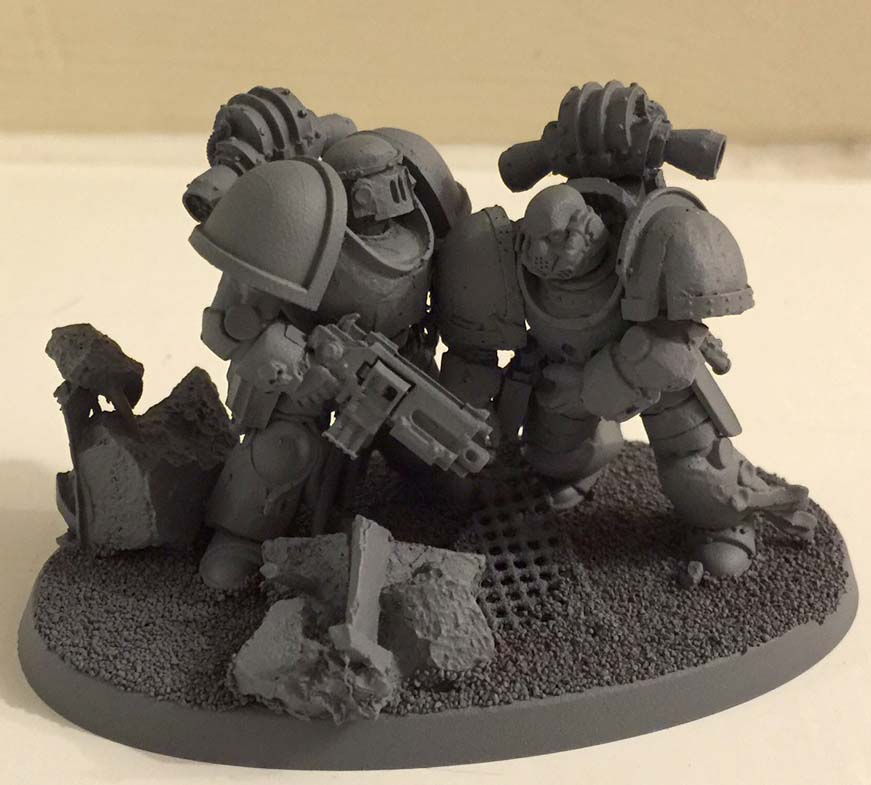
+ I don't pretend my stuff's up there with those two! Nevertheless, these (and many like them) have been great inspirations, and it's always fun to try out something a bit new. For that reason, I've been working on a vignette of injured Astartes that started out as two separate figures: 


+ I decided I'd prefer to make them into more of a visual piece than gaming ones, so transferred them onto a single base:


+ While I liked how they were looking at this point, I decided I'd prefer the piece to work from a number of different angles. At the point above, there's very definitely a 'front' to the piece, which felt rather forced. Either the marine on the left is rather unkindly dragging his injured fellow back into the battle(!), or he's very definitely in combat, in which case his colleague's pose looks too resigned. He's upright enough to be walking, but his shoulders and head are slumped. It just didn't feel right. Finally, there's very definitely a main character; with the injured marine becoming more of a prop. I wanted to get away from that. +

+ Pathetic aesthetic +

+ The grim darkness of the far future is a horrible place filled with fear, terror and monsters. Even the shining heroes of the Imperium are fascist oppressors. Since I was turning this from a gaming piece into a scene, I thought I'd play up the horror and uncertainty of the setting, by giving a more obvious sense of injury to the right-hand figure, and making the left-hand figure look less sure of himself. This would also make both figures equally important, and help to show a moment in time: creating a vignette that is about both figures' uncertainty and fear, rather than a diorama of a rescue from a firefight. +

+ Turning the lead figure's head and altering his rifle arm to be pointing down, rather than firing, leads the eye back into the scene to the other figure. It also means that the head is facing away from the angle of either foot (and thus the direction of travel), which elicits an uncomfortable, uncertain feel. I replaced the heads with less aggressive ones, giving the injured marine a bare head to humanise him a little. He's an Iron Warrior, and thus a 'baddie', but I wanted to elicit some sympathy from the viewer. +

+ This change also means the vignette works from different angles:


+ I ended up reinforcing the right-hand figure's pose and sense of injury by moving the arm up and adding a hand cradling his abdomen. This further draws the eye around the two, making the focus on their relationship rather than as two separate figures:

+ A few scattered bits of ruined building and flooring, along with some dirt and soil, finish the composition. They're simple and ensure the focus remains on the figures. I kept them on one side to develop the sense of discomfort and upset balance. This also left the injured marine looking more exposed, increasing the sense of vulnerability. +


+ Overall, I think the vignette works well from a number of angles, each of which gives a slightly different feel, but still leading the eye around and telling us a little about the characters' thoughts. + 


+ Now just to paint the thing! +

Thursday, October 30

+ inload: Mark of Calth cover diorama +

+ inload: Mark of Calth +


+ Building on my previous blogpost about interpreting artwork into miniature form, here's my latest work, based on the cover to Black Library's collection of short stories, Mark of Calth. The original artwork is by Neil Roberts:


+ Here are the three figures from the front cover, Captain Ventanus, Sergeant Selaton (the mournful-looking chap with the banner) – oh, and Brother Genericus, third spear carrier to the left.


+ I'm very pleased with how they've come out – it was a real pleasure to just sit down and enjoy modelling and painting. I enjoy the challenge of finding the right bits and pieces for the models, and adapting existing parts with conversion work. +

+ I think the challenge isn't so much reproducing things perfectly as getting the tone across. The artistic interpretation is a big part of the fun – will that set of legs work if I trim away the detail and add a kneepad? What head do I use as the basis for that eagle-winged helm? Am I going to model that detail, or use paint to suggest it? – and so forth. +

+ Following are some detail shots or the individual marines, along with a few notes or thoughts. +


+ Captain Ventanus +

+ The 'main man' of the artwork, Ventanus had to be the focus of my effort, so I started with him. Ventanus was relatively straightforward to plan and build. The distinguishing (iconic) features I spotted looking at the artwork were the overall pose, the bare head and the unusual spiked pauldron. The head is an important part – and usually a focal point – of any figurative work. 

+ After rummaging through my bits box, I chanced upon a head from the Scout biker set. The plastic Scouts are fairly notorious for having blocky, ugly heads; but after a closer look, I thought that there was some potential there. In any case, the biker scouts are a little more promising than the foot version, with slightly better definition. I trimmed away the microphone across his jaw and filed it back to give the head the prominent jawline of Roberts' artwork. Similarly, I trimmed back the earpiece to make it more subtle, and softly filed back the head above the ears to give Ventanus his short-back-and-sides 'do, and reduce the slight bulging inherent to a two-part plastic head. This gave a good base for some heavy tonal work with the paints that adds the drama to the original artwork. +


+ I picked a set of legs from the Sons of Horus Justaerin set, as these came with spikes on and a heavy belt. I trimmed away the spikes and glued them on to the pauldron, starting from the centre – always a good idea on symmetrical devices! 

+ The artwork shows the Captain with angular gold-trimmed kneepads. Because of the way I was intending to do the metallics, I needed some structure, so I carefully trimmed the reinforcing rims on the original legs to reshape the kneepad. Similarly, I trimmed away the Eye of Horus on the belt, leaving a nice space to add the decorative belt. These detail is not – in my opinion – vitally important to the character, so this could easily have been done another way, perhaps using a different set of legs; or equally, left off altogether. +

+ Neil Roberts' artwork has some script or iconography on the pauldron, just above the trim, and also a Legion symbol with a grenadier device (a bomb, looking a little like a pineapple) on the knee. These were fun little details to add – the Grenadier guards are an elite British army regiment, so it's nice to suggest the symbol still symbolises duty and honour in the far future. +


+ Ventanus' right-hand side is hidden from view in the artwork, but needs to be considered in a three-dimensional model. I opted to add a sidearm (the magazine and muzzle is visible behind his arm) and some iconography to the pauldron in the form of the Legion symbol. Taking inspiration from the grenadier device on the knee, I included it in the Legion symbol as an honorific. I also added 'IV' at the bottom, as Ventanus is mentioned in the story as Captain of the 'troublesome' Fourth company. +


+ This view highlights a few divergences from the artwork – namely the colour of the backpack and the looped armour on the back of his legs. I've always interpreted the bits which come off the top of the backpack to be heat vents or thrusters, so I have painted them metallic since I was a nipper. While this model is for a specific purpose, I'd also like him to fit in with the rest of my Ultramarines, so I decided such a minor change was perfectly fine – after all, he's my interpretation of the artwork, so I want some design flourishes of my own! +


+ Not much to draw attention to here, except that you can see the unusual gold trim on the hands and the decorated gold forearm piece. This is a good example of making concessions to size. The original artwork has the forearm covered with delicate filigree. To get a similar effect at this size, I stippled a lighter metallic over the base colour before applying the wash that creates the gold. +

+ Sergeant Selaton +

+ This model is my favourite of the three. With none of the pressure of getting the first one right, and before I started to flag with the third model, Selaton just seemed to come together well for me, and was really fun and rewarding to paint, with lots of interesting details and techniques. + 


+ A secondary point of the artwork, the sergeant's distinguishing features are his mournful, head-down pose and – of course – the enormous banner. The head was taken from the Forgeworld Praetor model (fitting, eh?) with a little ProCreate putty used to sculpt some hair. +


+ Like his Captain, Selaton's legs are from the Justaerin set – in fact, the stock parts are identical. Here I cut away all of the trimming on the lower legs and sculpted some simple discs as new kneepads. I also chose to leave the crenellated reinforcement on the soles of his boots. Subtle differences, but together with some slight reposing in boiling water, the same pair of legs end up looking different. +


+ The banner itself was probably the biggest challenge. It's not hugely clear what design is on the banner in the artwork, but there are hints of red and blue in it, and lots of holes! I used a banner from Forgeworld (bits buying from ebay is a good way of getting just the bits you want) as it had the gold eagle shown in the artwork, and I thought resin would be easier to manipulate than plastic.

+ The modelling was fairly straightforward – I basically attacked the piece with a pair of clippers, then used a craft knife and needle file to tidy up a bit and create some finer marks. Aside from the drilled bullet holes, the only real thing of note is that I took some time in dry-fitting the pieces together, and returned to trim more and more from the side nearer Selaton's head, in order that he wasn't obscured. I used a hairdryer and boiling water (separately, I hasten to add) to heat and reshape the banner and draw out the shape into fluttering tatters. 

+ I ummed and aahed for quite a while about the design, first painting it a different hue of blue (a cool greeny-blue to contrast with the warm red-blue I used for the armour) then changing my mind and opting for a strong red. The overall impression of the artwork is red, so I used a little artistic license to keep it a solid background colour. I drew out the design on paper first, basing it on the description in a separate book (Dan Abnett's Know No Fear), where the device is described as a Legion symbol surmounting a double eagle. There's quite a lot of play in that description, so I went for a fairly simple iconocgraphic eagle device with a more flamboyant version of the typical Legion symbol. +

+ Unnamed background marine with the others +


+ The third marines is essentially a background element in the original artwork, so I didn't take nearly as much time over planning him. His distinguishing features were his helmet and pose. Again, I used the same pair of legs, trimming away the spikes and detail. The hot water reposing is far more obvious here, as it's distorted his pteruges (the loincloth thingie). Of course, since this is meant to be leather fabric, the distortion works fine. + 

+ The eagle-faced helmet is based on one of the honour guard from the Sevrin Loth character pack. I trimmed away the crest on top and used a little greenstuff to sculpt an aquilla on the faceplate. I wasn't hugely pleased with the effect (I prefer the flatter, more stripped back and simple Praetor helm, personally), but the detail came out nicely with the paintjob, and it's growing on me. +


+ This shot of him in the group shows his shoulder pad heraldry. In the original image, this looks to be gold, but I was concerned that would draw the eye too much, so I changed it to white on blue. I did retain the wreath/feather design, though, as I thought it was a cool look. As an aside, you can just make out Selaton's shoulder pad here, too. Neil Roberts has included what looks like script below the legion symbol on the sergeant's pauldron, a detail I only spotted after I'd added the little lightning bolts. I decided this would probably be a name plate, so just managed to cram in 'Selaton' in the space – a detail with which I'm disproportionately pleased with! +

+ A really enjoyable project overall – I'd love to hear what you think. +

Monday, September 30

+ inload: Converting and kitbashing +

+inload: Converting and kitbashing+

+ Kitbashing – taking standard parts from different kits and combining them to make a new miniature.

A kitbashed Death Skull ork
+This lucky ork has a rokkit launcha from the most recent recut of the Boyz sprue, as are the legs and arms. The torso is from the Warhammer Orc sprue, which has a bigger torso for the unit leader – perfect for an ork big enough to bully the mob into giving him the big boomy heavy weapon. 


+ Conversion – modifying the parts yourself, or constructing new parts.
This ork is kitbashed, but has also has some simple conversion work done.
+ This Death Skull required slightly more modelling skill than a basic kitbash, as the torso (from the savage orc kit) needed separating from the legs in order to attach it to some standard space ork legs. This let me keep the cool bone breastplate, which is very fitting for the Death Skull clan.

The newer Fantasy ranges use the muscles of the shoulder and back to hide the join between arm and torso, while the ork range has more old-fashioned flat panels. A little knifework and filling let me combine a left arm taken from the biker sprue with a savage orc arm.

+ This mini diorama, of an ork picking his mate's pocket while he's distracted by a thieving runt, required a bit more conversion work – although the overall effect is (hopefully) subtle. I haven't used many striking bits here, as I want the focus to be on the interaction between the models.

+ The runt is standard, except for a little trimming to have him turning back to grimace at the ork whose ammo box he's stealing. The middle ork has had some green stuff work on his face to increase his angry look, some trimming to get his arms in an appropriate 'mid-distracted grab' pose, and his fingers separated and wrist turned.

Oi, yer zogger – get back 'ere!

+ The pickpocket, meanwhile, required a bit of filling on his arm to get it outstretched, and uses a hand from the old night goblin sprue. I've also done some work to give him a sneaky expression, with his tongue poking out as he concentrates, but I'm afraid I don't have a very good shot of that!

+ This shows the critical part of the conversion/vignette, with the fingers just reaching the open pouch. Without this vital little bit, the pose wouldn't make any sense. You can also see how the legs are leaning towards the pouch, to get the sense of direction across. I've turned his wrist so that his pistol is not in a ready position. All these little bits are intended to add believability to the pose.

+ These orks are part of a mob I've made for a mate of mine – a lot of the bits were kindly donated by my friend Alex. Hopefully I'll be able to get some painted photos soon.