+ Texture, impact and effect +
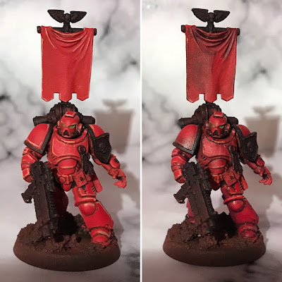
 + Working on these Blood Angels has given me a good illustration of a technique that I use a great deal in my painting. Have a look at the pict-capture here, which shows the same marine before and after what I call 'pre-shading'. +
+ Here, I used a mix of Liche Purple, sepia ink and flow improver medium; laying it onto the model before swabbing it off the raised areas using various tools – a clean brush, a bit of kitchen paper, and my bare thumb. +
+ The purpose of this stage is two-fold. Firstly, it enhances the tonal contrast. Squint at the image and you'll see that the armour plates on the pre-shaded marine (right-hand side) remain visually distinct as those on the earlier stage start to bleed together. This eventually helps to give the figure more impact, though it does rely on you working back in once the pre-shade is dry to develop the highlights and shades further. +
+ Secondly, and more importantly, it adds visual texture. You'll probably be familiar with greebling, which is covered nicely here: [+noosphreicexloadlink embedded+] and digital effects like bump-mapping. The second purpose of this painting effect is serving a similar duty as the 'time-damage' type of greebling covered in the False Machine blog entry: creating imperfection and suggesting teture. +
+ This visual texture is appealing because it implies greater complexity, holding the viewer's attention; helps to further push the illusion of scale; and also implies that there's something going on beyond the base of the model, giving it a sense of belonging in a scene, rather than being a model figure. It is a painter's story-telling tool. +
+ When to use it +
+ Once applied, you may well need to re-establish your highlights, and further deepen the shading proper; hence why I call it a pre-shade. It's a technique for the middle stages of painting. I establish my initial highlights and shading fairly quickly, apply the pre-shade, then use the effect of that to inform the remaining tonal work. +
+ Pre-shading works very well as a complementary technique to battle damage and weathering – in fact, it can very easily be used selectively (rather than over the whole model) to add grime or oil marks. The latter is particularly effective if you use a glossy chromatic black for a sheen. +
+ The ability to create visual texture on smooth surfaces, without creating physical texture, is also useful during the mid-stages of painting. It means that you can later apply overlaying washes and glazes without the paints pooling or gathering. A good example of this is on the banner of the marine:
+ On the left-hand side, it is clean, smooth and dull. The initial highlights and shading are stark and flat, giving an odd cel-shaded look. After the pre-shading has gone on, there is a sense of texture which helps to 'sell' the piece as fabric. There's subtle mottling, which suggests age and staining, and there's generally more for the eye to see. The highlights are softened (but not eliminated), and the shading deepened and enriched. It's worth pointing out that this technique works best when applied topically – that is, in particular places – and then drawn out and blended away with your brush, rather than applied over the whole area. +
+ Of course, as with every technique, pre-shading needs to be a tool to use when you want the effect. Using a pre-shade will flatten highlights, mute colours, and create visual complexity – compare the initial highlights on the stages above. Those effects are precisely why I use pre-shades, but if your taste is more for cleaner lines, smooth panels and vibrancy, it's not a useful tool. In 40k terms, I'd suggest that it's better suited to more grimy figures – Imperial, Chaos and orks – than to armies like Eldar, Tau and so forth. It would also work well for Tyranids, going a long way to getting an organic, natural feel. +
+ What colour? +
+ The precise colour of the pre-shade is irrelevant – for yellow I use a red-brown, for example; for blue I use a purple – it's more important that the tone is darker than the midtone. +
+ With that said, I tend to use harmonious colours (those close to the original colour on the colour wheel), as using complementaries – those opposite it on the colour wheel – will neutralise the hue. Since the effect is already dulling, this can make your models look too gloomy and murky. +
+ The complementaries of red are orange and purple. I used purple here because it gave a cooler effect, enhancing the idea of distance (owing to aerial perspective) and creating a low-key effect. +
+ The result +
+ Here's a before and after of the whole squad, which shows the effect more strikingly, as it's closer to how the unit will be seen; smaller, at tabletop distance. +
+ The cleaner, crisper effect here is appealing visually. The red is warm, the smooth texture is restful. Here, the Blood Angels look like noble figures, straight off the parade ground, or out of a propaganda film. It's nice, but not what I'm after. +
+ After the pre-shade is applied, the colour is cooled and muted. Details around the helms, torsos and knees start to pop more, creating areas of interest and complexity. There's more of a sense that the Angels are in battle; picking up a slight griminess without overt damage. +


No comments:
Post a Comment
+ submission exloadform: inload [comments] herein +