Showing posts with label heraldry. Show all posts

Monday, September 16

+ inload: Personalising your Titans +

+ Tinctures and markings – adding detail to your Titans +

+ Profugon Iratus looms protectively over a supporting Salamanders detachment during the . +


+ The scheme and method I used for this Reaver are detailed in an earlier inload [+noosphericinloadlink embedded+], but I hadn't had a chance to post up the Titan with the details and markings in place – so I thought I'd gather some thoughts on how to detail your Titans. +

+++

+ Theoretical: Why personalise your Titan? +

+ Titans have a will and personality of their own. The character and identity of each War Engine is unique, and is informed and shaped by the actions in which it walks; the Princeps that direct it; and the Legio to which it belongs. +

+ One of the Mysteries of the Adeptus Mechanicus states: 'The Soulless Sentience is the Enemy of All' – a half-understood lesson passed down by rote since the Age of Strife, when Abominable Intelligence nearly wiped out humanity. It is because they are invested with a sentience of their own that Titans are unlike mechs and similar giant robots in most other  sci-fi properties. No mere vehicles, the War Engines of the Collegia Titanicus are beings with a drive and character of their own. It's good to reflect that in your models. +

What's a Titan without a history and a name? Just a bit mound of metal.

+ Titans are individuals, and deserve some extra time and effort to reflect their nature. This is a key part of to their appeal to the painter and modeller. Quite aside from anything else, you'll only have half a dozen or so in your whole force, so you really can go to town and make a character out of each of them. +

+ Nameplates +

+ A nameplate helps to establish your Titan's legend. It provides insight into your Titan's background and makes it less anonymous to viewers. There are a few different places you can buy them, but I've always been slightly apprehensive about spending money on one only to find it doesn't quite look how I wanted. +


+ Alex and Johnny at Maximal Fire put me onto BattleBuilder, (battlebuilder.net) which launches today. The neat things about this option is that it lets you get things just as you picture them – it's got a live visualiser, so you can play about with fonts and styles, change the size of the base and look at it from different angles 'til you find the one that's right for you. + 

I'll be posting more about it in its own article – but suffice to say that I'm looking forward to adding a plate to Profugon Iratus – just as soon as I can make a final decision on style! +


+++


+ Practical: How to personalise your Titan +

The Titan Legion you've chosen will inform how you plan things. Nearly all Titan Legions have bold heraldic scheme. (If you'd like some general guidance, I've written about planning heraldic colour schemes before in this inload). Your details need to stand out, without covering things completely or muddling the overall impression. +

How much to paint? +

To ensure things don't get too fussy, I recommend that you leave between three-quarters and two-thirds of the base scheme showing – that is, leave a number of plates in the main colours of your Legio. If you've used parts with sculpted detail (like the kneepad of the yellow Legio Validus engine below), then count these amongst the detailed ones. +

+ Legio Validus engine on the left, Legio Maximal on the right +

+ Where to add the markings? +

+ Once you've decided how many plates to personalise, the next step is to decide which plates you want to add the markings to. Find a balance between in-universe narrative and on-table impact. These markings are there to boast of the Titan's prowess and individual history, so primarily need to be visible to the enemy – and as Titan Legions tend to regard their only equals to be other Engines, your Titan's most prominent markings should be at eye level to other Titans. +


+ There are, of course, exceptions. Your Legio may want to inspire their supporting infantry, for example, and so favour markings visible on the chestplate and lower legs – see above for what a Titan looks like to supporting forces. Generally, however, I'd suggest that you have the boldest markings on and around the carapace, as these are most visible to you and the other player during games, and to viewers when they are on display. +

+ Rear view – no markings; just the Legion's colours for easy identificaton by allies. +


+ Front view – the Titan's history and reputation laid bare for all to witness. +

+++

+ What medium to use? +

+ Two main avenues are open to you:(decals) and freehand painting. You can use a combination of these, but try to ensure visual harmony. It'll look odd to have super finely-detailed transfers with relatively blocky freehand, so unless you are very confident with your draughtsmanship, I'd suggest combining freehand only with bold geometric transfers, rather than the very fine ones available from GW and third party suppliers. +

+ I can thoroughly recommend transfers – both the official ones and third-party transfers are available, and the fine detail really helps sell the scale. They're also quick to apply and, being mass-produced, will provide great uniformity across a Maniple. +

+ If, however, you are hesitant about freehand, I'd thoroughly encourage you to give it a go. It doesn't have to be intricate or complex – straight lines are a great place to start, and if you're afraid even of these, then consider using low-tack masking tape to help guide you. +

+ The other advantage of freehand, of course, is that your imagination is the limit. This approach is ideal for creating a Titan Legion of your own. +

+++

+ Let's give it a go – bringing Profugon Iratus of the Legio Maximal to life +

+ This Titan belongs to the Legio Maximal. Here's the video on the Maximal Fire Youtube channel:


+ As noted here, the lore didn't include any mention of the colours, so after a bit of consultation with Maximal Fire's Alex (@peakethepainter) and with some excellent ideas and advice on @no_games_no_glory I adopted the orange and white of the website as the main heraldry. +

+ Black is used for the banners – and if you wanted to paint up a Traitor Engine from the Legio Maximal, you might try orange and black as the main tinctures, with white banners. +


+ As a base scheme, I used Grey Seer highlighted up to white, and Trollslayer Orange – but this is far from definitive. @no_games_no_glory suggested the following, which also looks great:
Primed- Colourforge Bone
Basecoat- Vallejo Rotten White fading into Vallejo Ghost Grey
The flames were-
GW- Mephison Red, fading into Vallejo Lava Orange and then into Two Thin Coats Yellow Flame. 

Trim
Base- Scale 75 Black Metal 
Highlight- Scale 75 Thrash Metal
+++

+ Now for the markings +

+ With the base scheme in place, we turn to decide on the markings. These can be split into two categories: patterns and icons. The former are things like chequerboards, dags, and so forth; the latter simplified shapes – everything from eyes to tridents to flaming swords. Both can inform the themes you choose to bring in. +

+ Most Legios have established common patterns – star charts, chequers, hexes, webbing etc. Where you don't have these provided, turn to the lore for inspiration. +

+ The Legio Maximal's Low Gothic name is 'the Vigilants', referencing their widely-spread nature and responsiveness across a large area. Speed and watchfulness are thus key themes. +


The half-chequers on the right-hand side of the head are done simply by drawing small tessallating right-angled triangles.

+ PatterningSpeed can be reflected through the use of zig-zags – which also nicely nod to Maximal Fire's new logo. Stripes would also fit in nicely. +

+ Icons: Traditional heraldry will often help you find something a bit more exciting than tired old Eyes and Eagles, so use reference where you can. This noospheric node [+noosphericexlaodlink embedded+] is a good place to start, for example. Browse or search for the quality you want to reflect. +

+++

+ Patterns +


The shoulder pad on the left-hand side of this picture shows a zig-zag break made with simple straight lines. +


+ The same principle is used on the kneepad here. For variation, you might swap the colours or direction of the pattern. Note also the repeated striping on the side of the carapace, where the zig-zagging is double. You might extend the pattern across the whole of a larger plate. +


+ Don't look on the trim as a restriction. Broken patterns – that is, where the overall shapes crosses a bit of trim – are possible, and help to ensure the Titan doesn't look too 'bitty'. The groin plate is a good example of this practise. +

+++

+ Freehand +

+ Returning to the carapace, you'll see a large freehand hare in the centre of the carapace. Having a single strong icon as a focal point can be striking. You'll also note a geometric shape (circle) with simple cutlass icon on the right-hand side. +


+ Why a hare? Not the most obviously vicious animal, but all the more notable for that. Hares have a traditional heraldic meanings of intelligence in warfare, and are also familiar for their speed and watchfulness – thus well-suited to the Legio's background. You could do something more  +

+ The cutlass, meanwhile, is a visual nod to the Corsair Cluster – the Legio Maximal's domain and area of responsibility. +

+++

+ Freehand text also falls under this category. You might choose to record a particular campaign, the name of a notable (or current) Princeps, or, as in this example, the name of the Legio's Forgethrone, Nabed-Paleae. +


+ Try different fonts for this – black letter or other serif fonts can be fun to try. +

+++
+ Banners +

+ There's an article on making your own banners on its way, but they are another fun opportunity for you to add some flavour. These – I  confess – were rather rushed, but the principles at play are worth highlighting. +


+ Here you can see the basic idea: a simple larger icon at the top, over a smaller split area that contains patterns or small icons. +

+ The banner between the legs represents the Titan itself, and contains the Titan's name – rendered abstractly, with dots and lines – below a lighthouse icon. Below the name band is the cutlass icon again – this time in white on black; and a series of dots on the right. This might indicate kill-count, or perhaps campaigns in which it's served. +
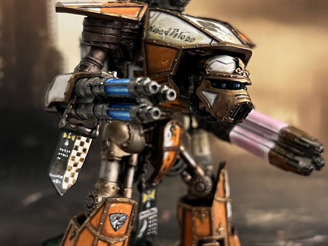

+ Weapons sometimes have Moderati banners, detailing the feats of the individual master of the weapon. These are smaller, and generally suit a simpler approach. +

+++

+ Personality and finishing touches +

+ It is intimidating to paint the first Titan of a new Maniple (or Legio!), but as you can see here, the process is easily broken down into manageable chunks. +

+ If you're struggling for inspiration on things like icons, the Titan's name can provide a starting point. It's also an opportunity to add a final finishing touch to your model – after which your Titan can start building its legend! +

+ This last point is why nameplates are a good idea for gaming. They remind you that you're aiming to tell a story with another player – so having the names right in front of you is a friendly way to help you both do so. Consider which is more immersive – 'Profugon Iratus targets the Dread Hellespontion with its turbo-laser' or 'My Reaver shoots its turbo-laser at your Warbringer'? +


+ Go Big, Go Loud, and Go Maximal! +


Tuesday, August 11

+ inload: Gnostic and Gatebreaker infantry +

+ Endworlds: Landfall +


+COMPILERCOMPILERCOMPILERCOMPILERCOMPILERCOMPILER+

+Chronostamp:ABSENTIA+

+SPOOLING transmission.+

+–re you picking this up? Respond. All channels occup–+
+–that infernal noise? Sounds like... like clockw–+


+++

According to the Gnostic's masterpiece auspex-organ, nothing was coming back from the gate. Quite literally. Not even static. The background radiation was utterly absent; a literal zero. Doubtless this accounted for the chill.

Kills shivered. In her heated, sealed, stuffy atmosphere suit, it was quite unnecessary. However, like coughing to break a silence, it felt somehow humanising; as though introducing some measure of useless movement, of entropy, would break the hex of this perfect, disquieting order. 

Though his vox-clicks were muffled by the dead air, the Gnostic was busy. At his words, the Strikeforce coiled back in, ghosting back towards Kills and her team.

The monolithic structures were straight, and clean. Again, disquietingly so. These were not straight in an ordinary, everyday architectural way, but suffused with an unsettling purity of geometry; as though the walls and corners themselves were manifested mathematics; avataric emblems of some unaccountably Other reality.

Absently, she brushed her hand against the Inquisitorial seal, concealed beneath her cloak. It felt like wax, and vellum, and familiarity.
For a symbol powerful enough to end worlds, she thought, with a grin, you feel positively wholesome.


+++

+ Painting +

+ Besides the Chapter markings, gunsights and tufts on the bases, the next batch of Gatebreakers are complete (hurrah). +


+ Two are on assignation to Inquisitrix Barbari Kills, one's the Strikeforce's Gnostic (a sort of non-psychic Librarian/Lieutenant hybrid, in charge of battlefield organisation and record-keeping). The remaining four are more Intercessors to bulk out the squads. +


+ I'll hold off background and names until they are genuinely finished (looking at the Gnostic above, a bit of battle damage needs further refining), but I wanted to show 'em off! +


+ Member-Ordinary with boltgun +


+ Member-Ordinary with boltrifle and auxiliary grenade launcher. +


+ Member-Ordinary with bolt rifle +


+ Coriolanus, specialist +


+ Septival, specialist +


We looked at these two a bit more closely in the last inload [+noosphericinloadlink embedded+], and they've received only minor updates. Still, it's sometimes surprising what a difference basing can make. +


+ I haven't yet added their Chapter markings (or the black purity seals that will mark them as seconded to the Ordo Propter), but I did add a specialist symbol in place of the usual Tactical/Devastator/Assault/Fire Support/Close Support symbol. I took this crescent moon device from an early edition of Epic. It's a nice clear symbol, with some mystical associations. +

Thursday, July 25

+ inload: Adeptus Titanicus – Senex Codomannus +

+ Old Spiteful – Senex Codomannus +


+ Brooding, surly and recalcitrant, the Codomannus is the last remnant of Legio Nikator's original Titans; the remainder being lost in battle, laid to rest, or ritually dismembered to provide parts for others during the lean days of the Masscal campaigns. +

+ Dramatis Personae: the crew of the Senex Codomannus +

+ Granted the honorific Senex to mark its age and significance, the Engine is more often known as 'Old Spiteful' to its enemies, owing to its dogged pursuit of exclusionary kills. The Codomannus' machine spirit is wary and suspicious, and highly demanding of its crew. +

+ The current Princeps is Teutates Polassar, a senior Princeps who habitually leads battlegroups of the Legio in their walks. +

+ Gaunt, balding and unprepossessing, Polassar has a keen eye for weakness – both in his prey, and in his crew – and a ruthless streak well-suited to the belligerent Reaver Battle Titan. +

+ Adept Xhao Non, Enginseer Primus, has attended Codommanus for a decade, serving well under Polassar's direction. +

+ Like all of Sumer-Nikator's techpriest caste, Non spends an enormous amount of time on neo-cartomancy, relying on scryservitors and withinlookmen underlings to influence and enhance his practical duties +


+++

+ Painting Senex Codomannus +


+ What a treat! I loved the original Reaver model, and when the 28mm scale Reaver came out, I nearly buckled. I couldn't justify the expense, however, so my plans for colour schemes and decorations have sat for the best part of ten years. When the new version of Adeptus Titanicus was released, I couldn't wait for the Reavers – and was not disappointed. Really beautiful kits, and very enjoyable to paint. +

+ The overall idea was to use a very painterly approach, crashing together some different periods of history to give a sense of continuation. +


+ Mediaeval Byzantium gave me the inspiration for the emblem on top. I'll likely add a scroll beneath with the Titan's name, just to finish it off. My initial plan for the Legio was to use terracotta and turquoise, but here the turquoise is relegated to the devotional scene on the carapace. I've painted this quite softly using a fairly high key as I didn't want the decoration to be the focal point – just another decoration on this ancient beast. +


+ The later Middle Ages gave me another source of inspiration, and this sort of design (based on heraldic 'counter-ermine fur') pops up here and there over the Titan. It's relatively simple freehand; requiring careful placement more than anything. +


+ Some large areas of white were added, as the terracotta/orange was far too dominant. These were weathered with a combination of inks and flow medium; heavily applied, then lifted away selectively with a dry brush to create the patination and drip patterns. +


+ I wanted to keep some bold areas of colour, so I have kept most of the decoration to the lower legs – after all, that's the bit that the enemy will mostly see. However, that'd look a bit dull from above – which the players of the game will see – so I added some detail here, too. +


+ There are a few refinements I'd like to tackle at a later date – the scroll work I mentioned above, weapon banners and general refinement, but I think Old Spiteful is ready for war. +


Tuesday, July 23

+ inload: Rise of the God-machines +

+ Sons of the Temple: Legio Nikator +

+ All hail the god of machines! + 

Following a weekend of gaming, painting and building enthusiasm, progress continues on the Titans of my Legio. + 


+ I've really been feeling my way around these models; diving in and out and developing areas in isolation. Quite an organic approach, which has advantages and disadvantages. +


+ The panels of off-white were fun. Once a flat surface was achieved and allowed to dry, I drew a brush loaded with sepia ink and flow improver downwards, leaving these attractive streaks of weathering. While wet, I rinsed and dried the brush to lift out pooling areas to avoid backruns. +


+ Bright and colourful and cartoony! The chainfist panelling is unweathered; showing how the armour looks before I go in with the inks and so forth. I used this area to test out the Legio symbol, a hand grasping a crown. I worked freehand, adjusting as I went, so it's not quite right here. I think I'll sketch in onto the carapaces first to make sure it's more symmetrical. +


+ The pauldron and head here show a little highlighting and weathering, while the carapace has received another layer. Building it up gradually like this allows me a bit of control over how weathered the final result appears. +


+ A rear shot shows how some panels are more developed than others. I think I need to incorporate more of the white areas here and there. I'm also in two minds on whether to build up heat glow etc. around the exhausts. +


+ A detail from another work-in-progress Reaver, this kneepad was a fun bit of freehand, based on heraldic 'furs'. Tempted to expand the use of this – perhaps on the carapace of one? +

Thursday, November 8

+ inloads: Iron Warriors 'Officio Monstrosa ' army shot +

+ Iron Warriors 242nd 'Footsore' Great Company and the Officio Monstrosa +


+ Is there any greater satisfaction – hobbywise, at least – than seeing an army you've painted laid out, and completed to the best of your ability? +

+ MIssing the tanks, but otherwise complete +
+ I found myself in the (unusual, for me!) position of having finished everything I need for an event with some time to spare, so I decided to double-check everything was complete. I ended up surprising myself with how much I'd done for the force. Because they've developed rather more organically – i.e. with less pre-planning than other armies I've done – I'd quite forgotten some of the models. It was nice to dig 'em out and get some details – I hope you enjoy the show. +


+ Tactical legionaries are at the heart of every space marine force I've ever done. I've ended up with nearly forty, all told. +


+ Perturabo hasn't seen table-time yet. Now the army's 'done' (though is any army ever really finished?), I'll have to twist the arm of Stuntwedge to face me with his Imperial Fists in a suitably large game. Perhaps that cowardly wretch Rogal Dorn will make an appearance? +


+ Zaricus Cjarn has led the force so far. A relatively lowly Centurion, I think he'll end up being superceded by a higher-level officer soon. I won't forget this axe-wielding loon, though. One of my favourite models full-stop.+


+ You see the benefit of 'boring' poses when you set out your models like this. Having more restrained marines helps the more dynamic poses stand out, and makes for a better overall look. +


+ Talking of dynamic poses, I think this chap is my favourite in the force overall. +


+ The stripped-back aesthetic of the Iron Warriors still leaves a little space for details that add a bit of narrative. Here a little wolf token – a gift from the XVIth Legion? A trophy from the VIth? – is there for viewers to pick out. Note also the hazard striping. I've deliberately kept that minimal. It's such an eye-catching device that it can really draw attention away from the metallics. +


+ Freehand banners. A lot of fun, and a good opportunity to practise your brushwork. +


+ New Destroyers. The damaged pauldrons come from Master-Crafted miniatures. The metallics here are ever-so-slightly darker than the rest of the army; to reflect the rad-soaked background. +


+ Multi-meltas – a perfect example of a unit made just for looks. They attract a lot of positive comments, which goes to show a change is as good as a rest, sometimes. One of my favourite bits of the army, they make heavy use of the Blood Angel helmet that I adopted for its sinister eye slits.  +


+ The new apothecary – see yesterday's inload [+noosphericinloadlink embedded+] – was designed to fit alongside the vignette of two injured Marines [+noosphericinloadlink embedded+] I made. +


+ Again, a bit of freehand detail really sings out against what is, at root, a super-easy metallic scheme. The little targetting panels were painted with the same blue accent I've used sparingly across the army. +


+ Rapiers are fun – small enough that I enjoyed painting them (unlike most vehicles), large enough to stand out. +


+ GIANT ROBOTS +


+ MORE GIANT ROBOTS +


+ ...and back to regular ol' troops to close. Converting every model is time-consuming and sometimes frustrating, but it really helps to make the army feel like yours; adding a very personal artistic touch. It also helps to remind you that even the 'basic' Space Marine is a distinctive hero (or villain), with the potential for own narrative development. This all adds to the enjoyment of every aspect of the hobby; from generating ideas for painting honorifics to suggesting storylines and plots for gaming. +