Showing posts with label Legio Nikator. Show all posts

Monday, March 20

+ Collecting Titan crew +

+ On Long-Range Sensors + 

+ White whales, holy grails... We've all got that one figure that we've been after seemingly forever. Perhaps it's nostalgia for a particular model that got you into the hobby, finishing off a particular set, or perhaps it's as simple as the model going out-of-print before you could find a copy. +

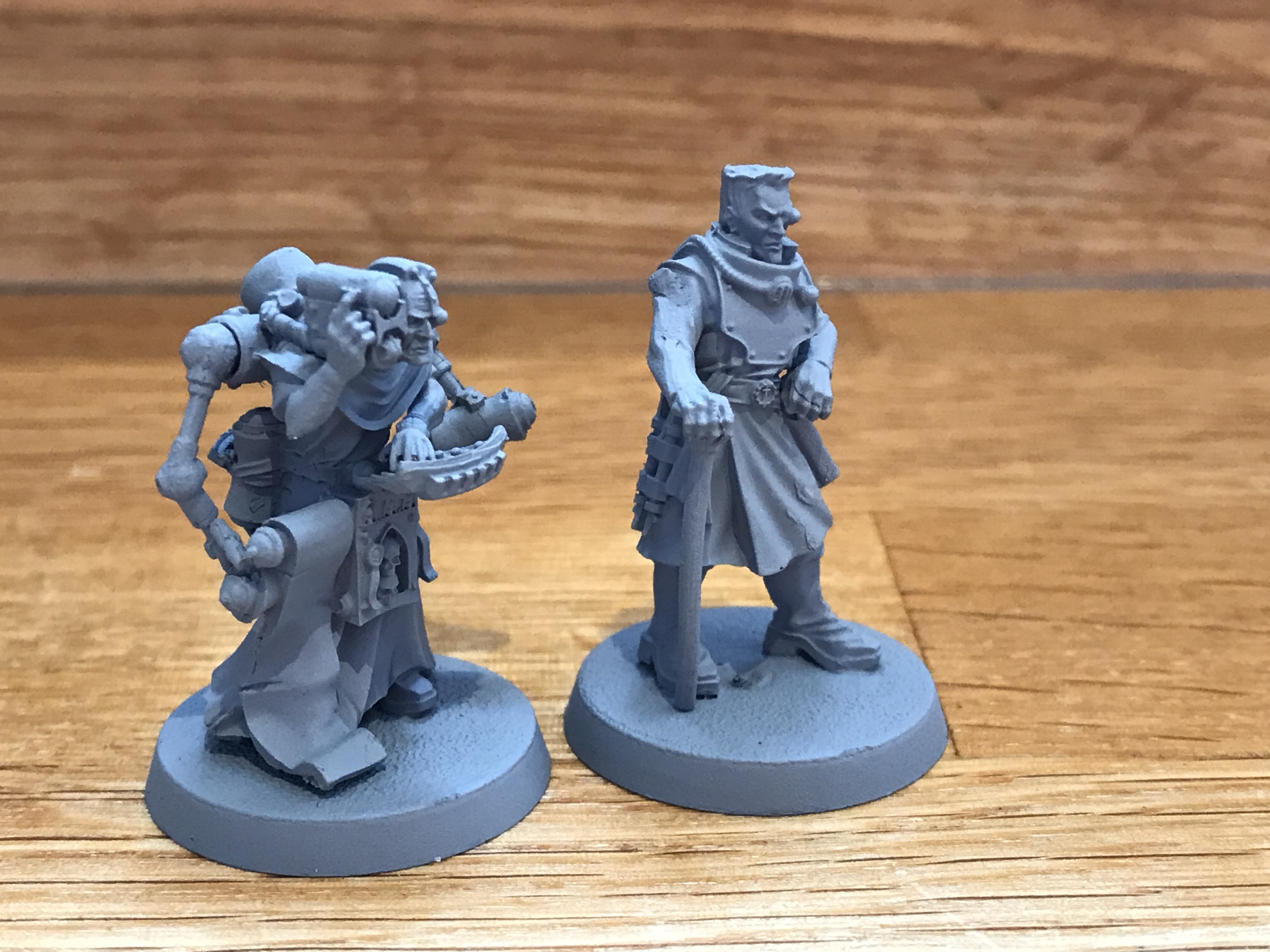
+  In my case, I've been collecting Titan crew from Forgeworld for fifteen years. Aside from these models, I'm not really much of a collector per se – I'm usually far too ready to chop things up! This range, however, is small enough that it's been quite fun hunting them down, and I've kept them largely unconverted. You can read a bit more about the others in the range here: [+noosphericinloadlink embedded+] +


+ As you've probably guessed, I've managed to lay my hands on two of the outstanding figures – quite literally 'outstanding', as they're the two crewmen that stand on the upper deck of the Warbringer Titan. They're both rather lovely figures, packed with character. They came ready-assembled and primed (beggars can't be choosers), but certainly appear to be genuine, rather than recasts. +

+ As you'll spot above, they'll need a little cleaning up and prep-work – the casting gate is still present on the right-hand figure's shoulder, for example – but given how rarely they come onto the market (not surprising, given the fact you normally need to buy a £950(!) Titan to get them), I'm happy to do a little additional prep. +


+ Listed simply as 'Officer' and 'Servitor' in the instructions for the big model, it's a little unclear which crew members they're meant to represent (or perhaps they're simply being transported?) Personally, I'm choosing to interpret the right-hand figure as one of the Moderati of the Titan. Adeptus Titanicus has lovely schematics of the various Titans that list the crews (an example through this link: [+noosphericexloadlink embedded+]. These mention specific roles that the Moderati have like Sensorius, Tacticarus etc. +

+ Since these two seem to have lots of range-measuring devices, we assume they're something to do with directing the targetting of the Warlord-weight weapon on the top of the Warbringer-Nemesis. Not being designed for this sort of weapon, perhaps the Titan's head doesn't have physical space or the right equipment, necessitating a Moderatus to stand to? Who can say? +

+ Painting-wise, these will join the Legio Sumer-Nikator (Sons of the Temple). Having gone to the bother of collecting them all, it seems silly to split them up! +

+ These were the models I was most keen on getting. The others in the collection are mainly the seated models, which I'm not quite so interested in. Having said that, if you know of a Titan crew model that you can't see either here or in the earlier inload, do let me know – these figures are quite hard to find pictures of online. +
+++

Friday, February 3

+ inload: Playtesting the Eldar and Legio Nikator walk +

+ Legio Sumer-Nikator fight Alaitoc +

Not want you want to see marching towards your lines...

+ I brought the Sons of the Temple out to Walk. In my defence, they are on my list of priorities this year, as they've lurked in a state of just-complete-enough-to-be-put-to-one-side-but-not-quite-finished for more than a year now. +


+ Coropedion +

+ Initial playtesting +

+ With 2023 being Alaitoc's time to shine, I thought I'd run a very quick playtest of the Eldar Titan rules [+noosphericinloadlink embedded+]that I've been working up. This test was simply 'does it work mechanically?', so I set up the Phantom 8in away from a Warlord – Coropedion doing the honours – and set them blazing away at each other. +


+ The first problem I found was identifying which weapons were which! After some consultation with the PCRC, we decided that the weapons were, from top down: Wraith Glaive (a simple one, this), Heat Lance (based on the similarity to Eldar fusion weaponry), Pulsar (as it shares design features of the Eldar laser weapons), and D-Bombard  (based on the vanes). +

+ That means the Titan I'm working on [+pictcapture below+], is armed with a D-Bombard and Wraith Glaive. +


+ I fought for three rounds with this set up, and while both were heavily mauled, they were still standing at the end. Mechanically, the Phantom works. The lessons I took away from this very limited test were: 
  • It was quite fun using the holofields – the mechanics worked quite smoothly, involved the location dice early one, and seemed to give roughly similar overall protection against attacks as I'd expect from void shields.
  • The Phantom doesn't have much to do with its plasmaweave (though note there was little movement here), and generally felt a bit 'Imperial'.
  • A 'Special' result disrupts the vanes, but it's not clear where the damage itself should be applied. 
  • The D-Bombard is awesome. The first shot scattered, but only enough that the hole on the template missed – and that caused a Devastating Hit to the Warlord's body. The second shot hit and caused a Critical to the legs – but then a lucky shot from the Macro-Gatling Blaster hit the vanes and disrupted the holofields. This let the Warlord target the D-Bombard and knock it out with its Laser Blasters.
+ I then repeated the process with Pulsars, and then decided to try out melee against Ipsus Granicus, the Manifest Law [+pictcapture below+]. Here, the Phantom strode in happily avoiding the Manifest Law's attacks for two rounds, but was unable to do very much at all before the Manifest Law finally laid it out with an uppercut! +


+ Overall then, a quiet success. In concert with some feedback I've had from comments here, on the Bolter and Chainsword and Facebook, I'll be making some tweaks. These will be functional and aesthetic changes at this stage (i.e. to make sure things work mechanically and don't break the game), rather than 'big picture' changes (i.e. a different design philosophy). That's largely to ensure that the rules get a proper test; I know from experience that it's very easy for things to get derailed by making too many changes too early on. +

+++

+ Change log v003 +

  • When a Special result is rolled on the location dice, the damage should be applied to the Body. This is consistent with the mechanics for Imperial Titans, and so immediately familiar.
  • The 'Plasmaweave' – a term I've never been too happy with – will be replaced with a Spirit Stone/Infinity Circuit-themed panel. Rather than a literal Plasma Reactor heating up, pressure on the Titan and crew will be reflected by stress on the Infinity Circuit.
    • While it will operate in much the same way as a Plasma Reactor and use the same mechanics, it also opens up future options for things like the Titan's Conclave (that is the Maniple equivalent) potentially sharing 'stress'; and/or partially replacing/complementing the repair mechanic*.
    • Visually, It'll be nice to have gem-shaped icon on the Terminal, rather than a circular light.
  • Add backs to the weapon cards.
  • Move the Quake (Draining) special rule on the Sonic Lance to the front, for clarity.
+ On the 'sharing stress' across a Conclave, this was an idea that came from various sources – thank you all for the feedback. My gut instinct is to be slightly leery of the idea – in the original background, the Titan's infinity circuit is limited to the Titan itself, so it seems odd to extend it beyond the Titan. On the other hand, the lore is fairly vague, and the idea of a sort of Conclave-wide 'communion' is fitting with the psychic nature of the Eldar. Perhaps most importantly, it helps to differentiate the Eldar from the Imperials while keeping the fundamental core mechanics intact. +

+ *On the repair mechanic, a lot of comments have included suggestions for improved repair for Eldar, on the basis that the Bonesingers can sing the damage away. I've decided not to pursue this because I don't feel like this is a 'battlefield repair' sort of thing, lore-wise – and unlike Imperial Titans, where the techpriest and servitor clades are on board, there's no suggestion that a Bonesinger (or equivalent) is part of the crew. More importantly, it closes off the design space for other races. To me, Eldar war machines should feel tough but brittle – or well-armoured but squishy, to put it another way. I hope that explains the design approach. +

+ And a final note, I've also had comments that state a Phantom is better equated to a Reaver than a Warlord. I don't necessarily disagree with that, though I've deliberately using Codex Titanicus as the core inspiration, which explicitly states the Phantom is the Warlord equivalent. I certainly don't want to exclude anyone – I think there are at least as many very good arguments for a Reaver-equivalent as a Warlord-equivalent. Happily, I think this is a problem that has two good solutions – why not both? +

+ In much the same way as Warlords used to be divided into Eclipse, Nightgaunt, Nemesis etc. types – the distinction being forced on for commercial reasons (GW couldn't afford multiple plastic Titans, so the studio had to make do with tweaks on the one model they had), so the Phantom originally had two types: The slightly slower, heavier Spectre and the slightly faster, lighter Shade. +

+ While my preference is for the Warlord-equivalent (the Spectre), it seems good to be able to add a little variety to the force by giving the option for a Shade. As they're so closely related, my intention is to keep both called 'Phantom', simplifying the interactions of mechanics, weapon cards etc., using the same naming convention as the 'Warbringer Nemesis', for example. We'll thus see the Phantom Spectre and Phantom Shade in v003. +

+++

+ Arty stuff +


+ Painting the model is ticking along, too. Last night I polished off the upper legs and knees, the shoulder pods and started work on the arms. While I'm very pleased with how it's coming along – a lesson, if ever I needed one, that sometimes there's no replacing simply spending more time and effort on a model  for the best results – I am annoyed with myself for not cleaning it up more carefully. +


+ Lesson learned, and so for the second Phantom (being sung into existence as I write), I've cleaned up the components much more carefully. The vanes [+pictcaptureref above+] were nerve-wracking to clean as they are so fragile. +

+ I'll likely build some more weapon options soon – I'm waiting for an additional set of mirrored arms so I have access to ranged weapons on the left arm. +

+++

+ On the Catwalk +

+ A few glamour shots of the Titans as they stand. +

+ Gaugamela (with alternative head) +


+ Senex Codomannus – 'Old Spiteful' +


+ One of the Amber Kings – Legio Validus +

+++

Monday, April 26

+ inload: Using hue and temperature

 + Full Stride: creating a path around your model  +

'I spent a mortal lifetime searching for what was good. I beheld then Titans; and ever after have searched for what is right.'

– Aphorisms, Polyphy

+++

+ Painting weathered white +

+ The Sons of the Temple, my Titan Legion, have orange and white heraldry, so finding a way to quickly and effectively paint large panels was key. Below you'll see a composite picture of how I tackle this. While it's demonstrated on white, the colour is largely irrelevant; as the same mix and technique is used for the orange and blue panels, too. This is important in terms of harmonising the scheme. +

+ To give the sense of scale, colours must be ever so slightly desaturated; and tonal contrast slightly reduced. Aerial, or atmospheric, perspective is the term for the effect that makes distant objects look increasingly blue and less vibrant than closer ones (owing to dust and light scattering). This technique makes blacks ever so slightly lighter, and whites slightly darker, while also merging the tones across the whole model. The intent is to mimic the effects of atmospheric perspective. +


+ The main image is the finished result, the top row the various stages. 

i_ I start by painting a flat, clean surface of Army Painter's Mummy Robes. This colour covers well, so two thin layers usually gets the result you want. If you are including any freehand (such as the heraldic fur markings visible in the finished pictcapture here), paint this on now. 

ii_ Next, we mix sepia ink (I use Daler Rowney's calligraphy ink, as it has a convenient dropper) with brown paint – I used Dryad Bark for this example. THis is then thinned down with a little clean water, a little flow enhancer (a colourless medium that breaks the surface tension of the paint), and granulation medium (which encourages the pigments in the paint to clump together, creating a gritty visual texture without physical depth). This is applied with a 12mm (½in) flat brush in vertical strokes, working down from the top of the area. 

There's no magic consistency or proportions of these components; indeed, I think it's best to vary it, as it leads to more naturalistic, realistic results. Having said that, you want to find a balance that ensures it's fluid enough to be lifted off by a dry brush, and thick enough to stay in the recesses. 

iii_ Working quickly, for the paint must still be wet for this stage to work, rinse the brush and dry it on kitchen paper. It doesn't need to be bone-dry, but take off as much water as you can. (You might instead keep a separate brush for this, but I find it more enjoyable to use one rather than stopping and swapping all the time). Using the dry brush, repeat the downard strokes slowly, allowing the paint mix to be drawn up into the dry hairs of the brush through capillary action. This is called 'lifting off'.

iv_ Allow to dry completely. This is shown in the top centre of the picture above. You can see how the granulation fluid has caused the paint to, well, granulate. It's a simple way to build very fine texture that, again, helps to suggest the colossal scale.

v_ Repeat steps ii_ and iii_ until you are happy with the result. As per my note on consistency, there's no real 'right' way of doing things – just make sure that you stop before you go too far. You can always add another layer later, but it's a [SCRAPSHUNTERRORABORT] to remove. +

+++

+ Dread Hellespontion +

+ We last saw this Engine in my review of the Nemesis Warbringer Titan kit [+noosphericinloadlink embedded+], and the poor fella has rather slipped through the net on painting updates. I think I got enthused by Blood Angels and Gatebreakers at the time, so never posted him up. +

+ He is, however, well on his way to completion. He's also a good example of how the weathering technique above works across a whole titan. You can see some blue and white panels here alongside the orange; and different iterations of the same mix have been applied across all without discrimination. +


+ Two particular things to note – not every armour panel has been treated, and the metals are not touched with this. As an example of the former point, the knee and lower leg on the left of the pict-capture above are the plain base coat. This gives me the freedom to add freehand to these areas later, once I can see how the overall structure looks. Assessing and adjusting is something that I like to do while I work, as it keeps my mind active and involved, creating interest and stopping it becoming a chore. +

+ Secondly, leaving some areas clean means that I can build and layer the existing panels later, creating natural variance in the finish. Titans are both vast and religiously important to the techpriesthood, so cleaning and maintaining them is not just a case of getting the garden hose out. I reason that the enginseers might occasionally replace entire panels of armour, leaving some (temporarily) pristine, while others are repaired and made good. Over the years, these much-repaired panels would build up a particular patina and distinctive quality. Who knows? Perhaps some Legios allow individual Titan crews some leverage in deciding whether and how to make sure their charges are maintained – making the decision of whether to repair or replace areas a balance akin to the preservation and modernisation of mediaeval churches. +

+ Variety and difference in the quality of the glazes and layers helps to suggest this effect, but it's important that it appears intentional. To that end, I suggest building two or three broad finishes to ensure some cohesiveness, rather than painting every panel in a completely different way. +


+ Returning to the point about the metals, they are not touched with this layer; they will be done later, at a separate stage. The intent is that it helps with the differentiation between armour and superstructure, preventing eveything blurring into one. +


+ Another angle. Note that the model at this stage looks quite murky and muddy, so some contrast is needed to help add some pop. How do we do that? Let's read on. +

+++

+ Giant laser guns +

+ Speaking of visual pop, how's this for contrast?


+ It's a bit of a PCRC in-joke that my models all look like they've been dragged through a muddy puddle. That goes doubly for the Titans, as I can't push the contrast in areas as far as I normally would – for fear of losing the sense of distance and scale created by the atmospheric recession. +

+ I'm not normally one for special effects on figures; I like a heavy dose of verisimilitude to offset the inherently fantastical nature of space knights and aliens. Typically, therefore, I would treat Titan weapons as properly encased, looking to create something that looks like a naval gun; but I'm not completely averse to the sparing use of visuals like this – it does, after all, look cool!+

+ My solution to the problem of the models looking boring was thus to bring in the SFX team. I opted to use paint to create some much-needed visual contrast. Aerial recession is less noticeable on light-emitting objects, so opting to give a bit of weapons glow to the models helps bring back eye-catching interest. It's a very simple process: base paint the areas white, then gloop on the new Contrast paint. Once dry, use slightly thinned white to emphasise the effect slightly. +

Pow! Pop! KAZAM! etc. etc.

+ Choosing accent colours for impact +

+ More important than the technique is the colour choice. The lasers here could have been any hue, but using blue is particularly vibrant because it's the complementary colour to orange. When complementary colours are placed alongside each other, they each make the other appear brighter and more vibrant because each stimulates different photoreceptors in the eye. +

+ If you're unsure of a colour's complementary, a quick way to check is by staring at the colour under a bright light for thirty seconds or so; then quickly looking at a white wall. You'll get an afterimage in the colour's complementary. This is because the photoreceptors of the colour are temporarily bleached through stimulation, causing the optical illusion that the white wall is stripped of that colour, leaving the brain to assume the complementary is present. +

+ The importance of hue and temperature +

+ The use of your own eye is a useful technique because bald colour theory often neglects the precise hue of a paint. While it's true that orange is opposite blue in the colour wheel, there are lots of different oranges – some leaning more towards the red, others more to yellow – and lots of different blues, which likewise can err towards red or to yellow. If both the paints you pick lean towards red (for example), you'll be slightly harmonising the effect, which isn't what you want. Instead, you want to maximise contrast. This quality of colour – the precise blueness of a blue, for example – is 'hue'. +

+ Colour temperature is another way of creating contrast. As mentioned above, aerial recession makes colours appear increasingly grey-blue in the distance, which makes them appear cool. Some hues are naturally cooler than others. Duck egg blue, for example, is a yellow-tinged cool blue; while French ultramarine is red-tinged and warm. If your main colour is cool, you can use a warm accent for greater contrast and impact. +


+ For the Sons of the Temple, who have an overall warm scheme, I used cool blue for the lasers. As you can see, the effect is striking; preventing the force from looking realistically murky – but also a bit boring. This will also have a nice in-game effect, making things easier to distinguish for the players. My plan is to extend to idea to other weapon systems, using purple or green for plasma weaponry, and red for future volkite upgrades. +

+++

+ Summary +


+ A last little shot of the force as it currently stands; and a close-up of 'Old Spiteful', Senex Codomannus. With his trim completed – in warm gold, he shows what a difference that punch of ice-blue makes to the finished result. Compare the similarities and differences of the blues hues across the model:, and the effects that has on how the eye works across the figure: from the immediate focus of the laser, then to the cool blue focal point on the carapace, and finally to the warm harmonising deep blue on the knee and lower leg. +

+ Be as generous as you can to your viewer: use hue and temperature to guide their eye around your model, and they'll spend longer looking. We spend a lot of time on our models; and a bit of theory can really help – whether your aim is painting for competitions, or simply to make get results for your own pleasure. +


Wednesday, April 21

+ inload: Gaugamela +

+ Titans! +


+ Gaugamela, the third Warlord of the Sons of the Temple (Legio Sumer-Nikator) is on the painting table. We last saw him when building the Reaver Maniple, at which point he looked a bit like this:


+ Fist and plasma here – these have since been returned to stablemate Manifest Law +

+ The head is from the wonderfully affable Artisans of Vaul, who you can look up on Facebook. The designs are available – nice and affordably – from the 3D design-sharing site CGTrader, through this node [+noosphericexloadlink embedded+]. To forestall any cries of anguish that (like me) you don't have access to a 3D printer, Artisans of Vaul have also licensed the designs out to Battle Bling and goldiesprints.co.uk. I've ordered a couple of additional bits from the former, and will doubtless pop up a mini-review soon in case you'd like to check things out before buying. +

+++

+ Just add weather +

+ Spool on an evening's painting work, and he's starting to look rather less factory-fresh. Prior to the stage below, the orange parts of the armour received another layer of Citadel's much-missed Solar Macharius Orange; the white parts a couple of layers of Mummy Robes (from Army Painter's Warpaint range – this colour's fast becoming a favourite for white); and the blue parts Vallejo's Prussian Blue. +


+ This initial weathering/toning is produced with a variegated wash of Citadel's Dryad Bark brown paint mixed with Daler Rowney's sepia ink. This is then heavily diluted with flow medium, water and granulation fluid. It's the combination of sepia and granulation fluid that causes the particles to gather, creating the instant 'sooty muck'. +

+ The wash is applied panel-by-panel with a 12mm (½in) flat brush, which I then quickly rinse and dry before using it to lift off the excess. This is done by drawing it slowly down the panel from top to bottom. The excess fluid is drawn up into the brush hairs by capillary action, allowing you to reinstate midtones/highlights as you wish. The advantage of using a large brush is speed; the advantage of a flat brush is that you can use the corner of the brush head to lift out fine details. +

+ There's no perfect consistency to the wash mix; in fact, I think it's more effective and realistic if it varies across the model. Try different proportions of the constituent parts for different effects. More paint and ink will create heavier results, while more water can cause backruns. +


+ The heraldic shield was an off-the-cuff idea to replicate the heraldry of Hofmeister – a lager that, like the Titan above, has enjoyed a resurrection and vast improvement from its 80s roots! I think the heraldry the beer uses is the coat of arms of Bavaria (where it's brewed) – and if you're ever stuck for heraldic ideas,  I thoroughly recommend looking at British county flags or the medieval states of Europe for inspiration. +

+++

+ Some Things Are Best Left Forgotten +

+ ... but not the Silver Stars. I've been beavering away on these; but much of my hobby time has been taken up with editing and sorting out the War of the False Primarch. If you're in the mood for some longer-form reading, go check out these recent articles:


Monday, January 25

+ inload: Legio Sumer-Nikator +

+ Reaver Battlegroup +

+ My Titan Legion, The Sons of the Temple [CROSS-REF: Legio Sumer-Nikator] have received some reinforcements in advance of the upcoming release of the new Warmaster Titan. I'd pop some pictures of that up here, but to be honest you'll get a better view direct from GW's own Warhammer Community website – go have a look, I'll wait. +

[SPOOLING]
[REENAGEMENT DETECTED]

+ Cool, isn't it? Like the Warbringer, my initial reaction is cautiously positive rather than glowingly excited, but I suspect that it's a figure which has a lot of presence. I'm looking forward to seeing one in-hand. +

+ Reaver Battlegroup: Serpens +

+ In the meantime, I'd better get painting. I snapped up a bargain of three partially-built Reavers, and have used them to give myself a second battlegroup. That will allow me to field a full strength Corsair group (that is, five Reavers), alongside an additional reserve Reaver. +

+ I've temporarily glued the weapons in place – with three magnetised, I thought I'd make a few more dedicated options. The first is this as-yet-unnamed close-in Reaver – a Vandal, to use the old terminology. Alongside a melta cannon and chainfist primary weapons, I've given him a Vulcan megabolter on the carapace. This selection keeps him relatively cheap, and allows the Princeps to focus his reactor on getting him safely across the table with shields alight. +


+ The Vulcan Megabolter is from Vanguard Miniatures [+noosphericexloadlink embedded+]; sadly out of stock, but a snip at £4 for two. I think Forge World's 'official' one is perfectly serviceable, but at £11 for one, I couldn't really justify it. +


+ The one criticism I have with the Reaver Titan kit – an absolute favourite of mine – is the lack of head options. Sure, there are three different mask, but they're all fairly similar. I'm hoping that Forge World (or an enterprising third part) come out with a head similar to the old second option. In the meantime, I've bashed my own: 


+ The top, rear and 'eyes' are from a Warlord head with the detail trimmed down and replaced. The front is from a 40k scale Knight, again trimmed to alter the proportions slightly. The grille is from one of the spare Reaver masks. +


+ I also tweaked the second Reaver's head; though that was very minor, simply cutting back the 'tusks' of the standard kit. This head sits atop a Goth class Reaver – the old term for a long-range 'heavy' Reaver. I just couldn't resist a dual Volcano Cannon option. +


+ Far from optimal, I suspect he'll spend a lot of time trying to cool down, but the visuals and rule-of-cool override all else! Perched on top is the Forge World Warp missile, making this Titan a long-range threat to enemy models whether they have shields or not. I hope that he and his Vandal brethren will work together well; the long-range Titan herding the prey and slowing them down for the other two to close in. +


+ The third is currently another Vandal, though I might tweak him to a more generalist role. I think I might swap the chainfist for a Power fist, as I think I have one spare; and possible substitute the melta cannon for a gatling blaster. +

+++

+ Warlord +


+ No great progress here, but I have managed to lay my hands on a 3D print of a fan-made Lucius-Alpha head. As soon as it arrived, I got it primed and popped it in place – very pleased, and looking forward to giving it a coat of paint. +


+++

Wednesday, September 16

+ inload: In which work-in-progress is revealed +

 + Revelation +


+ Indulge me on the portentous title to this inload; there's nothing hugely new here! However, it's a good demonstration of what's I've got on the blocks. +

+++

+ 'You ever been mistaken for a Cadian?' 'No, have you?' +

+ First off, sergeant 'Ripper' Jackson; the new Catachan sergeant. Lord Blood the Hungry was kind enough to pick up a box for me, as I was otherwise indisposed over the weekend. Absolutely fantastic little model; and if GW release a Catachan squad kit of this quality, I am in like Flynn. + 

+ A very nicely engineered kit, the joins are well hidden when you construct her. Loads of beautiful details, from the relatively crude bionics to the characterful expression and pose; Jackson just bleeds bad-ass. I'm especially taken by the integrated base, which goes a huge way to making her look at home in the jungle. A word of warning for those about to construct your own version of the kit – the fern is delicate, and one of the sprue attachment points is near the tip. I managed to ping the end off, and had a few grumpy minutes scrabbling around trying to find the tip of a plastic toy leaf! +

+ Jackson is going to join Inquisitrix Barbari Kills for a bit – but with a mind to a future Catachan project, her base won't match the Gatebreakers. I've long fancied doing a Kroot/Catachan/jungle 'thing'. Whether that ends up in two small opposing forces, a combined army of some sort, or merely remains a pipe dream, I do not yet know. +

+++

+ RH1N0 utility tractor Armoured Personnel Carrier +

+ Regular inloaders will know my dread/loathing/fear of painting tanks. Few of my usual techniques work, and I just find them a drag. As a result, when I was seized by the infrequent desire to work on one, I went for it! +


+ The tracks – and some other fun accessories – are not pictured, but are currently drying, too. You'll spot the Rhino's on a base: that's part of my plan to help frame the piece and to give it a bit of additional height. It'll still look rather undersized in comparison with the infantry, but hopefully not too markedly. The large oval size base seems to fit the Rhino well; not so large that it's obstrusive, but not so small it gets lost. +

+ Painting it was partly an exercise in trying new techniques, and partly a dry run for painting the Gatebreakers' Land Raider. I used stippling to build up the red here in the following layers:

1_ Vallejo Flat Red
2_ Vallejo Flat Red, Dryad Bark and Xereus Purple
3_ Vallejo Flat Red, Vallejo Off-white and cadmium yellow


+ Stippling – that is, holding a brush perpendicular to the surface and tapping it up and down to deposit subtle dots of paint – allowed me to build up some variation and visual texture without an air-brush style smooth gradient. I think the latter would be great for Eldar tanks or similar, but I see Space Marines as a bit more rough-and-ready. Some texture on the tank also helps sell it as a scale model of a battle tank. Big smooth flat surfaces can easily look toy-like. 

+ I use an old 20mm (¾in) flat brush, which had started to splay for the stippling, which sped things up considerably, and avoided the repetitive identifiable 'stamp' which you can get with a smaller or round brush. +

+ The metals were approached in the same way as my Iron Warriors [+noosphericinloadlink embedded+], for a deep, dirty effect. +


+ From the details above, you'll note I've supplemented the effect with some edge highlighting. This throws some of the more important lines into contrast, and helps to make the model 'pop'. The lower left detail shows the glazed windows, a detail I'm absurdly – and quite disproportionately! – proud of. They were made with blister plastic glued to the inside with PVA (don't use superglue, as it can fog). +

+ The markings are still to go on; I'll use the original as a guide, but likely modify things a touch. The big flat markings look great on Tim Prow's clean, crisp original, but my grungier style is nowhere near as clear and accomplished. I think my work will be better suited to more 'realistic' stencil-type markings. There's a balance to be struck between making it recognisable and making it my own. +

+++

+ Legion Sumer-Nikator +


+ These moderati build on the collector's project covered here [+noosphericinloadlink embedded+], and use all my favourite paints – Macharius Solar Orange and Hawk Turquoise (for the accents), Dheneb Stone (for the fatigues), and Charadon Granite (for the helmet, boots and so forth). +

+ Lovely little sculpts, these are unaltered. +

+++

+ Gatebreakers: Emblem +


+ The Eremite known as Emblem (above) has got some paint down on him. He's got to be varnished, and then I'll be doing a batch of burnt umber oil washes on him and the arms for the soldiers below. +

+ For the coat, I'm planning on using the same deep worn leather look I used on Nayam Shai Murad's coat [+noosphericinloadlink emdedded+], as this looks practical and utilitarian, and will also give some nice eye-catching contrast. +


+ Having lots of projects on the go can sometimes be paralysing; making you feel like you're not getting anywhere with any of them. Try to bear in mind that none of this is a job. There are no deadlines save those you set yourself; and painting should be full of enjoyment. +


Wednesday, April 8

+ inload: Warbringer Titan review +

+ Raising the Dread Hellespontion +

+ Warbringer Nemesis Battle Titan review +


+ Notes on building +

+ Games Workshop's Adeptus Titanicus kits are the most beautifully-designed and engineered wargaming kits I've had the pleasure of building, and the new Warbringer is no exception. If anything, it only improves on the Warlord and Reaver by including markings on the parts (neatly hidden once built) that help with alignment. + 

+ As with the Warlord and Reaver, the kit comes on three sprues: one for the superstructure, one for the armour plates, and one for the weapons. The armour plates include options for the front upper carapace: blank, Eye of Horus, or Imperial Aquila. It's supplied with the same size base as the Reaver; but unlike the previous kits, it also comes with weapon cards and the Command Terminal. +

+ Being a fan of a bit of asymmetry, I opted for one blank carapace shield, and one proclaiming the Legio's loyalty to the Warmaster. Note that the heraldic shields are optional – you can leave them off (as shown right of pict-capture) and reveal only a natural-looking armour seam. +

+ Features [VALUESTATUS:ungood] +

+ There are no weapon or head options, which I found a little disappointing. The sprues are packed, so the lack of weapon options was not surprising, but I still would have appreciated a head option. This is a natural focal point for any figure, so having all Warbringer heads being identical is a shame. I can only hope that this presages a release of upgrade heads from Forge World, Specialist Games or enterprising third parties soon. (On that note, I'm waiting for some talented 3D modeller to create a version of the long-snouted second Reaver head, from the original edition – please let me know if you spot one in the wild!). +

+ The really galling thing is the amount of space used up by the optional carapace armour plates – and I'd level a similar criticism at the Reaver and Warlord here. Given the high quality of the engineering, I'm surprised that the Aquila and Eye of Horus symbols aren't loose. The plates are otherwise identical, and having the symbols unmounted would save a huge amount of space on the sprue – perhaps allowing for some variation in the head, or at least some variant knee pads or something. +

+ A final petty criticism before we get stuck into the huge wad a good bits – no crew. The huge deck area is just screaming for a figure or two, and I thought it was a missed opportunity not to create Adeptus Titanicus-sized equivalents to the crew present in the 40k-scale version. +

+ Features [VALUESTATUS:plusgood] +

+ Onto the good stuff – of which there is much! +

+ The arm weapons are identical to the Reaver ones, and fully interchangeable. A nice touch is the cabling, which has a secure default anchor to the superstructure rather than the weapon. As with the other Titan kits, 5 x 1mm recesses are built into the weapon mounting points to allow for ease of magnetisation. The Warbringer's an improvement on the Reaver here, as the recesses are included on the 'elbow' of the arm, like the Warlord – a feature notably missing from the equivalent place on the Reaver. +

+ The AA guns also include 5 x 1mm recesses, which is a fun addition. Interestingly, the Reaver carapace weapons fit rather neatly here prior to the the carapace armour and main gun being fitted... This gets my servo-clamps twitching to do a conversion and create a standard (i.e. non-Nemesis) Warbringer, armed with four Reaver-class weapons. +

+ While the large Warlord-class Mori Quake cannon does not have a magnet, I don't think that's an oversight. It is secured to a large cradle which ensures it is held comfortably in place by gravity. You can glue it down, but not doing so allows a limited traverse (and makes playing with the toy robot easier!) +

+ The quake cannon reload mechanism and ammo
hoppers are visible at the bottom of the pict-capture. +
+ The ammo hoppers at the back require gluing to the torso, but if you want to future-proof your model for additional weapons – the Belicosa volcano cannon seems a shoe-in – then you might want to magnetise using 2 x 1mm magnets or simple pins run horizontally into the superstructure. This'll allow you to remove the reload mechanism easily, and replace it with whatever the equivalent is for a giant laser cannon. +

+ The greatest improvement in design terms is simple: the addition of labels on parts which are hidden after construction. The feet, for example, are marked 'L' and 'R' within the sockets that the ankles are glued into. It's a very simple change from the older kits, but I've frequently seen Reavers assembled with their (very similar) feet on the wrong legs. No such fear here! +

+ More subtly, but no less helpfully, the armour plates and armoured pistons that attach the foot to the lower leg are marked with two letter codes like 'LI' (for Left Inside). All very useful when building, and really the cherry on the cake of what is a fantastic kit. It's a very minor thing, but just goes to show the ongoing improvements the design team are making. +

+ The card components are worth a note, too. While the Command Terminal is unpunched, and the same thin card as the weapons (rather than the thick board of previous Terminals), it's a great touch to have it included with the kit. It's easy to be cynical, but I think including the cards and Terminal (albeit in a cheaper form) is a positive step, and if you're interested in gaming, then its one less hurdle to get over. +

+++

+ Pricing, judgement and closing thoughts +

+ Price-wise, it sits closer to the Warlord than the Reaver; to put this in context, I found the former wince-inducing, and the latter surprisingly cheap. Had this kit sat exactly midway between the two, I think I'd be considering buying a second or third. As it is, the lack of in-kit options (especially the lack of a second head), means I'm unlikely to buy another in the short-term. +

+ These criticisms are minor compared with the joy of having a new Titan class in the game. I wasn't an immediate fan of its aesthetics when I saw previews of the 40k scale one, but I think now that the images suffered from foreshortening, making the legs and weapons look stubby, and the head disproportionately large. Seeing it in the hand, it still looks ungainly – but in a pleasing, intentional way. +

+ The Reaver Old Spiteful (Senex Codomannus) and the Warlord Manifest Law (Ipsus Granicus) alongside Dread Hellespontian +
+ Given that it's the first new Titan design for ages, it would have been easy for it to look out of place, but it fits in beautifully alongside the other Titan types. Bravo to the designers. +

+ If the Warbringer follows a similar pattern to the other Titans, we'll likely be seeing a follow-up release with a different weapon sprue. I anticipate this will be the Belicosa Volcano Cannon, Melta Cannon and Gatling Blaster, as this will complete the weapon options currently available in the rules to the Warbringer Nemesis. You may, therefore, wish to wait a few months if you're after a particular load-out. +

+ In summary then, my criticisms are few, and my praise plentiful. 
The Warbringer Nemesis is a gorgeous kit that looks fantastic in-hand, and I wholeheartedly recommend you get one. +

+++

+ Dread Hellespontion +

+ As part of the Legio Sumer-Nikator, The Sons of the Temple [+noosphericinloadlink embedded+], Hellespontion needed a couple of extra tweaks. When assembling, I trimmed away all the posing tabs, giving me free reign. +

+ My advice for creating a slow walking pose is simply to assemble the stable leg first (usually the front leg, or it'll look like your Titan is walking backwards). Secure the foot flat and slightly off-centre on the base, set back a short distance from the front of the base –as the Titan's centre of gravity will be biased towards this point, you want to leave a space for the upper body and weapons to fill; otherwise you'll make it hard to bring it into base contact. +

+ Once that's in place, build the leg above it, canting the lower leg forward, so the knee is over the front toes. If you go straight up, or lean it backwards, the sense will be that the Titan is coming to a halt. +

+ Next, attach the upper leg, canting it backwards so the leg is bent. Don't go with too extreme an angle, or you won't sell the idea of a ponderous pace; it'll look too dynamic to be convincingly weighty. Such high-speed poses are generally better-suited to Reavers or Warhounds.  +


+ With the stable leading leg fixed, you're virtually home and dry on the pose. Glue the pelvis in place, tilting it slightly so that that it's higher on the trailing leg's side. This ensures there's a sense that the rear leg is lifting. +

+ The rear leg can then be built in relative safety. Working down from the pelvis, mock-up the pose by holding the upper and lower legs and the foot roughly in place (use some blu-tak or similar to hold it, if you struggle to hold them). Depending on how fast you want the Titan to seem to be moving, you can swing the foot inwards or outwards. +

+ Swinging it in towards the centre of the Titan will imply speed (the foot is pulled in and up towards the centre of gravity as it trails), while leaving it further out will give the sense of a steady walk (the foot remains underneath the shoulder, ready to be placed for stability). +


+ I've picked a mid-pace stride here. The forefoot is placed flat and secure, the leg slightly bent to brace it. This helps to suggest the immense weight of the Titan is almost all over the front leg. The trailing leg is lifting away, only the front two still in contact with the ground. As the pelvis is raised, the leg is lifted vertically, and the foot therefore swings in. However, because the pelvis is not swung fully (as it would be at greater speeds), the foot doesn't move too far towards the centre of the Titan, ending up slightly between shoulder and groin. +

+ I couldn't resist adding a little Epic Space Marine to the base,
which came from Silverback Games' (formerly Gladius Game Arts)
Titan City range. Really nice quality.. +
 + To help sell the pose, I needed to bend the toes. This was easily achieved simply by cutting in between the main toes and the little armour plates, then bending them with a little brute force and ignorance. While the side and rear toes were bent downwards to suggest weight, the front toe was bent upwards,leaving as much in contact with the floor as possible. This was to avoid it looking too dynamic – as though the Titan were tip-toeing along. +

+ That completes the pose; you just need to balance the upper carapace on top. For a walking pose, this should cant slightly towards the stable leg. The angle should be more extreme for greater speed – but you should also bear in mind that Titans can turn as well, which might affect the angle you want to place it at. +


+ Some spare 6mm figures help to fill the upper deck, and give a sense of scale to the city-ending ordnance of a Titan! +

+ Hope that was helpful, and please inload your thoughts and comments in the + {Commentary Submission Access} + form below. +