Showing posts with label painting white. Show all posts

Monday, January 20

+ inload: Metalica marches on +

+ Rifling through the databanks +

+ Making progress on the Titan maniple involved digging through some Retrohammer reference material to find some alternate angles on the Titans. Today's inload looks at challenges and opportunities of this approach. +


+++

+ Stripes are very in this season +

The work this weekend revolved largely around the white areas – shading them down and adding depth, then adding the freehand stripes. This is most obvious on Steel Hammer, as the warlord has the largest and most prominent areas of these. I'm very pleased with how these areas look, and I think this level of detail is (at last!) starting to bring the project together. 


In practical terms, the white areas were brought up to a level I was happy with using diluted Dawnstone (a pale grey) to provide the shading. When shading white, I try to remember not to take the shading tone too dark, and to restrict it to a smaller portion of the area than I would for (say) the red. That helps the area to remain nice and bright, which can then be emphasised with nearly pure white edge highlights. It's doubly important on areas that are white and black to keep the white above an overall mid-tone, or everything will blend in together.

+++

Painting stripes

Freehand stripes can seem a bit intimidating – it can be hard to visualise how broad the stripes will need to be; you need to consider how many you want to include, and how they'll fit in the space; and working them on curved or irregular areas adds further complication, as it's easy for the line to go for a wander if you're just going straight in with paint.

Using masking tape is one solution which ensures nice clean straight lines, but I was a bit concerned with how it would interact with the paint I'd used, weakened as it was by the use of flow enhancer.

+ Old Three Skulls flashing a bit of ankle. The red piping works quite nicely here – a fun touch from the original inspiration +

For these reasons, I decided I'd just work freehand. I used a sharp HB pencil to gently sketch in an outline. This let me ensure the width of the stripes would be consistent, that they ran across broken areas cleanly, and also let me preserve white areas I particularly liked.

These initial pencil marks were made very lightly. Once happy, I dabbed them with Blu-tak (a putty rubber would be a better choice, but adhesive putty is fine) to remove excess graphite, which can otherwise muddy the paint. Not really a problem with black, but good practice. It makes the marks less obvious, so if you do go a bit squiffy, the pencil marks don't stand out.

The stripes themselves are simply Contrast Black Legion. I'll come back to highlight them later, applying the opposite rule to the white above – i.e. only highlight to a midtone.

+++

+ Inadvertent launchblessing protocol +

It's traditional to smash a bottle of champagne on a new ship as it's launched, and presumably something similar is still maintained by the ritual-obsessed Adeptus Mechanicus.

Less traditional is sloshing a glass of brandy all over your half-painted maniple as the ironing board leaps out from ambush behind the door, but such was the fate of these Iron Skulls. 


This cued a few minutes of frantic cursing, mopping up and rinsing them under the tap. Thankfully very little damage seems apparent. Aside from some odd purple sediment on Old Three Skull's missile launcher, where the alcohol or subsequent tap water seems to have reactivated the wash, there doesn't seem to be much permanent effect. Praise be to the god of machines that the combination of washes, contrast paints and acrylics proved largely water-resistant.

(You'll be pleased to hear the brandy glass survived, even if the drink itself was wasted!)

+++

+ Yellow +

Back in the 90s, super bright saturated colours and jewel-like impact were all the rage, so it's fairly predictable that the bright red Titans would have some equally vibrant accent colours. While I've opted for ash waste desert rather than verdant Goblin Green bases (great for complementing red, but a retro step too far for my tastes), I did want to include some of the more notable elements, like Old Three Skulls' bright yellow-and-black chequered fist:

This was achieved with a yellow ochre (Balor Brown, I think) base – the strong coverage gives a clean base, and it's easy then to layer on the more transparent bright yellow (Yriel yellow, in this instance) to get a good result. Once dry, a glaze of burnt sienna (Mournfang brown) was added to create some shading.

I assembled the power claw without the built-in vulcan mega-bolter for a couple of reasons: it niggles me that it doesn't have an in-game effect, but more importantly, leaving it off gives you larger armour panels to paint, which is going to be critical if the chequerboard effect isn't just going to look confused. 


Even as-is, I'm a little apprehensive that the chequerboard effect isn't going to look great on such a visually confusing area. Neverthless, in for a penny, in for a pound. Amongst the best bits of taking inspiration from older models is the enjoyable challenge of translating details like this onto modern figures, often much more complex.


+++

+ Return to White Dwarf +

When pursuing Retrohammer projects, it's good to keep your reference to hand, and check it every once in a while. I've spotted various bits and bobs on these Titans that I've interpreted incorrectly, altered inadvertently, or simply miscoloured.


The other lesson is that you don't have to match things exactly. Projects like this are meant to be fun, after all, and you should feel entirely free to balance making things 'authentic' with making it look cool to you. I'll count it as a win if the overall concept is clear and the homage recognisable, so I won't lose sleep over a particular panel being subtly different. 

For example, the heads of the original Titans are not entirely clear to me, from the photographs. I can't decide whether they're meant to be grey, white, silver or a variety across the Titans. 

Here I've leaned into the lack of clarity and decided that I can mix and match. I like the idea of the Iron Skulls having metallic heads, but then I'm not so keen on silver metallic trim on silver metallic plates – which is what I suspect was the thinking of the studio painters, too. Perhaps the heads are white as that's the heraldic way of portraying silver?

+++


Claviger's carapace is an example of making assumptions – I was convinced it was black and white, and even sprayed it white with that in mind, as you can see in this inload [+noosphericinloadlink embedded+]. After checking, I realised it was red; the black and white a figment of my imagination, or an illusion caused by the shoulder pads. Fortunately I had a spare carapace, which I sprayed red.

+++

+ White Dwarf 184 battle report: Abomination! + 

If you do want to match things, then having lots of reference is handy. Anyone who's attempted to copy a colour scheme from a single picture will quickly realise the shortcomings of only having one angle visible. Fortunately, these Titans were used in battle reports over the years, so I dug into White Dwarf 184 to see if I could clear up a few  elements that were unclear to me.


This shot of Claviger gives a clearer view of the shoulder armour, and reveals that they're chevrons rather than just stripes.


Carnivore here can be seen to have a single chevron on his white pauldron, too. 


The carapace of Carnivore is an example of a change I've instated. Rather than a halved carapace with yellow and black striping, I've opted for a band of striping, which combines both white and yellow: a nod to the original model while updating it somewhat to the new scheme, which barely features yellow.


Shots like this are invaluable for generating ideas – I had no idea that the missile launcher had an Opus Machina on the side, for example. It's just not visible in any of the other shots.


Keen-eyed inloaders will spot that I've updated the right arm weapon from the standard gatling blaster to this Battle Bling variant, which I felt was closer to the vulcan mega-bolter of the original.

+++

To bring this rambling inload to a swift conclusion, things are motoring along. I'm going to aim to have the Titans themselves varnished and ready for oil washes by the end of this weekend – after that it'll be getting a bit dicey that they'll be dry for the event!
+++

Tuesday, July 30

+ inload: Shatterpoint +

+ Star Wars: Shatterpoint +

+ This blog is nearly all 40k-themed, but we do occasionally do something a bit different – and what better than something from a long time ago and from a galaxy far, far away? +

Shatterpoint is a game that looks like a cross between a skirmish-style wargame and a boardgame. It focuses on small groups of eight models or so a side; each of which is ~40mm tall, with fairly realistic proportions. There's some stylisation, which is there to blur the line between characters that appear in live action and characters that appear only in the cartoons. Otherwise, the proportions are fairly true to life, with only minimal exaggeration. +

+ The figures come unassembled, on sprues familiar to most wargamers. For anyone who has built models before, these are a breeze – the parts for each model are labelled with a letter and sequential numbers (e.g. B01, B02 etc.), so you can simply work through in a build-by-numbers approach. Parts are structured on the sprue in a sensible way, so if you clip, clean and assemble parts as you go, you won't have any trouble. +

+ This kit is 'Fear and Dead Men in Las Vegas', and consists of Darth Vader, a Stormtrooper Sergeant and two Stormtroopers. Most of the models in the game are named individuals or at least members of a specific group, but not these chaps! I was a little surprised to see everything on the same sprue – rather than having, say, the Stormtroopers separate from Vader – but in the context of the game, this approach makes sense. +

+ I got the models built over the course of an evening, and – since ol' Darth's lightsabre looks a little fragile, I have stored them safely in a display cloche for the moment. +

+++

+ Painting the Stormtrooper Sergeant +

+ I haven't sat down and painted a model from start to finish in what seems like months. What little hobby time I've found has been taken up with batch painting and dreary repetition, so I wanted to sit down, take my time, and enjoy the process of painting. +

+ I decided to start with the Stormtrooper sergeant for a number of reasons. Mostly, it's because I think Stormtroopers are amongst the most iconic visuals of Star Wars, and I've always though they looked awesome. Secondly, as a painting exercise, they're an ideal chance to explore painting high-contrast black and white. +

+ Painting black and white are famously challenging and intimidating – so I decided not to bother, and instead take it easy by painting grey instead! +


+++

+ Facetiousness aside, the point I'm making is that white and black aren't inherently any more difficult to paint than any other colour – just as you wouldn't limit yourself to the brightest tint and deepest shade of red for a red model, so we need to take in the whole gamut of greys between black and white for a model like this. +

+ To illustrate the point, (and because it would be good reference) I put together this paint swatch picture using Photoshop's colour picker tool and a picture swiped from the noosphere. +


+ This is the third reason that I wanted to paint the Stormtrooper sergeant first. He's almost completely neutral. There are slight pink and blue hints in the swatches above, but by and large the mixes are all combinations of pure white and pure black. This makes mixing a bit more approachable – unlike working with spectrum colours, I haven't got to worry much about hues muddying each other; and so could concentrate completely on tone. +


+ Importantly, the model pretty much matches the pose of the reference. I wanted to enjoy this process, so having a reference that matched the model would make things more approachable. +

+ I'm afraid to say that I don't have any work-in-progress shots; I just wanted to go with the flow and enjoy myself. Here are the colours I used: +


+ I worked over a GW Grey Seer spray base – no zenithal highlights, no fiddly bits, just a plain flat base. Sometimes I find going back to safe ground is useful, and particularly so when I'm experimenting with other aspects of the painting – in this case trying a high contrast model like this. +


+ The model still needs a bit of spit and polish – most obviously the base. I'm also going to repaint the shoulder pad in a colour. White is apparently correct for Stormtrooper sergeants, Omicron suggested that the Star Wars canon plays a bit fast and loose with this – and a spot of colour is a nice opportunity for a glaze. Think I might go with orange, which is a nice colour, and fairly 'safe' in background terms, being used by Stormtroopers of Commander rank, as well as Sandtroopers and Stormtroopers on Admiral Thrawn's 7th fleet. +


+ The back of the model shows where the purple is used for shadows, but I haven't made much of the opportunity to show how white reflects colours – an experiment for another time, now I have this experience under my belt! +


+ Since he is pretty much pure neutral, I'm tempted to paint the bases for this squad as though they're on the deck of a ship. I might have a play with gloss varnish to see if I can get a reflective deckplate feel. +


+ A shot under artifical lights (the others in daylight). +


+ Not perfect, but a great result from this experiment, I think. I shall look forward to the other two Stormtroopers, and then tackle Lord Vader. +


+++


Tuesday, October 4

+ inload: One Throne on Terra! +

+ Marginalia: Silver Stars +

'Ymga? I recall... vessels. Glass; and... other materials. It is as though a skein of silk lies over that memory; and because of that I know it was close to what I lost. Of the Rangda? Hm. It is hard not to know that name. Every one of the inquisitive asks me of it – them? And yet, I can account for that absence. If I were there, I... have forgotten. I know only that it is a mercy that I no longer know.'

'It was not intended that we should forget. I remember... afterwards... it took a great deal of craft. Bargains were struck beyond the Rim that it should be so.'  

'No, there are no seals. It is not as simple as that. There were, I am told, moments when I would have welcomed mental mutilation; and given my certainty, I perforce place my trust in my former self. It is a ragged conviction – but I must believe that I, or my father, so decreed the action. I resent your intrusion. Nothing remains beneath. This is no mere semblance or mummery. I have forgotten. And I will it to remain lost.'

'These are, it seems, times in which conviction bears more weight than truth. The latter – for me as for my father – has become a luxury I can ill-afford. Some things, after all, are best left forgotten.'
[//attr. Conficturas+]


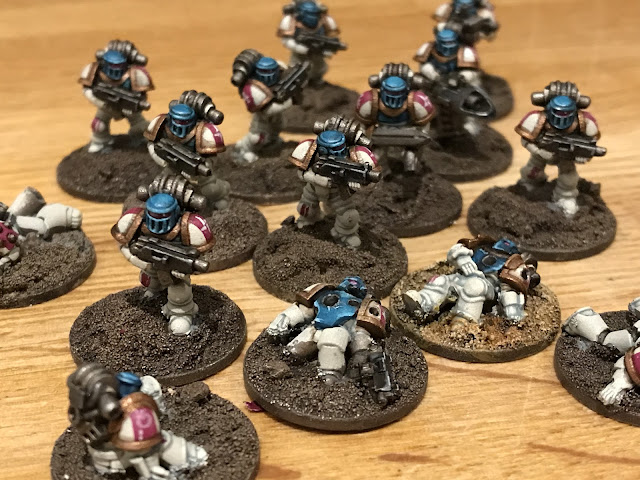
+ Ten tiny Silver Stars. These were painted with a stripped-back version of my scheme for their larger-scale brethren.

_1 Spray with GW's Wraithbone undercoat.
_2 Paint the base with a deep brown.
_3 Paint the whole figure with Apothecary White – the contrast paints are absolutely stellar for these small scale figures.
_4 Once dry, pick out the backpack and boltgun with a mix of brown and black diluted with flow improver (this makes it behave a little like a wash, so you get a deeper tone in the recesses).
_5 Use Sotek Green to paint the chestplate and helm.
_6 Paint the pauldron stripes with Screamer Pink.
_6 Paint the backpack and boltgun details with silver.
_7 Pick out the shoulder trim and chestplate with Balthasar Gold – at this scale, the paint has enough coverage to work straight over the white undercoat, which is a great timesaver.
_8 Once dry, add the washes: Agrax Earthshade over the backpack, boltgun, and gold areas; and Drakenhof Nightshade for the turquoise areas.
_9 Allow to dry, then pick out any details to finish.


+ I added highlights to the helms by adding a little Vallejo Cold White to the Sotek Green, and also used Cold White to pick out the Legion* symbols and other markings on the pauldron. I also picked out some squad designation on the kneepads with simple stripes of Screamer Pink. +


+ Casualties proved a good way to test out the scheme on different armour marks. +


+ Echoes of Warzone Null +


'I cannot account for the absence. I... have forgotten.'


Friday, September 10

+ inload: Painting Marines Mendicant +

+ Painting the Marines Mendicant +

+ Or +

+ 'See, that's just what a liar would say' +


'Call that a knife? N-no – wait... argh!' *stabbing sounds*

+ Here you can see one of the Marines Mendicant; a sort of special forces set up by the Partisans during the War of the False Primarch – and if that's all gibberish to you, then why not transferinload to +Some Things Are Best Left Forgotten+, where you can delve and indulge in such depths of lovely collaborative models and background that even Slaanesh might say 'Ooh, not for me; couldn't manage another morsel'. +

+ For those of you who've come here to talk painting and modelling rather than lore, I thought I'd scribble down a few thoughts on painting these marines. +

+++

+ Off-road individualism +

+ Necessity is the mother of invention, and the creation of the Marines Mendicant was very much led by my desire to make the War of the False Primarch as accessible as possible. While there are eleven Partisan Chapters to pick from, along with six Pentarchy Chapters (owing to my desire to square a little circle about the multiple Death Eagles schemes and backgrounds), it was inevitable that some people who might want to get involved would be put off by having to pick an existing scheme. +

+ To avoid this, I created the Vigilants [+noosphericexloadlink embedded+], a group of marines a bit like the Deathwatch, which would allow people to bring in one or two models of their favourite Chapter, whether of their own creation or not. Importantly, I wanted to ensure that people could share their Chapters' scheme, and so hit on the idea that the Vigilants simply painted one part of their armour red, with a yellow and black stripe (a nod to the ret-conned Field Police of Rogue Trader). +

+ That simple device means that people can join in with the minimum of effort – just by adding a panel to an existing model. Voila, a perfectly useable Vigilant marine ready to do battle. If that's all you want to do, perfect; but if it sparks a bit more interest, then that figure can be used as the seed of a Pentarchy kill team – or even army. +


+ Of course, what's good for the goose is good for the gander – and it seemed a shame not to let those hobbyists attracted by the idea of following a returned Primarch a similar avenue to get involved. I didn't want to make a direct opposite – that seemed a bit unimaginative, so instead I dropped a few hints into the ongoing narrative about a group called the Marines Mendicant, then let it stew. +

+ As the background of the project – and the Silver Stars – developed, the Marines Mendicant started to take on more of their own form. The results are in today's update on +Some Things Are Best Left Forgotten+ , in which I was able to hint at the Silver Stars' way of working without laying everything bare. +

+ As before, creating a uniform would likely put off as many people as it attracted; and in any case I felt that a single colour scheme would not really reflect the purpose or approach of these special forces/advisor marines. Intead, I picked a logo – the reversed silver star icon of the Legion, and gave some details on how it could be applied. Other than that, hobbyists are free to paint them exactly as they choose. As with the Vigilants, it can be as simple as slapping a silver star icon on an existing figure – but there's also the option of using the rose, white and turquoise of the Silver Stars scheme in alternative ways. +

+ White can be quite intimidating (even with this handy guide to painting Silver Stars [+noosphericinloadlink embedded+]), while magenta and turquoise are both beginner-friendly hues and forgiving of mistakes. Allowing people keen on the Stars to get involved without the stress of painting white seemed like a sensible idea. +

+++

+ Putting it into practice +

+ All the well-intentioned lore in the world won't help if the scheme looks crap in reality, so I thought I'd double check that it works. You can be the final judge, of course, but I'm pretty pleased with how he came out. + 


+ I opted for a vertical split, turquoise on the marine's right-hand side, rose on the left. As explained above, this is arbitrary – the Marines Mendicant use highly individualistic schemes (though there's equally no reason you couldn't paint a kill team in a set uniform; that's well within their intentionally contrary modus operandi). +


+ There was an unintentional and unfortunate hint of Alpha Legion about the scheme when seen from this angle. I wanted the project to be a proper civil war; something more grey on grey and akin to the Badab War conflict than the Horus Heresy; and so Chaos – which is too dominant a theme and threat to be anything but the focus – doesn't really fit here. +

+ Secondly, memes have rather spoiled the XX Legion for me, and while I have no problem with planting a seed that 'the Alpha Legion did it' for the whole False Primarch thing – after all, lies and truth are the point of the project – it's also a bit obvious. I therefore used lots of iconography suggestive of the Silver Stars – and also Raven Guard and Carcharadons – to provide some equally plausible other interpretations from this side. +


+ Loads of juicy little icons and symbols here; mostly taken from logic and mathematics. The tau (upside-down 'T') is a logic symbol for 'false' – a little Easter egg. As with everything, background, lore and painting are all great, but they should all take a back seat to having fun with you hobby. +


+ A back shot. Not a huge amount to say or see here, beyond the fact that I've found I really like split schemes. There's something very focussed and rewarding about getting the lines with smooth strokes of the brush. All very mindful! +


+ Chequers helped to detail this side – again, a split scheme from this side looks a bit Emperor's Children. Not as problematic as the Alpha Legion side, but still worth breaking up to distinguish it from any extant force. +

+ Were I to do more Marines Mendicant, I'd be tempted to vary the scheme still more, and make more of the white area. If you're tempted to do a Marines Mendicant (or any other Chapter involved in the War), I'd love to see it. Why not share it with the #somethingarebestleftforgotten and/or #warofthefalsepriamrch tags? +


Wednesday, April 28

+ inload: Silver Stars markings and honorifics +

+ inload: Silver Stars Legionary markings +

+ We covered the basics of the Silver Stars paint scheme in this inload [+noosphericinloadlink embedded+], but it doesn't really touch on the markings and so forth. Since I've had a couple of people asking about them – and very pleasingly, have seen some examples painted up by other hobbyists – I thought I'd scribble down my notes on the various sigils and markings. +

+++

+ Esoterica +

+ Before anything else, it's worth making the point that the Silver Stars are (out-of-universe) intentionally slightly unclear, and this has been intentionally built into their marking scheme. They are, after all, supposedly the returned Legion of a lost or forgotten Primarch; or possibly a renegade Chapter masquerading as such behind an abomination; or perhaps the time- or dimensionally-displaced results of some Other event. +

+[identquery: unresoved – all records REDACTED]+

+ I think a big part of the appeal of the lost and forgotten Primarchs and Legions is that we don't know who or what they were, what happened to them, or why. Giving definite answers to those questions misses the point. The key to their presence in the project, therefore, is to provoke curiosity – to cause viewers to think 'I want to know', rather than to answer said question. At root, I'm far more interested in creating a space for others to explore the Chapters of the Partisans and Pentarchy and the myriad groups of Imperial forces, both orthodox and secessionist, that are about in M33, than I am in the Silver Stars. They are effectively a plot device, rather than characters. In short, the qeustion of whether they are a lost Legion or something else entirely is more important than the answer. +

+ The downside to that, of course, is that it makes it difficult to give guidance or answers on markings and colour schemes – after all, if you're going to explore the space, you have to have some answers to create a sense of verisimilitude and believability – after all, even picking a name and colours is in some way pinning things down. To that end, I have framed my own answers to the various questions about the true nature of Volnoscere and his Silver Stars, but they will remain obscured. Is this scheme the scheme of one of the Lost Legions? If so, has it changed since Unification? Who can say? +

+++

+ The basics +

+ With that important proviso out of the way, let's get stuck in. Here's Legionary [REDACTED]. The basics of the scheme are armour as white as bone, as green as the ocean, as rose as coral; and with gold accents. In terms of placement, the helm and upper torso is turquoise (Citadel Hawk Turquoise), the remainder white (Army Painter Mummy Robes covered with Citadel Apothecary White, and highlighted with Valljo Off-white). +


+ The placements of accents varies according to armour mark and rank, but banding – on the shoulder pad rims and collar – is usually a muted gold. I'm afraid I'm a bit crap on metallics: I've usually stuck with my comfort zone of Boltgun Metal and Chainmail, and never learned the new paint names. Suffice to say it's a mid gold that's knocked back with a layer of Seraphim Sepia wash and Leviathan Purple added to recesses wet-in-wet. +

+ Legion markings +


+ Silver Stars bear what appear to be Legion symbols both on their left pauldron (as typical for Space Marines), and on the centre of their torso. The marking is a white, four-pointed star made up of four small, unconnected right-angled triangles. They typically appears to be rotating anti-clockwise on the pauldron and clockwise on the torso (both suggesting forward movement); but occasionally run in the opposite direction, which indicates a form of intra-Legion specialism or honorific termed Manawa. +


+ Whatever the direction of travel, and wherever it appears, the Silver Star symbol is near-universally rendered in white (that is, heraldic silver). This necessitates rose banding (Citadel Screamer Pink, for those painting their own) on the pauldrons in the form of an heraldic pale (a vertical stripe). +


+ Pauldrons are occasionally completely rose, or the rose band is a fess (a horizontal stripe) or a bend (a diagonal stripe from top left to bottom right). The colour also often appears on the belt buckle in a bend, and on the helm. Many Silver Stars wear plumes or headdress; any fabric or organic material is dyed coral-rose; and in their absence, a pale is applied on the top of the helmet, occasionally continuing over the faceplate. +

+ The right pauldron bears squad designations. Some appear to be alchemic symbols, commonly – but far from exclusively – those for Tin/Jupiter (), Gold/Sol (), and Bismuth (🜘). Others are more esoteric or unidentified, such as the example above. +


+ Besides the squad markings, the Legionaries frequently bear symbols on other areas, usually over the additional Astartes organs (symbolically, if not literally) – most frequently the secondary heart (right of the torso), and the sus-an membrane and catalepsean node (both on the helm). These are again alchemical symbols – occasionally modified – including that for calcination/Aries (♈︎), colgination/Taurus (♉︎) and scruple (℈) alongside the squad designation markings listed above. Considered unlikely to be personal honorifics owing to their frequent repetitions within groups (though this could equally demonstrate a close kinship or bond), these patterns may serve as markings to indicate larger formations, such as Company, Millennial or Wing. Equally, they may instead have a ritual, apotropaic function within the Legion. +

+ In addition to these markings are wedge-shaped numerals that usually appear within the belt buckle in black, but occasionally elsewhere, including on the front of the pauldron (as in the example above), on the helm, or on the rear of the backpack. These numerals are almost always identical, so do not seem to indicate squad, company etc. markings. Finally, the left knee appears to occasionally be decorated; seemingly according to purely personal preference. +

+ Notably, the Silver Stars rarely, if ever, seem to use numerals besides the aforementioned cuneiform. Similarly, script of any kind is notable by its absence. +

+++

+ Over to you +

+ I hope that's given a bit of clarity on how to go about painting and detailing your Silver Stars without giving too much away. If you do paint one up (or indeed any of the Partisan Chapters), I'd love to see and share it here – please post it on Instagram with the tags #somethingsarebestleftforgotten and/or #warofthefalseprimarch, or on the + Death of a Rubricist + Facebook group. +

Monday, April 26

+ inload: Using hue and temperature

 + Full Stride: creating a path around your model  +

'I spent a mortal lifetime searching for what was good. I beheld then Titans; and ever after have searched for what is right.'

Aphorisms, Polyphy

+++

+ Painting weathered white +

+ The Sons of the Temple, my Titan Legion, have orange and white heraldry, so finding a way to quickly and effectively paint large panels was key. Below you'll see a composite picture of how I tackle this. While it's demonstrated on white, the colour is largely irrelevant; as the same mix and technique is used for the orange and blue panels, too. This is important in terms of harmonising the scheme. +

+ To give the sense of scale, colours must be ever so slightly desaturated; and tonal contrast slightly reduced. Aerial, or atmospheric, perspective is the term for the effect that makes distant objects look increasingly blue and less vibrant than closer ones (owing to dust and light scattering). This technique makes blacks ever so slightly lighter, and whites slightly darker, while also merging the tones across the whole model. The intent is to mimic the effects of atmospheric perspective. +


+ The main image is the finished result, the top row the various stages. 

i_ I start by painting a flat, clean surface of Army Painter's Mummy Robes. This colour covers well, so two thin layers usually gets the result you want. If you are including any freehand (such as the heraldic fur markings visible in the finished pictcapture here), paint this on now. 

ii_ Next, we mix sepia ink (I use Daler Rowney's calligraphy ink, as it has a convenient dropper) with brown paint – I used Dryad Bark for this example. THis is then thinned down with a little clean water, a little flow enhancer (a colourless medium that breaks the surface tension of the paint), and granulation medium (which encourages the pigments in the paint to clump together, creating a gritty visual texture without physical depth). This is applied with a 12mm (½in) flat brush in vertical strokes, working down from the top of the area. 

There's no magic consistency or proportions of these components; indeed, I think it's best to vary it, as it leads to more naturalistic, realistic results. Having said that, you want to find a balance that ensures it's fluid enough to be lifted off by a dry brush, and thick enough to stay in the recesses. 

iii_ Working quickly, for the paint must still be wet for this stage to work, rinse the brush and dry it on kitchen paper. It doesn't need to be bone-dry, but take off as much water as you can. (You might instead keep a separate brush for this, but I find it more enjoyable to use one rather than stopping and swapping all the time). Using the dry brush, repeat the downard strokes slowly, allowing the paint mix to be drawn up into the dry hairs of the brush through capillary action. This is called 'lifting off'.

iv_ Allow to dry completely. This is shown in the top centre of the picture above. You can see how the granulation fluid has caused the paint to, well, granulate. It's a simple way to build very fine texture that, again, helps to suggest the colossal scale.

v_ Repeat steps ii_ and iii_ until you are happy with the result. As per my note on consistency, there's no real 'right' way of doing things – just make sure that you stop before you go too far. You can always add another layer later, but it's a [SCRAPSHUNTERRORABORT] to remove. +

+++

+ Dread Hellespontion +

+ We last saw this Engine in my review of the Nemesis Warbringer Titan kit [+noosphericinloadlink embedded+], and the poor fella has rather slipped through the net on painting updates. I think I got enthused by Blood Angels and Gatebreakers at the time, so never posted him up. +

+ He is, however, well on his way to completion. He's also a good example of how the weathering technique above works across a whole titan. You can see some blue and white panels here alongside the orange; and different iterations of the same mix have been applied across all without discrimination. +


+ Two particular things to note – not every armour panel has been treated, and the metals are not touched with this. As an example of the former point, the knee and lower leg on the left of the pict-capture above are the plain base coat. This gives me the freedom to add freehand to these areas later, once I can see how the overall structure looks. Assessing and adjusting is something that I like to do while I work, as it keeps my mind active and involved, creating interest and stopping it becoming a chore. +

+ Secondly, leaving some areas clean means that I can build and layer the existing panels later, creating natural variance in the finish. Titans are both vast and religiously important to the techpriesthood, so cleaning and maintaining them is not just a case of getting the garden hose out. I reason that the enginseers might occasionally replace entire panels of armour, leaving some (temporarily) pristine, while others are repaired and made good. Over the years, these much-repaired panels would build up a particular patina and distinctive quality. Who knows? Perhaps some Legios allow individual Titan crews some leverage in deciding whether and how to make sure their charges are maintained – making the decision of whether to repair or replace areas a balance akin to the preservation and modernisation of mediaeval churches. +

+ Variety and difference in the quality of the glazes and layers helps to suggest this effect, but it's important that it appears intentional. To that end, I suggest building two or three broad finishes to ensure some cohesiveness, rather than painting every panel in a completely different way. +


+ Returning to the point about the metals, they are not touched with this layer; they will be done later, at a separate stage. The intent is that it helps with the differentiation between armour and superstructure, preventing eveything blurring into one. +


+ Another angle. Note that the model at this stage looks quite murky and muddy, so some contrast is needed to help add some pop. How do we do that? Let's read on. +

+++

+ Giant laser guns +

+ Speaking of visual pop, how's this for contrast?


+ It's a bit of a PCRC in-joke that my models all look like they've been dragged through a muddy puddle. That goes doubly for the Titans, as I can't push the contrast in areas as far as I normally would – for fear of losing the sense of distance and scale created by the atmospheric recession. +

+ I'm not normally one for special effects on figures; I like a heavy dose of verisimilitude to offset the inherently fantastical nature of space knights and aliens. Typically, therefore, I would treat Titan weapons as properly encased, looking to create something that looks like a naval gun; but I'm not completely averse to the sparing use of visuals like this – it does, after all, look cool!+

+ My solution to the problem of the models looking boring was thus to bring in the SFX team. I opted to use paint to create some much-needed visual contrast. Aerial recession is less noticeable on light-emitting objects, so opting to give a bit of weapons glow to the models helps bring back eye-catching interest. It's a very simple process: base paint the areas white, then gloop on the new Contrast paint. Once dry, use slightly thinned white to emphasise the effect slightly. +

Pow! Pop! KAZAM! etc. etc.

+ Choosing accent colours for impact +

+ More important than the technique is the colour choice. The lasers here could have been any hue, but using blue is particularly vibrant because it's the complementary colour to orange. When complementary colours are placed alongside each other, they each make the other appear brighter and more vibrant because each stimulates different photoreceptors in the eye. +

+ If you're unsure of a colour's complementary, a quick way to check is by staring at the colour under a bright light for thirty seconds or so; then quickly looking at a white wall. You'll get an afterimage in the colour's complementary. This is because the photoreceptors of the colour are temporarily bleached through stimulation, causing the optical illusion that the white wall is stripped of that colour, leaving the brain to assume the complementary is present. +

+ The importance of hue and temperature +

+ The use of your own eye is a useful technique because bald colour theory often neglects the precise hue of a paint. While it's true that orange is opposite blue in the colour wheel, there are lots of different oranges – some leaning more towards the red, others more to yellow – and lots of different blues, which likewise can err towards red or to yellow. If both the paints you pick lean towards red (for example), you'll be slightly harmonising the effect, which isn't what you want. Instead, you want to maximise contrast. This quality of colour – the precise blueness of a blue, for example – is 'hue'. +

+ Colour temperature is another way of creating contrast. As mentioned above, aerial recession makes colours appear increasingly grey-blue in the distance, which makes them appear cool. Some hues are naturally cooler than others. Duck egg blue, for example, is a yellow-tinged cool blue; while French ultramarine is red-tinged and warm. If your main colour is cool, you can use a warm accent for greater contrast and impact. +


+ For the Sons of the Temple, who have an overall warm scheme, I used cool blue for the lasers. As you can see, the effect is striking; preventing the force from looking realistically murky – but also a bit boring. This will also have a nice in-game effect, making things easier to distinguish for the players. My plan is to extend to idea to other weapon systems, using purple or green for plasma weaponry, and red for future volkite upgrades. +

+++

+ Summary +


+ A last little shot of the force as it currently stands; and a close-up of 'Old Spiteful', Senex Codomannus. With his trim completed – in warm gold, he shows what a difference that punch of ice-blue makes to the finished result. Compare the similarities and differences of the blues hues across the model:, and the effects that has on how the eye works across the figure: from the immediate focus of the laser, then to the cool blue focal point on the carapace, and finally to the warm harmonising deep blue on the knee and lower leg. +

+ Be as generous as you can to your viewer: use hue and temperature to guide their eye around your model, and they'll spend longer looking. We spend a lot of time on our models; and a bit of theory can really help – whether your aim is painting for competitions, or simply to make get results for your own pleasure. +