Showing posts with label Purefinder Chanterwick. Show all posts

Thursday, January 11

+ inload: Chaunterwick Unathletic ready for play +

+ First drive +


The team's moving out onto the pitch. After a push last night, I've got the squad ready for gaming. I hesitate to say absolutely finished – I'd like to punch up the red with some glazes, and I'm umming and ahhing about weathering – but they're certainly at a stage I'm happy with for a few games.


Numbering on both the front and the back helps with identification during gaming, so I've added high contrast flashes with the player's number on. These also look nice, of course! A few little details like this work wonders for making them appear like a sports team.


You won't have missed the names on the front of the base, either. These are visually distracting, but these are gaming pieces first and foremost, so I think they're worthwhile here. In the past, I've always found it adds hugely to the enjoyment of the game if I can think in terms of individuals rather than abstract pieces – and that applies to both sides. Victories are sweeter when 'such-and-such' scores a sweeping touchdown; and setbacks are softened if you can think in sports terms – 'so-and-so' stealing an interception from your pass is a more immersive result.


Distinguishing positional players is important, and I like to make it as easy for the other coach as possible. In addition to the differences in sculpt and pose, my blitzers all have a white frontpiece to their helm. This is the sort of decision you can make that doesn't compromise the uniformity of the team strip, but does avoid confusion, which is the bane of Blood Bowl. No-one likes seeing a critical play fail because you mistook the stormvermin for a gutter runner.


Fortunately, the sculpts of this team make distinguishing positionals relatively easy; the catcher and thrower here are good examples of how a change in pose and a few select details can help a sculpt to tell a story – in addition to having a ball sculpted on, the throwers share open-faced helms (in contrast with the barred helms of the linemen and blitzers), and their poses make them look lighter on their feet without charging (as with the blitzers). Similarly, the catcher is much more lightly armoured, and has an oven glove catcher's mitt that further emphasises his pose.


Here's the team photo. The throwers are my favourite sculpts; probably because their faces are more visible. You'll notice the ball on Jimmy Turnpike's base – it's easy to forget the other bits and bobs you need for the game; and I think it's a shame to have a pair of lovely teams playing with unpainted reroll counters, turn markers etc. As a result, I started painted those at the same time; though I'm afraid my eyelids drooped before finishing the re-roll marker!

Wednesday, January 10

+ inload: Blood Bowl – Chaunterwick Unathletic +

+ Return to the Tallowlands +

+ With the Iron Circle polished off [+noosphericinloadlink embedded+], part II of my short-term 2018 plans, detailed in inload #400 [+noosphericinloadlink embedded+] is in motion. After a push last night, the whole team is at a stage where I can turn to the enjoyable detailing. +

Excuse the slightly scary pupil-less eyes; still WIP!
+ Chaunterwick Unathletic's 'stadium', the Purefinder Bowl; capacity 1200(ish, depending on whether smaller spectators are willing to sit on larger spectator's shoulders) – isn't the most attractive, comfortable or practical playing field. You might expect a 'but' to append that last sentence, but there isn't one. +


+ A Catcher and two throwers: #7 Marius Magismet; #3 Jimmy Turnpike; and #1 Karljung Eastmoor (VC). +
+ With the exception of the Captain, Piritt Silvers, who is a slightly converted version of Forge World's Griff Oberwald, the team is the metal version released by Games Workshop in 2004. I bought a set years back, and regretted selling it on, so it's nice to have a set again. Nicer still to have it (nearly) painted! The original set was unusual for a GW release in that it had a full sixteen-man team, each with a unique sculpt. Mine has a duplicate, because I wanted a crouching scrimmage line (see below). +


+ The team's blitzers: #10 Harald Furness, #2 Piritt Silvers (C), and #13 Bobby Tuppence. +
+ Prior to the new plastics, this was the most up-to-date human set, though because it was received a limited release through the short-lived Fanatic subsidiary, it may be unfamiliar to some readers. The sculpts vary in quality. I think the throwers are fantastic, but there are huge inconsistencies within the set in terms of height, hand size and general bulk. +

+ Even taking into account differences in posture and physical variation, the set is a bit all over the place, particularly in the standing linemen, which I think are the weaker sculpts of the set; their poses a bit half-hearted. With that said, it does give the models great character and individuality; meaning that each one really does feel like a real person. +


+ Bruisers on the line of scrimmage: #5 Derby Welch, #4 Bartram Binks, and #12 Bryan Wobegone. +
+ One thing I didn't like about the set was the huge spikes and blades all over the models. Yes, they add to the over-the-top Blood Bowl feel, but to be honest, I think they look much better trimmed down – you can judge for yourself by comparing the unmodified Derby Welch (on the left) with Bryan Wobegone (on the right). Apart from anything else, I think easily-hidden knuckledusters and subtly sharpened rivets are much more in-keeping with the (admittedly fairly blurry) in-universe rules of having no weapons on the pitch. +


+ ...and the remaining linemen: #9 Ifor y Gyrdl, #8 'No-Hope' Nobbins, #6 Toby Riverbank, and #11 Colin Ap Scond. +
+ Part of the reason I like this set so much is that it's largely divorced from the Warhammer military. Most of the 3rd edition Blood Bowl releases took too many design cues from their respective Warhammer army (the High Elves were a particularly bad culprit), and lost the 2nd edition fantasy football charm. These have it back in spades, and it's interesting to note the similarities between these relatively unsophisticated sculpts and the new Griff model, who reads like a very slick update of the metals. +

+ What next? Well, I'm hoping to finish off the team this week, if not tonight, and then it's on to the next part of my short-term plan: a return to the Alien Wars [+noosphericinloadlink embedded+]; though perhaps with a quick diversion to the Iron Warriors – the PCRC are meeting up at the end of the month, and we've got a big game planned. +

Monday, October 26

+ conceptinload: Plans afoot +

+ Worldbuilding +

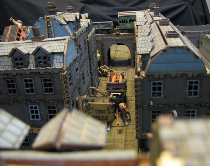
+ Buildings – structures – rubble. These are what turns a wasteground into a settlement. A few people have asked what sort of buildings I'd like for my new board, Purefinder Chanterwick. Here's the plan:

+ Gloomy streets +

+ Victoriana is not as well represented in gaming terrain as some other themes, but there is stuff out there. I recently stumbled upon this current kickstarter campaign [+noospheric inload embedded+], which has some fantastic buildings. I've pledged for the tenement set, which can be seen here (amongst some other bits):


+ As you can see, it looks like it should fit nicely with the other stuff I already have, so I'm looking forward to receiving it. +

Renaissance Miniatures, who are running the kickstarter, have a number of successful campaigns under their belt, and look like a lovely little company – so I hope this turns out to be another successful campaign for them. +

+ Existing material +

+ Bought a while back, this selection of Micro Arts terrain, from their Wolsung kickstarter, will form the core of the board's structures:

+ I've already attached the large buildings to baseboards, which you can see here on the WIP board: +


+ I also have another structure from Microarts; one from their range intended for Corvus Belli's Infinity. It's mounted on a larger square, and will probably make for a slightly more interesting game. I want to include a variety of architectural styles to give a sense of history and overbuilding. +


+ What else? +

+ I'll be producing a step-by-step on Word Bearers, akin to the Iro nWarrior one I did a while back. +

Tuesday, October 20

+ inload: Worldbuilding – the finished article +

+ The Streets of Purefinder Chanterwick +

+ Vox-silence for a few days, but I'm very happy to show the finished board. +

+ The Rubricist Childeric and his compatriots make their way to a rendezvous with Magos Manderghast + 
+ Iron Warriors push through deserted streets +
+ A Pan-Oceanian Fusilier checks his six in this unfamiliar city +

+ How it was done +

+ The building stages can be seen in earlier inloads starting here: [+noospheric datalink embedded+], but the painting technique follows:

_1 Head outside and lean the primed board against a tree. 

_2 Use a large household brush to splash some hot zones over the board. Spread them randomly; aiming to work into some recesses and avoid a patterned approach.

_3 Colour the paving one colour (I used a lighter cream-grey) and the remainder a complementary hue (I used a neutral mid grey).

_4 Work the edges of the wet grey areas into the edges of the red areas, aiming to leave some zones of pure colour (see step 6 for how to blend large areas).

_5 Continue to blend areas into one another to achieve a mottled result as shown. Blend the paving more (footfall and travel will smooth out dirt).

_6 To blend, stipple the brush on the borders of the areas with the household brush. Use a gentle tapping motion with the tip of the bristles, and adjust the angle of the head to avoid creating patterns.

_7 To remove any brushmarks, use a household sponge to dab over the surface. This also helps to blend the colour further.


_8 Leave the main board to dry a little. While you're waiting, paint any other bits you need – in my case, the large building bases and scatter boards. These were done in the same way. Note the splashes of light green on the unworked boards on the right. These come in next.

_9 You can get a bit Jackson Pollock here. Take some contrasting and complementary colours. I used light green, pale brown (made from a mix of the red and light grey paints I used earlier) and light grey; but the principle is to have colours that fit with the palette you've used. Spatter them in a variety of directions over the board by loading your household brush with the colours and cracking it sharply against your palm to flick the paint across the board. For a less controlled approach, simply wave the loaded paintbrush around sharply, as though fighting a lightsabre battle!

_10 Stipple the areas of colour in as above, then lay the board down to dry. At this point, I went in to watch the Rugby, and came out in a bad mood when Wales lost. Black armbands are optional at this point.

Put any additional boards nearby – this is so you can do everything at once, for some consistency.

_11 Open a number of ink bottles – I used red, yellow and green – and pick a large brush. I used a size 16 round, but anything fairly large will work.

_12 Drip the colours over the board, with an emphasis on the paving. 

_13 While the ink remains wet, use the household sponge to smear the inks over the paving area.

_14 Drizzle water over the whole board (don't drench it – just use the household brush to drip lots of water on) then use the ink-soaked sponge to dab and move the colour around the whole board. Tip and tilt the board to encourage the colour to flow and move around. The gesso is waterproof, so don't worry about it soaking into the cardboard paving. 

Once you are happy, leave the board to dry. This completes the basic painting, and you're on to the time-consuming bit; detailing.


+ There's no simple method for detailing – it'll depend on your specific board. For the paving, I used a combination of drybrushing and more careful brush application to colour the area with a variety of stone colours. The manhole covers were coloured with rub 'n' buff gold. +

+ With the colours in place, I used superglue and PVA to attach grasses and drifting leaves (Gamer's Grass tufts and birch seeds respectively) to add a bit of life. This is an important step, and one that makes the board look more 'lived-in'. While a board looks fine without them, it lacks a little verisimilitude; and comes across as artifical – though you might struggle to put your finger on why. + 


+ The shot above shows the leaves and grasses in place, along with a couple of the building baseboards. I've used the same technique on these, and also added patches of greenery with fine turf. In the grim feudal darkness of Cepheus, people still have a scrubby yard to grow vegetables, raise ovi-avians or simply sit and watch the world go by. Again, a little greenery adds life, and it also breaks up the monotony of the board. +

+ You'll also note a couple of bits of terrain – a leaking water/power tank, and a tiny park bench. I'm hoping to add lots of little touches like this to create the sense of a real place. They're both perched on the spare pill-shaped bases I made specifically to hold these details. These are designed to fit almost anywhere on the board to provide cover away from the large main buildings. + 


+ The gutters here show the raised nature of the road itself. They are specifically just wide enough to hold the small scatter boards mentioned above. +

+ So, that's it for the moment. I need to add some buildings, and I'm hoping to get my first game in on the board around All Hallow's. +

Tuesday, October 6

+ inload: Worldbuilding – The exciting bit +

+ Purefinderre Chaunterwyck +

+ With the base sanded down, it's time to prime it and get into the... oh, no – apparently it's time to put buildings on and start pushing toy cars around my little town. +

+ Yeah, after all the work I'd put in, I felt I deserved a chance to put some panels and buildings on and get a preview of the town. As well as sanding down the roads (I used a coarse/fine sanding block bought from B&Q), I've secured some washers to the pavement surface with superglue and blended them in to the surface with a little additional sand. These will be contact points for scatter terrain like phone boxes, streetlamps, trees, benches and the like. I also added a couple of other patches of sand so that the dirt and rubbish didn't pile up unnaturally around these features. +


+ I also used the same sand and some spare tiles to texture the baseboards of the scatter boxes, which you can see on the far left of the pict-capture above. These will have greenery and scrub on top; both to act as terrain and – more importantly – to add some much-needed colour to the board. Urban spaces tend to have a lot more life in them than some typical urban boards, and that goes doubly for feudal worlds like this. I'm aiming for fairly scrubby looking greenery – a sort of urban planting that's gone to seed over long years of neglect. +


+ The buildings are from Micro Art Studios District-5  [+noospheric inload embedded+] and Wolsung [+noospheric inload embedded+] ranges. While very different in detail, they share much in common in terms of wall thickness, square corners and similar design features; so I think with the right paint scheme they'll fit together naturally – just like modern and older buildings fit in together in the modern world. +

+ The panels you see creating a little platform are a vague idea that came to me as I moved the paintpots (little tester emsulsions) I'll be using for the board. I may work the empty paintpots into columns once I've finished with them. That'll let me support a second level on the board at the same height as the Wolsung walkways. +

Tuesday, September 29

+ inload: Worldbuilding – a load of old cobbles +

+ Purefinder Chanterwick +

Imperial Fist soldiers oversee construction.
+ Progress continues on the gameboard [+noospheric link embedded+] I'm building. A loose part of the Court of the Sun King project, I've given it a little bit of background. +

+ Purefynderre Chaunterwycke +

+ Wherein the deck ys stacket +

Finding his place, he began tracing a finger through the uneven pages of the old history. 
"The style is a little florid, I'm afraid, but that was the accepted style –" the underscribe stopped as he saw Northgrass' eyebrow rise and mouth set sternly. "Perhaps another time." He coughed, and began:
'Lamplit and now largely derelict, the settlement of Purefinder Chanterwick has, like most of the City, served many purposes over drawn-out centuries. Of its origins, none can be sure, for histories have been written of its histories; and much now is lost that might once have been remembered. '"
"'For now, it suffices that it sits between the docks and the leathermaker's district; and on a thoroughfare that connects more important parts of the city to one another. A fairly anonymous area, it encapsulates the lot of the Imperial peon. This is the domain of the Purefinders, a vital part of the leatherman's art; for it is they who gather the nuisances used in 'bate'; an infusion of fecal matter from animal species used to soften hides for tanning. The transit of equids, riding-dogs and cavalieravans as they pass through means that much of the road is filled with – unpleasant – giftings of these riding and draft beasts.'" 
Having finished reading out the extract, Ferlinghetti closed the book slowly. The old leather cover sat awkwardly on the yellowed and buckled pages. Veck smiled inwardly as the underscribe placed the book down slowly and unconsciously wiped his metallic fingers on his robe.
The Inquisitor rose to his feet.
"So, dwellings in the dung district, Ferlinghetti? You've come up in the world." He said, wryly. "Unglamorous, under the web. Why, Manderghast'll make an agent of you yet.'

+ As well as being fun to write, making up a story about the location necessarily makes it a bit more personal – much like making up a name for your general. It will also start sparking ideas. Here, for example, the idea of the area sitting on the outskirts of the leathermaker's district might spark some ideas for shopfronts; the sort of rubbish that'll be scattered about, and so forth. I like the idea of stringing up some washing lines, too – purefinders probably like a good scrub! +


+ Practical: paving +

+ With the roads in place and board dry, I took it outside to get rid of any stray bits of glue or sand using a scraper. +


+ A few minutes work left me with the bare streets +

+ I then began the process of paving the streets, following this tutorial [+noospheric link embedded+] from Rob Hawkins' Hobby Blog. To add a little extra detail, I decided to add some manhole covers, which are made from small decorative wooden bits from Hobbycraft. These were glued in place first, aligned with one another. + 


+ I then began gluing on the paving slabs, placing a couple of larger ones and building up the shapes around and between them. +


+ I gradually began filling in the gaps with smaller pieces. In hindsight, I wish I'd made them all a little smaller to enhance the sense of scale (these are fairly huge at 28mm/32mm), but I think it works quite nicely. +


+ A couple of hours – and a couple of cups of tea – later, it was starting to look a bit more developed. You'll notice that I've added smaller stones around the manhole covers. This has a practical purpose (covering the area around a cirle), but also looks much prettier. +


+ Here's the board at the end of the evening. The bulk of the roads are done, though I now need to go back add fill in some spaces with smaller stones. I'll leave a few gaps for broken or missing slabs, but I hope the addition of tinier stones will help sell the scale. The picture above also shows the pavement started on the lower side (bottom of the picture). For this, I glued stones of varied size along a line, roughly 5mm (¼in) away from the gutter. I'll fill this line with kerb stones, and fill the space behind the main slabs with smaller cobbles. +


+ I couldn't resist playing with toy soldiers at this point, so I'm going to pretend that this shot is to demonstrate the different levels and show the scale. The marine on the left is standing in the gutter, and the second on the pavement step. While only 25mm wide, you can see that a 30mm base still sits steadily on it. When the paving is added to the pavement, the drop will be even less. The sergeant (with the banner) is on the pediment. As you can see, there's a nice height difference between the different levels. +


+ A slightly arty shot of the streets, this also shows one of the buildings on its own base. Again, this base gives some extra levels and height. I don't think this will cause much in-game effect, but it'll improve the realism of game photographs, and add to the sense of immersion. +


+ A closer (if very dark!) look at the building across the road. +