Thursday, October 16

+ inload: Interpreting artwork into miniature +


+ The First Expedition is a forum that focusses on the Horus Heresy, a fictional civil war to determine the fate of the future galaxy. They're running a competition to create in miniature a version of a piece of Horus Heresy-themed artwork. +

+ To a degree, the idea of recreating models that more closely followed the artwork is what led to the Praetors of Calth project in the first place; allowing me to interpret images like this:
Visions of Heresy
...into miniatures like this:


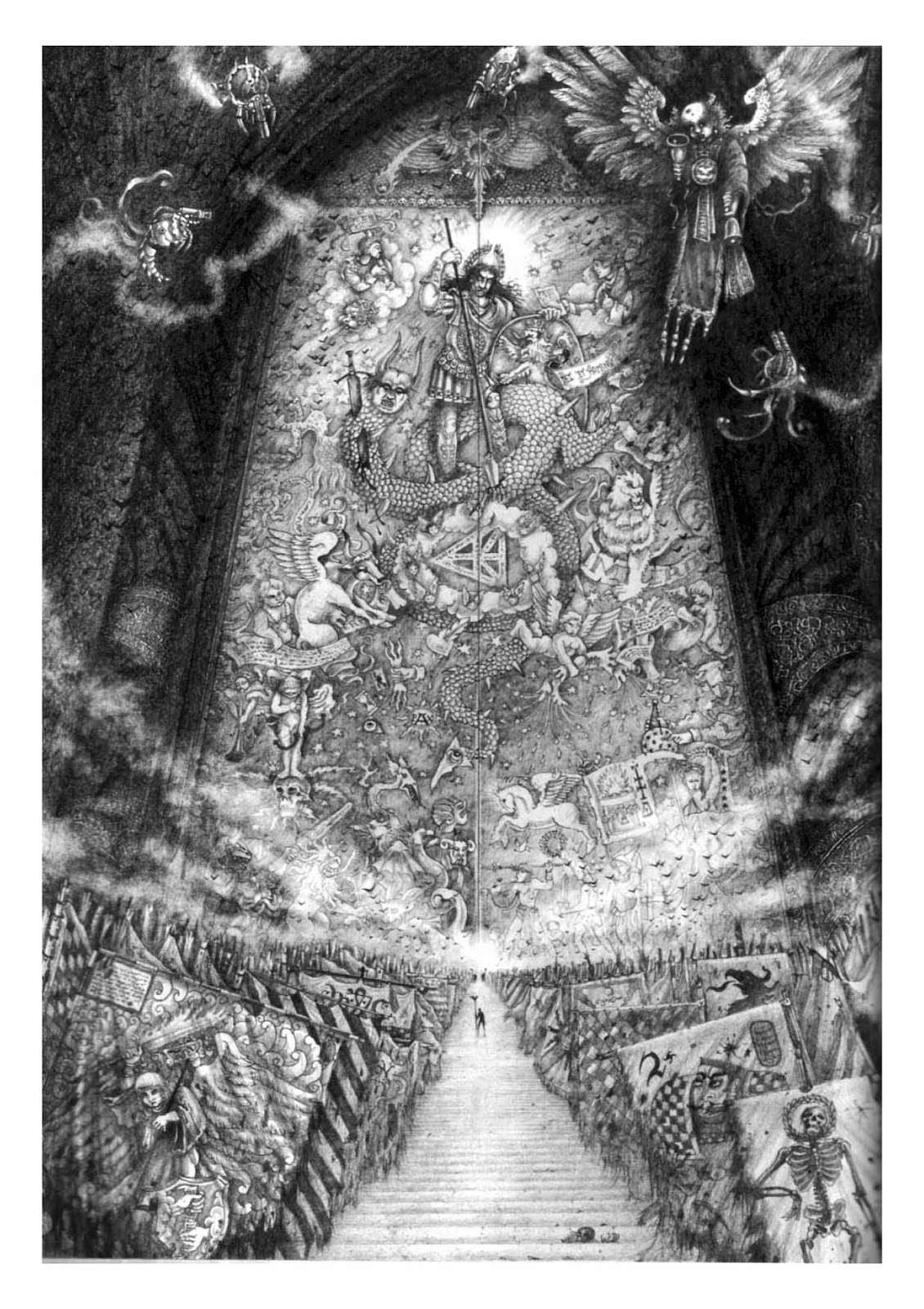
+ However, there's a difference between using artwork as inspiration, and actively trying to recreate the artwork as accurately as possible. I have tried this in the past in two dimensions, with a banner based on John Blanche's fantastic Eternity Gate artwork: 
Click for a bigger version – the banner's in the lower left-hand corner.

+ If my mem-banks don't fail me, there was an explanation in White Dwarf magazine that the countless serried banners were honoured relic from long-disbanded/destroyed armies of the Emperor, built up over 10,000 years – a wonderfully gothic conceit! I liked it so much that I built it into the Praetors of Calth as a little nod:


+ This obviously required a little interpretation – the whole banner isn't shown, and I wanted to tie it into the Ultramarines. However, it wasn't overly complex to interpret a two-dimensional image into another two-dimensional image. The same can't be said for miniatures, which are three-dimensional and proportioned very differently from the artwork. However, I did have a go at turning John Gravato's cool artwork Techmarine Arius (again from the Visions of Heresy artbook), into a miniature:


+ This was a really fun challenge, and a good test to see whether the altered proportions I'd done for my marines worked with the proportions of the artwork. Here's the result:

+ It's not a perfect replica due to my lack of skill, and also necessary compromises to use existing pieces to create the model. However, I think it successfully evokes the idea of the artwork, and has enough ideintifable features – the pose, the helmet, the cogged and clawed backpack etc. – to make it recognisable. This is what I call finding the iconic elements. If you have enough of them, you can play quite fast and loose with details, while still reminding people of the original. +

+ While I'm writing about the Arius figure, I'd like to point out a couple of bits – the the streetlamp on the base. The original artwork has a powerful light source behind it; and I thought adding a streetlamp here would serve two purposes – creating a light source on the miniature, and simultaneously create a strong, solid piece that would help protect the model from gaming wear-and-tear.+ 

+ This miniature was also a good opportunity to try a little trompe-l'oeil – the hoops that make up the armour segments are just painted on. I think I'd do a better job of it these days, but I remember feeling very pleased with it at the time. Models like this – one-offs that for one reason or another you spend more time thinking about and trying new things out on – are a great opportunity to stretch yourself, and are very rewarding. +

+ Coming back to The First Expedition's contest, I'm having another go at recreating a bit of artwork. Since the contest doesn't end until the end of the month, here's a little silhouette teaser.+


+ Have you ever tried your hand at turning an artwork into a figure – or perhaps the other way round? +

Thursday, October 9

+ inload: Minor progress on the Calth front +


+ The painting war continues apace. I used the pencil for the metal areas on the Rhino. Quite tempted to use it on the boarding shields, too; though I'm a bit concerned about over-using it... Thanks for all the feedback, by the way – it'd be lovely to hear (and see) how you're using it :) +

+ I can't quite decide how to paint the boarding shields. On the one hand, a utilitarian approach seems fitting – they're largely disposable, and I don't think the 30k Ultramarines would have developed the slightly fetishistic approach to honouring the battle gear of the dead that's prevalent in 40k. If I go this route, I thought either dark blue (as for the gun casings and other hard equipment) or dark grey. +

+ Alternatively, I could paint the shields with a group emblem (like the Roman Legions), or individual totems (like a hoplite phalanx). I'm currently leaning towards adding thunderbolts like Roman Legionaries, as it's an image that turned up a lot in early 40k. What are your t
houghts? +

Wednesday, October 8

+ inload: Workflow and graphite metallics +

+ or, The Pencil Is Mightier Than The Sword +


+ Experimentation is generally a good idea in painting, in my experience. Rote painting can get very dull, and while it's more likely to result in a uniform appearance, that's not necessarily always a good thing. +

As my day job, I'm a book editor for an arts and crafts publisher, and I work with lots of fine artists – which is great for picking up ideas! One of the common themes of their advice is to simply use what's to hand. Of course this is balanced by their years of experience in knowing what's likely to work, but I really love the flow that this gives their work. Given how little time most hobbyists have for their painting, the workflow is an important part of making sure we make the most of things. +

+ Over the weekend, I sat back down and assembled some Infinity miniatures (see blog post below). While I was sitting back holding a model and waiting for the arms to glue on securely, I looked over a few primed Ultramarines huddled in one of the pigeonholes on my painting bureau, and decided to quickly add a little to them.+

+ Inspired by that, and with thoughts of pigments in my head (weathering pigments are essentially just ground-up pastels – or to put it another way, pure pigment), I picked up a nearby HB pencil and began rubbing the edge of it over some black base-coated areas of one of my marines. +

+ This rapidly built up into a lovely metallic effect, as seen above. I've simply rubbed the side of the pencil over the areas I wanted to colour – the shoulder pads, helmet grille, the sword, and the heat vents of the backpack. This must have taken aroound thirty seconds or so – very quick indeed. +

+ As you can see, it built into a burnished steel effect that reflects light well. The pictures below show the same figure being taken under the same lighting from the same angle, as I gently rotated him:


+ A nice simple trick that results in a lovely effect. +

+ I'm fairly sure this idea's been used for many years in military modelling for weathering; but I'm pleased it worked for more stylised figures. With that in mind, I used the same technique to add some weathering to my Contemptor, Strix:


+ Note the fine lines on the power fist and on top of the chassis. I also used it to add some smooth metallic effects to the heat-dispersing bits on the barrels of the melta cannon – compare the pencil shininess there to the duller metallics on the fuel canisters at the back, which were produced with metallic paint (boltgun metal and chainmail) washed with Badab Black. As you can see, it works quite nicely over painted areas, and having the point of the pencil meant I had more control than a brush. +

+ The downsides of this technique: pigments need to be fixed (there's no evaporating carrier like a paint to seal them), so if you do use this technique you'll need to either varnish them or simply be careful not to let them rub. I spent a bit of time really working the graphite in (which leads to the shiny, smooth effect), and found that it was fairly resistant – a fairly hard wipe over with a thumb didn't lift too much, but there was a residue of graphite on my thumb afterwards. + 

+ Secondly, while you have control over the point of a pencil, there's no flex to it like a brush, so any hard lines will show very starkly (like this cut I had made into the marine's helmet:


+ There's no way to get the pencil tip in there, and you will catch any sharp edges. Not necessarily a downside, as you can use this to avoid recesses (useful on things like the studded forehead area on the model above, where I wanted some natural shading), but worth bearing in mind. +

+ Thirdly, the pencil is quite hard, and this can scrape the paint back if you're too vigorous. I imagine this can be ameliorated by using a softer (B) pencil. +

+ Finally, you can't overpaint the graphite and retain the effect. I washed the areas with Gryphonne Sepia last night to see what I did, and ended up with an unattractive brown (presumably where the loose graphite pigment had prevented the wash spreading and adhering as usual). +


+ Fortunately, you can work straight back over with the pencil – compare the shoulder pad on the left-hand side of the picture, where I have quickly reapplied the graphite, with the right-hand (studded) one. +


+ So, overall a useful little tool to add to my repertoire – hope it helps you too. +

+ On a related note, I have been reading some excellent posts by the Modelling Magos Quinn over at the blog Pontifex +inload link http://theunderhivea.blogspot.co.uk/+, as I have plans for a new board and wanted to get some ideas from his excellent underhive terrain. +

This fantastic site is quickly becoming one of my absolute favourite blogs, which captures the aesthetic of 40k to a tee.  One of the things that struck me was how many found materials and techniques – ink, gesso, sand etc. – Quinn uses. I wonder what other lessons I can apply from my day job? +

Tuesday, October 7

+ inload: Infinity Operation: Icestorm +


+ Corvus Belli have recently released a boxed set of their tabletop skirmish game Infinity. I have been vaguely following CB's miniature releases over the years, as they burst onto the scene with some great, dynamic sculpts. More recently, their work has picked up in release pace and realism as they have embraced computer-aided design. I hesitate to say they've picked up in 'quality', as I think traditional hand sculpting is a different (though obviously comparable) discipline, and hand-sculpted models have a different appeal and charm. In addition, CB have always produced some very nice sculpts, so it's unfair to dismiss the earlier stuff as lower-quality. +

+ Anyway, CAD brings with it a number of advantages, not least of which is consistency, speed and the ability to produce extremely fine detail. Since the sculpt can be much more easily reproduced, tweaked and altered than a hand-sculpt, manufacturers can get some absolutely gorgeous models. +

+ Icestorm comes with two sets of figures that each represents a special operations group, and an extra model to represent a civilian/operative. The two groups are from rival factions of the near-future game – PanOceania and the Nomads. In generic terms, PanOceania are influential, well-equipped and well-trained professional soldiers – perhaps with a hint of smugness about their worldview – while the Nomads are rogues and rebels; a disparate group that want to live off-grid for a number of reasons. A very simple 'blue vs red' set up that seems sensible for a starter set. +

+ The models are all high-quality multipart white metal, and supplied in small individual baggies. They have been well-designed to glue together in proscribed poses. I found they went together well and required minimal cleanup – slight trimming of vents, but virtually no flash whatsoever. They're also true 28mm, which makes them fairly small. This is quite nice to see; I've been getting fed up with models that don't fit on their bases! +

PanOceanian Fusiliers, the lowest-level PanO troopers in the box
+ I decided I'd paint the groups up together, in order that I end up with a complete set. The box has a set of missions to teach you the basic rules, and mission one pits teams of three basic troopers against each other. These groups seemed a sensible starting point. +

Alguaciles, the Nomad equivalent to the Fusiliers.
+ I trimmed the slotta tabs from the models and attached them to tupenny bits, onto which I had superglued some small spare bits from the Microarts Studios terrain pieces I showed last month. I then used PVA to secure the join and added fine sand for some basic texture. I'll probably go back and develop the bases a bit more at a later date. I decided to use coins to base these models (much as I do for Epic figures) to give them a bit more weight and stability. +

+ Since these are more realistically-proportioned models, I think they looked a bit odd on the supplied slottabases, standing proud of the terrain. Using coins for the bases also dropped their height a bit. This won't affect the game, as there's a silhouette marker mechanic to deal with line of sight issues. I probably would have used coins anyway – 'models first, rules second' – but it's nice to not have to worry about the potential for annoying other players. +

+ The models have a lovely sci-fi feel, with great detailing and appealing details, and I'm looking forward to painting them. The Nomads in particular have a great Battlestar: Galactica vibe to their uniforms, and it's nice to see diversity both in gender and race. Each of the figures is quite distinct and has a lot of character; from the cornrows of one of the Nomad (centre of image above) to the excellent draping on the PanOceanians soft clothing. +

Nomads – rear shot

+ The downside of this is that conversion work is made that much harder – you risk creating odd poses or destroying the lovely balance of the figures, but since they're so good anyway, I don't see this as a problem. In fact, it's quite appealing. I've got so used to converting things and having to build from (necessarily) generic multipart models, it's quite nice to go back to constructing models that are deliberately in a specific pose. +

+ One point of note is that these are very fine figures, which means they are likely to be fairly fragile. The joints, while designed with notches and recesses to help you glue things in the right place, are very small and thus vulnerable. Careful play should see problems kept minimal, but drilling and pinning is going to be time-consuming. I'm relying on using superglue and being careful!+ 
PanOceania – rear shot

+ As you can see, I've got stuck into the painting on the PanO team. Once assembled, I primed the figures grey, than used a light dusting of white spray from above at a fixed angle in order to establish some initial tonal work. I'm not sticking with the official colour schemes – since the models are monopose, I wanted to add my own touches and paint scheme seemed the obvious choice. +


Friday, October 3

+ inload: the Iyanden Craftworld +

+ inload: Iyanden +


None save the foolish trust the eldar. 
Few amongst the foolish trust them twice.

+ Hobbywise thing have been a bit fallow recently, as my attention has (happily!) been elsewhere. I thought I'd post a bit of a retrospective of my Iyanden craftworld Eldar army, as I don't believe I've put much of them up. + 

+ The ghost warriors of Iyanden have become a bit trendy over the past couple of years, as they took centre stage of the most recent Eldar Codex and had a sub-Codex of their own. They've got a lovely bright colour scheme, and coming from my drab grey-brown Craftworld Ctho (see below), they were a refreshing contrast. +


+ Here's a selection of Iyanden stuff. If you'd like a closer look at anything, please let me know in the comments and I'll get some shots. +

+ Tiny Epic Iyanden! +


+ Witch-Council. Pleased with these – they contain a couple of third-party sculpts, but also go to show how Jes Goodwin's  classic Rogue Trader-era sculpts (front right, for example) fit right alongside his more modern ones. +


+ A WIP shot, by the look of things, of a Dire Avenger shrine. I must get round to taking some proper pictures of the army now it's finished. + 


+ Fire Prism. An ebay rescue job; hence the painted clear bits and general speedpaint! +


+ One of my converted Guardians +

+ My Autarch has an inload all of his own, I believe, in the early days of this blog. +


+ I'll leave you with an unpainted Eldar. Not really sure what he is – he was built with no particular army in mind – but he looks a bit Prince/Corsair, doesn't he? Not sure whether to paint him up to join this army, or just as a bit of painting fun. +


Wednesday, October 1

+ inload: Objective Secured +

I'm here to rescue you!

+ Like terrain, I often leave objectives to the last minute in favour of adding more soldiers – and like a lot of last-minute stuff, quickly-done bits like this can turn out surprisingly well! +

+ Marker objectives +

+ You can split objective markers into loose categories – markers, and modelled. Markers are the simple ones; tokens or abstract models like the set of servo skulls GW released a few years ago. I had fun painting these up one weekend round at my friend's house while we chatted and drank synth-ale:


+ I used the opportunity to try out some different white/bone colour schemes and lens effects. While the models aren't particularly detailed, they paint up quite nicely, and their larger scale provides some good blending practice. A little freehand detailing was added with red, to fit them into the 40k universe. +

+ I find dice, templates etc. being left on the table during a game detract from the experience by spoiling the visuals. I won't go so far as to say they ruin it or anything, but I always try to keep the board clear. As a result, I've often cleared off dice meant as wound markers, objectives etc., which can get very annoying for the other players! Having these little servo skulls to cradle specific dice is a great way to ensure these bits remain unswept. +

+ Here's another example of a quick improvised marker – an Advanced Space Crusade blip token being used as an objective point for the Novamarines Fifth company as they attempt to sweep a Splinterfleet Cerberus hiveship. +

+ These sort of symbolic objective markers are simple, and they have the advantage that they can't be mistaken for anything, but they're not quite as pleasing visually as modelled objectives, particularly if those are themed around the game or army. +


+ Modelled objectives +

+ These are a lot of fun, and while they take a bit more effort, they're a great way to encourage you to think of a story for your games. I've made quite a few objective markers over recent years; they work nicely as a quick way of enhancing the feel of a game and being a good way to help create a sense of immersion. +


+ Governess Sibley of Thrymyr, above, was the final objective of our Frigia campaign. Built from a GW Vampire Counts model (the giant ghost throne thing), I simply trimmed back a lot of the excessive baroquerie and sculpted a danish pastry-style haircut to make a Princess Leia-alike that would fit into the 40k universe. +

+ Since she didn't have to fit into any army, I had a lot of fun playing around with some techniques that I would find too time-consuming for a whole army – the white blending – and also tried experimenting with blood spatter and resin rubble on the base. Both turned out quite well, and I've used them elsewhere. +


+ A quick paintjob on an optional model gives the benefit that you're not too invested in the figure, so you have the freedom to experiment without the feeling you'll be letting down the overall look of a group. As a result, such figures benefit from a real creative, experimental urge, and – at least in my experience – a much more satisfying result! + 

+ Theming objective models around an army also gives you a chance to show the non-combat side of the army; whether that's a civilian or simply a serf, like this runt, a serf in service of the Novamarines Fifth:

Perhaps not exactly non-combat, but bearing an empty scabbard is about as peaceful as the 41st Millennium gets!
+  Again, a model that let me experiment with some new techniques – the drybrushed craquelure basing (of Agrellan Earth, from GW's technical paint range) and experimenting with red alongside the blue and white of the army's paintscheme. This confirmed the colour didn't work well as an accent, so I didn't use it elsewhere in the army itself. +

+ The pict-capture to the left shows a new dark mix that I tried out – a watered-down Orkhide Shade and Necron Abyss mix over a grey undercoat, then covered with Winsor & Newton black ink and Daler Rowney matt medium. A fairly successful experiment that was used on Captain Mercian's cloak. +


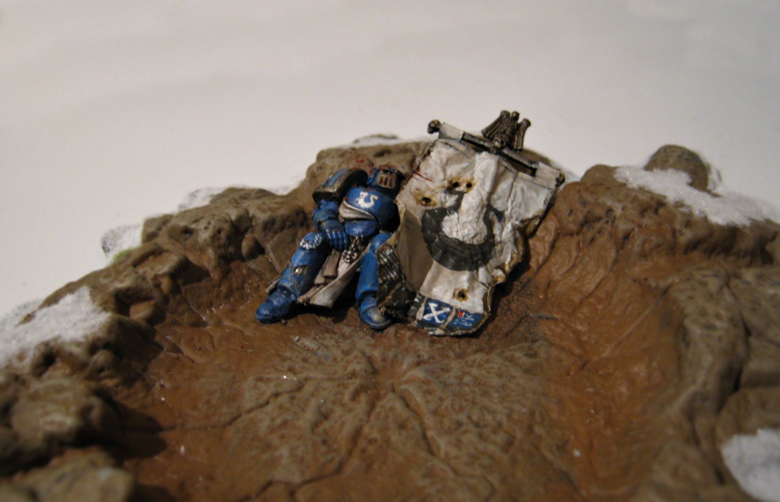
+ Small objectives at the size of single figures can look good, but objective markers can also be bigger terrain pieces in certain circumstances. This deceased Ultramarines banner bearer has collapsed into a large shell hole – a large centrepiece that has good visual impact.+ 


+ This approach gives you an extra piece of characterful terrain to play with later, irrespective of whether it's used as a gameplay objective or not. + 

+ What do you use as your objectives? +

Tuesday, September 30

+ inload: Skin tone recipes – pale skin +

+ Painting pale skin +

+ Tonal contrast is probably the most important thing to get right in creating a striking miniature. Hue is much less important. Because the eye is drawn to areas of contrast, it's often the case that pale skin is useful to help draw the eye and provide contrast with darker cloth/armour etc. +

+ For pale human skin, my advice is to mix a tiny touch of Blood Red and Yriel Yellow into a lot of white and use that for the base. Give it a glaze of yellow glaze (very dilute Yriel/Golden Yellow; or Gryphonne Sepia, if you prefer washes), then reapply the pale mix. Add more white and yellow to highlight overall, with the addition of a touch of red to the mix for the lips and cheeks, for these results:


+ I've added purple to the mix above the eyes for the suggestion of eyeshadow. I've found the trick is to be as subtle as possible – apply the real-world rule of makeup. If you can tell there's something there, you're doing it wrong! +

+ For a cooler feel – more appropriate for figures that use a cool palette, or if you want to suggest a cold atmosphere, replace the sepia with a purple glaze (dilute Warlock Purple, or Leviathan Purple if you prefer washes), and use less yellow in the mixes. This will give the following results:


+ Of course, the thing to remember about any paint recipe for skin is that it will result in a formulaic feel. This can give a uniform effect, which I usually feel is inappropriate for humans – we're all very different colours, even within ethnic groups. To get a natural effect across a group of miniatures, it's important to vary the mixes. 


+ The core advice I'd give for pale skin is that it is built from 95 per cent white, with tiny touches of yellow and red. By varying the specific colours you use – substituting the white for a cream or ivory, for example; or Yrial yellow for Iyanden Darksun, you will get subtly different results. This example uses Dheneb Stone in place of the white paint:


+ These skintones are just colours; so remember that you can use them elsewhere. They make nice fabric colours, for example. Alternatively, you can use them for non-humans. A good recipe I've found for a pale alien/elfen skintone is the following: start from a pale base of 50/50 white and Dheneb Stone with a touch of purple added, then add more white for highlights. Glaze with very dilute purple and glaze repeatedly with white for this effect:


+ To reiterate, this recipe isn't a be-all and end-all, but a starting point to achieve good tonal contrast. In the figure above, all the hues are very desaturated, but the tonal contrast between the pale face, hair and hands and the dark remainder of the model draws the eye to the focal points. This can also be seen on the end of his spear, where the blade and gem are very dark, and contrast with a very pale silver setting. +

+ Note also that I haven't used pure white or black anywhere on the model – they're just very dark (or light) tones. His blond hair (built from a mix of yellow and white) also shows that you can use light hair alongside very pale skin without losing the distinction between the two. +

Monday, September 1

+ inload: Worldbuilding – city streets +

+ inload: Worldbuilding – city streets +


+ Terrain can tend to take a back seat to building armies; but there's nothing better-looking in a wargame than two gorgeously-finished armies in conflict over a convincing set of scenery. +

+ Since building my board (noospheric inload link ref: http://apologentsia.blogspot.co.uk/2014/04/inload-worldbuilding-while-i-own-realm.html), I've been more keen to get some sets of terrain together for the boards. A couple of years ago I supported a Kickstarter for a game called Wolsung, produced by Micro Art Studios. I'm not that interested in the game (though I'm sure it's fun), but the scenery they produced was great – it has an alternative 19th Century industrial feel. This was ideal for me, as with a little forethought, it can fit nicely into 40k and Warmachine. +

+ The box that arrived has sat in my attic for a while, but with a spare evening, I sat down and began construction. My pledge bought me two buildings ('XIX Century Block of Flats'), two walkways, and some spare oddments that I think were part of the stretch goals. +

+ As a brief review, each item was supplied as a pack of MDF in shrink-wrap. The flats and walkways had a cover sheet, which included some very basic instructions. The pieces have been very thoughtfully designed, with a great compromise between decoration and utility. Even built out of the pack, there's a lot of potential variety. For example, the storeys of the buildings slot together neatly and solidly, and are interchangeable, so the two buildings I have can be assembled as one three-storey building and one bungalow, or two two-storey buildings. The walkways in particular are very modular. 

+ In terms of construction, the fits are neat and clean. I used a little PVA to hold together critical parts, but almost everything fits so tightly that this is largely unnecessary. For the most part, construction was quick and straightforward. While the instructions are very basic and a bit half-hearted – the market stalls didn't have a cover sheet included, for example – there's nothing here that can't be worked out by anyone who's done a jigsaw puzzle. Even if you do make a mistake, you can generally remove the piece with minimal fuss. +

+ As mentioned, the sets are well-designed both as single sets – the flats are detailed inside with optional interior doors and walls – and as a set. To illustrate this, the walkways are the correct height to marry up with the first floor of the flats; and the ladders from one set will join to the stairwells of the others. 

Despite some fairly fine and small components, the finished pieces look and feel sturdy, with jutting components kept to a minimum. I did break one of the walkway struts, but they need to be fine to get the effect (and also to be able to get fingers in when gaming). Overall, I was really pleased with them, and would thoroughly recommend them. +

+ Here's a picture of the whole set up, with a single 28mm figure on the walkway for scale:


+ As you can see, there's quite a lot of the board covered, and to a good height. This has long been the 'missing link' of a realistic set of urban terrain, and I'm sure the addition of useable vertical height (i.e. not just lone buildings, but connections between) will add a lot of tactical depth to our games. +

+ The modular ladders can be added at any position along the walkway. There's clearly been a lot of thought put into balancing the aesthetics of these terrain elements with practicality, and how they will work with figures. The stair steps/rungs are large enough to accommodate 30mm bases comfortably, for example, with spaces left between so figures can be balance safely instead of hanging precariously or having to be placed at the top or bottom of the stairwell. The walkways also have attractively-designed railings that are anonymous enough to work in a number of aesthetics while still being interesting. ++

+ This shot shows how the elements from different packs fit together smoothly. The 'water tower' on top of the building is part of the walkway set. The ladder from this leads down to the building, where a soldier can either fight his way down the stairs into the building, or slip down the fire escape to the balcony. From there, he can jump onto the reinforced wall (another stretch goal separate pack I'd quite forgotten was included), where he can either jump down to ground level or gingerly edge his way along to the walkway; vaulting over the railing for cover. +

+ The walkways are a good height – again, clearly well-thought through at the design stage – combining realism and detail with accessibility. In a detailed skirmish game, I imagine a fit 28mm soldier could jump up to the lower ironwork and clamber up to the railings. All this sort of material increases the tactical possibilities. Big armoured walkers are scary, but if they can't fit through tight gaps, maybe you should send in the skirmishing light scouts? 

+ This shot also shows the care taken in designing the flats – you can see one of the small cellar windows/drainage gutters at the lower left, and the laser-cut detailing on the wall panelling. It's this detail that makes me give this the thumbs-up, and really shows one advantage of commercially-bought terrain – while it'd be possible to cut these details by hand, it'd be awfully time-consuming. This set has enough detail that I feel I'm getting my money's worth: while it's not as personal as something I've hand-made, the time saved makes up for it. +

+ A model's-eye view of the market stalls. These were very much an afterthought – as freebies, I wasn't that taken with the design, and very nearly put them to one side to assemble later (i.e. lurk in the Cupboard of Shame for another few years). How glad I am that I did construct them! They fit neatly against the walls and add some all important human interest to the area. This is something that's missing from a lot of terrain set-ups – the sense that it's a real city or location where people live, toil and love. These abandoned market stalls are really lovely reminders, as well as providing a bit of variety (and cover!) to the buildings. + 


+ In the foreground here are a couple of resin piles of crates, barrels and sacks, another free stretch goal. Single-piece castings, they feel very sturdy and solid. The larger double-sided market stall is visible in the midground. These pieces did require assembly with PVA glue – they don't slot together as solidly as the walkways and flats. +

+ As you'll see from the photographs, even unpainted these have a nice look to them. They'll be improved with brushwork and basing, but the clever use of laser-etched detail alongside white balsa and the dark burnt sides of the MDF means you could go straight into a game quite happily. +

+ Overall, I'm happy to give these three mechadendrites up, and I'll certainly be shopping from Microarts Studios again. +

Friday, August 22

+ inload: Legio Validus +


+ Titans are awesome. The Reaver was always one of my favourite models. The one above is the classic GW lead Reaver. +


Thursday, August 14

+ inload: The Oldhammer movement and Epic +

+ inload: The Oldhammer movement and Epic +


+ I'd heard of the 'Bring Out Your Lead' weekend held up North – neatly summed up and reviewed by Orlygg [+noospheric inloadlink embedded+] – but until I came to catch up on some blog reading, I hadn't realised how many of the writers and artists I follow were going. What an event! I'd be very keen to pop along to a future version to meet up with some of the noosphere's luminaries and fellow enthusiasts. I'll cross my fingers and do some work to see if some warp entity'll send an invitation :) +

+ One of the games particularly interested me, and that was LegioCustodes' of Oldhammer 40k [+noospheric inloadlink embedded+] Epic-scale work. Really fantastic (got and have a look at his Flesh Tearers), and got me fired up with the Epic bug again. +

+ I thought I'd dig into my bits box and paint up some Word Bearers. I've been umming and erring about painting some Renegade Marines for a while. They've got a number of advantages:

  • Classic red scheme to indulge some John Blanche inspired techniques.
  • Opportunity for a lot of variation.
  • Good excuse for lots of different styles.
  • They're baddies, so there's more narrative possibilities when facing the most common armies (loyalist Space Marines).
  • They tie in nicely with my Ultramarines army and joint-blog with Doghouse, furthering the Calth theme.
+ Anywhere, here's the first group, including a motley mix of Epic marines – third-party troopers, some from the awesome plastic Epic 40,000 sprue, and a veteran lead Rhino of the Long War (the 90s).


 + I decided on a deep red (Blood Red over a yellow base with purple and black washes), and added silver shoulder pads to distinguish them from Blood Angels. +


+ The Rhino got boltgun metal doors to echo the shoulder pads of the Chapter. +

+ I haven't got an army list or anything worked out. I'm just going to paint up the bits I have, and then add some stuff until I'm happy. While I'm most likely to use these with the Epic: Armageddon rules (because they're brilliant!), I want to just let these grow organically from stuff I'm enthusiastic about, in the grand tradition of my younger self! +