Showing posts with label balance. Show all posts

Wednesday, February 26

+ inload: Legion symbols and finishing +

+ Betrayal at Calth +

+ *Phew!* That's a wrap – on mission one, at least. Last night I finished re-basing and detailing the squads of Ultramarines and Word Bearers that I'll need for mission 1 of Betrayal at Calth. Now just to find someone to play it with! +


+ Next up for this project – well, after a game, that is – will be Captain Aethon and five Terminators. I'll be making a new model for Aethon, but the Terminators will be a sprucing-up and repaint of my old Novamarines. Painting up the bits for this boardgame is proving a very enjoyable way of consolidating lost projects and satisfying random bursts of enthusiasm... +

+++

+ Your army, your way +

+ In fact, the project is helping me to further shake off the idea of a set of models 'for one army, for one game'. A few years back, I was used to collecting X points-worth of models, generally to a set army list. While this was great for getting stuff done – far less faffing around in my painting then than now – the result was that I always felt a bit restricted, and had a sense that the lists and model selection needed to be polished, or optimised, or refined. Today, I find it better to run with my enthusiasms and spend that time refining and polishing on the models themselves – whether sculpting or painting. +

+ Of course, there's nothing wrong with painting/collecting for gaming in and of itself. Playing competitive or Matched Play style games – and not just 40k, of course – you'll need to toe the line on what you add to your force, and that makes for hard decisions. However, I think the principle of such restrictions apply so far across the tabletop wargaming world that it's become a de facto standard – and that is a shame. I'm a firm believer that there's no right way to play, but when discussion is predicated on tabletop efficiency, rather than that being one of a spectrum of considerations, it's restrictive. +

+ Models built purely to look how I wanted have turned out to be surprisingly (and fittingly for Ultramarines) flexible in gaming. +
+ Using 40k (and 30k) Space Marines as an example, we've seen the premier weapon choices alter from one edition to the next as the rules altered – five man squads with lascannon and plasma gun in 3rd, through to grav cannons in 7th, for example. Again, that's not a problem, but it's a shame when such choices become exclusionary, to the detriment of the visual appeal. I don't think heavy bolters and chainswords have ever been the tournament players weapon upgrades of choice, but they certainly look awesome! +

+ With this in mind, building models with a certain look in mind – rather than a certain game effect – is a good way to surprise yourself. It's an approach I took with my Ultramarines years back, with the happy result that they've remained largely 'edition-proof'. By using restrictions given by narrative and aesthetic – i.e. getting ideas from stories and artwork – rather than by rulebooks and weapon tables, I've ended up with a force that is versatile enough to be usable in virtually any game – from enormous 40k or 30k games to tiny skirmish (or even tabletop roleplaying) games. +

+ Sergeant Aquilla leads his men through the ruins of Numinus City, avoiding TItans of the Legio Suturvora. +
+ I'm likely preaching to the choir here, but I do want to be clear that I don't see any problem with gaming competitively, or in equal points matches – those can be great fun. My point is not only that you don't have to play like that, but that there's a huge world of opportunity and cool games to be played beyond the symmetrical. +

+ In fact, even if you're a dyed-in-the-wool competitive tournament player, you've certainly used a number of forms of imbalance:

  • Asymmetrical table setup
  • Different army lists
  • Different missions
+ These things are built into Matched Play, but they are at root part of the broader scope of playing – in its truest sense. GW provide rules that attempt balance, but they're ultimately never going to be truly fair: that's why there's such an emphasis on discussion with the other player, and the collaborative nature of tabletop gaming. There is an 'inherent social contract' – but really that's just jargon for playing to ensure everyone has fun. +

+ Anyway, back to the models. I'm not suggesting that it's for everyone, but if you are tempted to build or paint something a bit off-the-wall, then go for it. You might not find what it's useful for for ten years – but by then you'll likely have a whole cast of such figures, and that's given you the props you need to tell all sorts of cool stories. Good luck! +

+++

Thursday, May 16

+ inload: Creating an army of your own II: Heraldic paint schemes +

+ Creating an army of your own – part II: paint schemes +


+ This is the second part in a series of articles on creating and developing your own personal army. Part I can be found here: [+noosphericinloadlink embedded+] +

+ In the previous inload [+noosphericinloadlink embedded+], we looked at picking a name and generating the seed of a culture for your army. This theoretical work then led into you building the first model of your force. +

+ In this inload, we look at what can be the first big stumbling block in creating your own army: coming up with an effective scheme. +


+ Noosphericinloadlinks +

I – Invitation and overview
II – Paint schemes and heraldic schemes 
III – Muted schemes
IV – High impact schemes [This inload]
V – Analogous schemes [Spooling]
VI – Enemies and allies [Spooling]


+++

+ Choosing an effective paint scheme +

Whether you're a beginner or award winner, and whether the piece is intended for the tabletop or a display case, a strong paint scheme will improve the appearance of your model. The choices of colour will, of course, depend on your taste, but the sheer breadth of possibility can be daunting. Where do you begin?

Colour theory is a huge, complex and contentious subject, so the first thing I want to do is set out some limits to give us a framework. Over the next couple of inloads, we're going to look at four broad types of paint scheme: heraldic, muted, high-impact, and analogous; each of which has their own set of guidelines that make them very useful to generate ideas.
  • Heraldic – Inspired by traditional heraldry, these schemes are defined by vibrant primary and secondary colours laid out with clear structural rules that you define. 
  • Muted – Using naturalistic and often earthy colours, muted paint schemes make a virtue of subtlety. 
  • High-impact – The polar opposite of muted schemes, high-impact schemes bring instant clarity and definition to miniatures. 
  • Analogous – This sort of colour scheme makes use of closely-related colours to give a harmonious effect.
For each type, we'll look over some specific examples, then consider why – and how –  you might choose a particular paint scheme type for your own personal army. The example Gatebreaker model I've used below is intentionally work-in-progress, as I want the emphasis to remain on the basic paint scheme for your force. I'll develop my basic scheme – along with yours – further in a future inload; where we will look more closely at how we can use our 'culture seed' to inform and develop the basic scheme into something with more atmosphere and character.

+++

+ Painting models and painting armies +

Before we begin, I want to make it clear that the advice below is necessarily limited. Each of these approaches has its own set of advantages and disadvantages, so from the start it's important to know that there is no single right answer to getting a good scheme. The guidelines below are artificial limits to help you find a handle on how you want to paint your force to make it personal and distinctive.

Secondly, this isn't primarily advice on how to apply paint. While I outline how I've painted the example figures below, the aim is not to show you how to paint, but what to paint. Your painting techniques and style are key to giving your models character, so the key advice here is really hung around answering the questions of 'what colours do I use, and where do I put them'?

Finally, I want to arm you with techniques that work both for single models and can scale up to a whole force; so I've included information that will help you apply the schemes to infantry, tanks and monsters. Whether you choose to paint just that one figure you built last time, or go on to build a bigger army, this article aims to help give you striking, distinctive and personal models.


+++

+ Heraldic schemes: Theoretical +

These schemes typically involve bold, bright areas of rich colour and marked contrast. Different areas are strongly delineated; either by the physical structures of the model (i.e. gaps between armour plates are obvious), or by freehand work. Heraldic schemes typically make use of primary or secondary colours; which are consistent across the army.

The GW studio Space Marines and Eldar are good examples of heraldic schemes. Infantry and vehicles share the same bold, saturated colours; and the placement of those colours usually follows some sort of pattern – helms are one colour; trim another etc., for example. Even less brash armies, like the Black Templars Chapter or Ulthwé Craftworld, are examples of heraldic schemes.

+ Iyanden Craftworld: an example of an heraldic scheme using
bold blue and yellow +
The specific hues you choose are largely unimportant for this type of scheme – almost anything can work as long as they are distinctly different in tone and applied relatively consistently. The scheme I have chosen for my Gatebreakers is an example of an heraldic-type scheme:

+ First steps: Gatebreakers colour scheme +

It gives equal weight to two colours, yellow and green, which are our dominant colours. In addition, we have an accent colour – purple. For the work-in-progress piece above, the accent colour is used just for the eye lenses. Note the proportions of the colours. The yellow and green cover equal amounts of the model's surface, while the accent is restricted to a very small area. 

Dominant colours should be just that. Using too much of the accent colour will confuse the eye and spoil the effect. A good rule of thumb when painting an heraldic scheme is to default to your dominant colour(s) when working out what colour a part should be painted. Only use an accent when you can't avoid it.

You'll notice that I haven't counted black amongst the colours used. That's because black (and white) are not considered as part of the scheme. Instead, they're treated as very dark (or very light) tones of the scheme colours. As a result, black and white can be used freely in any heraldic scheme. Think of them as 'freebies' and problem-solvers (we'll look at how they can be used below). 

+++

Heraldic schemes need at least one dominant colour. This can be anything, but for the best effect, pick an eye-catching colour rather than an earthy or muted colour. The primary colours of paint: red, blue and yellow, work well as dominant colours. Bright secondaries – purple, orange and green – are usually bold enough to work as dominant colours, too. Look for vivid, saturated colours, rather than desaturated (pastel) colours. For example, GW's Caledor Sky is a saturated blue, while Hoeth blue is desaturated.

 + The Eldar suit heraldic schemes very well; the tight restrictions
tying into their highly-regimented culture. +
Next, you need to choose whether you want to use more than one dominant colour. A co-dominant colour is given equal weight to the first colour, and is essential for halved or quartered schemes. I advise against using more than two. The more co-dominant colours you use, the more complex the interactions, and the less impact the scheme tends to have; instead disintegrating into visual confusion.

+ Novamarine: Co-dominant blue and white: purple accents. +
When choosing co-dominant colours, they should be markedly different. If they're too similar, you won't get the necessary impact. Holding the two pots up and seeing how they look together is a good, simple way to make an assessment. Another approach is to use the complementary colour to your first dominant colour, as these will always contrast strongly. Red and green are a complementary pair; as are blue and orange; and yellow and purple. Don't be restricted to these classic pairings, however. More unusual pairings are a great way to get some distinctiveness into your scheme. Your favourite colour is always a good place to start!


If you have just one dominant colour, you can pick a subdominant colour using the same approach as for a co-dominant colour. Subdominant colours are used for smaller areas than the dominant colour; and serve to prevent the scheme being monochrome. They should be applied sparingly, and act to support the dominant colour, not distract from it. Co-dominant schemes can involve subdominant colours, but don't need to, as the second dominant colour generally tends to do the same job. If you choose to include one, make sure it works with both co-dominant colours.

+ Scarlet Blade: Dominant orange; subdominant White (legs); red accents +

The final stage is to pick an accent or two. They are used in tiny areas to jump out – just as your final highlights draw the eye due to being different in tone; so accent colours jump our because they are different in hue.

If you have just one dominant colour, the accent can be almost anything as long as it's markedly different from the dominant and subdominant colour. Co-dominant schemes should have accent(s) that differ from both co-dominant colours. This ensures that eye lenses (for example) painted with the accent colour will 'sing out' from both sides.

+ Blood Angels: Dominant red; subdominant yellow/gold; accent blue +
+++

+ Heraldic schemes: Practical +

When choosing your colours:

  • Consider the culture  Heraldic colours aren't picked randomly. They will be invested with symbolism that is pregnant with meaning for your character or force. Spend a little time thinking about what the colour means to them. Perhaps a hive city army picks 'sky blue' as an aspirational colour, a symbol of the ideal, rather than reality, of their polluted homeworld. 
  • Pick pot colours  This stops you having to mix the colour every time, which is both a timesaver and will help you get a consistent colour across the force – important for a finished heraldic effect across a whole force.
  • Take a chance on something unusual  It can be difficult to avoid using colours that you've seen elsewhere, but this is a real shortcut to getting something distinctive. Purple and orange, in particular, are underused colours for forces like Space Marines.
  • Pick something you like  This may seem a bit obvious, but there's no point picking a scheme that ticks all the theoretical boxes but leaves you cold.
  • Make a list  Always useful, but particularly handy for heraldic schemes as they rely on consistency across the force for impact.

+ Applying the paint+

With our scheme chosen, we now need to work out where to place the various colours on our model. If your scheme has just one dominant colour, it should be used for the bulk of the model – basically, anything that can be painted this colour, should be. If you are using co-dominant colours, they should cover a roughly equal amount of space.

Beyond this, spend some time thinking and planning before you begin. These heraldic colours don't just look good; they have significance to the character. In-universe, these colours will be important to the force or character, so will be reserved for important areas. You are more likely to see the heraldic colours on shields, ribbons and such-like, not on pouches, baggage and degradable areas like weapon blades.

  • Avoid breaking up your scheme too much  Split schemes such as halved or quartered are already visually complex. Complicating it further, by breaking it up more (having knee pads different from the rest of the leg etc.), is an easy way to lose impact.
  • Get the proportions right  Accent colours should generally be used where things look odd in the dominant or subdominant colour, and the subdominant colour should never take over from the dominant colour. A proportion of 5:3:1 of dominant:subdominant:accent is a good rule of thumb.
  • Outline  Creating visual breaks lets the viewer's eye rest. Black-lining is a technique that's fallen out of fashion in miniature painting, but it's quick and great for breaking up large vivid areas.
  • Respect the heraldic colours  Don't paint disposable or mass-produced items like grenades or ammunition with the heraldic colours – reserve the heraldry for well-respected and culturally important elements like armour and banners; and use neutrals, black, white or metallics for such disposables.

For my Gatebreakers, I chose Flash Gitz yellow, a vivid, saturated and cool primary as my first dominant colour, and Warpstone Glow; an equally vivid cool green as the co-dominant. The grass green and sun yellow were informed by the cultural seed I created; but – more importantly to me – they looked good together. Although both are given equal weighting, I applied the yellow first, on the basis that green covers yellow better than vice versa. Use your first model for such experiments.

+ Gatebreaker basic colours +

I chose a quartered scheme, which is a simple way of breaking things up evenly. However, you can be much more ambitious. My Whisperprince, below, is an example of a complex co-dominant heraldic scheme (purple and crimson). The colours are used both on their own and blended together on the banners; but the balance is such that both are given equal visual weight. A subdominant neutral beige is used for much of the equipment.

+ Whisperprince +

Note that the rest of the scheme is stripped-back. The armour is black, the skin is near-white, and the parts where I could have used accents (hair highlights, jewel) instead use variations of the dominant colours.

+++

+ Consistency and variety +

Most Space Marine heraldry is usually uniform across the army – that is all Novamarines will have a white upper right quarter and a blue upper left quarter, for example; but heraldic schemes don't necessarily need to be uniform.

Understanding this is vital to ensuring you are in control of the paint scheme, and not held hostage by it. For quartered, halved or similar split schemes, the same rules can be applied:
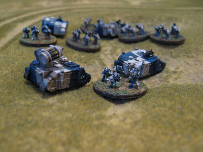

+ Novamarines infantry and vehicles +
... but this is not always the case. If your first figure is painted with a red arm, you know that the next infantryman needs a red arm. This can be applied to other, similar figures – Dreadnoughts, for example, can easily be tackled with the same 'rules'. What, however, do you do when faced with a Rhino?

As long as you keep the proportions of the colours right, you can paint different parts of your force in very different ways. This is a fantastic way to keep your interest up for the whole army, while ensuring visual coherence across the force. Knowing that it is the proportions and not necessarily the placement of the colours will allow you to tackle a vehicle as easily as a second infantry figure. 


+ Brown and blue-grey co-dominants make an unusual harmonious pairing.
Although split in quite a complex way, and differently across the models,
note that they are still used in roughly equal proportions in both cases. +

+ While a very different shape, the Falcon grav-tank here can be tackled
 easily by keeping the proportions of the co-dominant colours the same.

+++

+ Universal principles for paint schemes +

I've looked into heraldic schemes in quite some detail here because they lend themselves well to analysis. I'll cover the other types of scheme – muted, high contrast and analogous – in a follow-up inload soon, but to close this inload I wanted to talk about a few universal principles of getting a good result.

Part of the appeal of making your own army is simply doing something a bit differently; and I encourage you to pursue that way of thinking for your paint scheme – imagination will always trump theory when it comes to personal taste. However, that's not to say that theory is useless. Awareness of the following will help you to achieve a good result; if only to help you head off common pitfalls.

+ Tonal contrast +

A strong scheme will demonstrate contrast in tone (the relative lightness or darkness of a colour). A model should have both light-toned and dark-toned areas; though whether these are within a single colour (i.e. an area that goes from light blue to dark blue), or across the scheme as a whole, is not important.
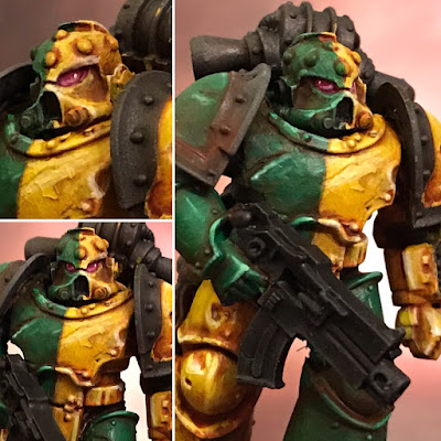
+ Gatebreakers in colour +
Note that each area is highlighted and shaded individually; it's not just the differently-toned base colours doing the work.

+ Reduced to black and white, the scheme is still rich with impact. +


+ The importance of leaving gaps +

Breaks are important in a colour scheme. If everything is clamouring for attention, the scheme dissolves into confusion. Similarly, if everything is muted and hushed, the scheme can be hard to read. Leave visual gaps to punctuate your scheme.


+ Flat yellow is broken up with contrasting bold blue stripes. +

High-contrast lining and edging prevents this ivory-white scheme
from blurring into a boring mass. +


+ Lead the eye +

Your scheme should let you lead the eye to the point you choose. Well-chosen accents and subdominants allow you to drive the viewer's eye to parts you choose.

+ Black-skinned, bright-armoured Salamanders provide
a challenge – how to draw attention to the face? +
The red salamander skin cloak surrounds and leads the eye to an otherwise muted face. Note a hint of the same colour has been used in the cheek – joining the otherwise muted face to the bold rest of the scheme. 


+++

+ Practical +

If you've opted for a heraldic scheme, get on with painting that first model you built after the previous inload; then please do share your results (both models and cultures):
+++

Tuesday, January 22

+inload: Painting The Sons of the Temple +

+ The Sons of the Temple: picking and executing a paint scheme +


+ Restarted painting Legio Nikator last night, which involved getting a bit experimental. When you're making your own paint scheme – and if you never have, I thoroughly encourage you to try it – it's fun to push yourself and try some new techniques. +

+++

+ Old Spiteful +

+ I started with the old man of the Legion, 'Old Spiteful'; more properly known as Senex Codomannus. After undercoating him black, I did a quick drybrush of Boltgun Metal across the superstructure to give that a base, then began work on the armour plates. I used Solar Macharius Orange for this. It's one of the Foundation series of paints that I never found a use for, but's a lovely soft orange that worked wonders as a base for terracotta. +

+ I began with the carapace, and started working down. +
+ After getting a lovely smooth finish' highlighted up with the addition of Averland Sunset, I then [SCRAPSHUNTERRORABORT]ed it up with a combination of sepia ink and granulation medium. This... sort of worked. Sometimes experimentation gives great results; other times not so much. There's something I like about the effect, but I'm not quite sold yet. +

+ This may be an example of 'mid-piece funk' – that feeling you get halfway through a painting when everything looks a bit messy and disjointed. It can be disheartening; but if you push through, you sometimes find that you end up with something you're really pleased with. Of course, sometimes it just ends up a bit crap – but you can always repaint it. Push on!+

+ A little later on +
+ Picking out some highlights [+see pictcapture above+] gives form to the damage – though I feel the marks are too large at the moment, and may need tightening up with more of the base colour (Solar Macharius Orange). +

+ The white areas are Vallejo's Off White – it's best to avoid pure white on figures of this scale, owing to aerial perspective. This is the effect of the dust and so forth in the atmosphere that makes things look bluer the further away they area – as a result, the tonal range needs to be slightly shortened – slightly deeper highlights, slightly more tinted darks. +

+ The effect of the medium is clear on the loin armour. +

+ If you're never tried granulation medium, it's a fantastic – if largely uncontrollable – way to create texture. The medium causes the pigment particles to cluster together, drying in a patchy, slightly blotchy way. It works best with inks, particularly naturally granulating ones like sepia and Payne's grey, as the suspension is looser than in (say) acrylic paint. If you do use it with paint, then dilute only with the granulation medium – don't add water too, or you'll lose the effect. +

+ Picking a colour scheme – or, the joys of homebrew +

+ Picking your own scheme gives you a lot of freedom, and the opportunity to make your figures more personal to you.  The low number of models in the game makes Adeptus Titanicus a brilliant choice for trying it out. +

+ A simple way to start is by picking a main colour – this can be literally anything. I plumped for an orange-tinged terracotta. Once you've picked that, select a secondary colour. This is where the challenge starts. Some colours clash – by which I mean that they just don't work well together; either blending into one another, or setting off disharmonies. +

+ To avoid this, consider choosing a complementary colour, which can be determined by its position on the colour wheel. Red is opposite green; yellow is opposite purple, and so forth. A pair of complementary colours will always look good in a scheme. In my example, the orangey terracotta is opposite blue; so I could use that as my complementary as my secondary colour. +

+ Harmonising or analogous colours – those immediately next to your initial colour on the wheel – will also work well. Orange is next to red and yellow; so both of those could work. +

+ You can also try a split complementary scheme. This is a bit more complex to explain, but essentially involves using the colours that are analogous (i.e. adjacent to) the main colour's complementary. With orange as my main colour, blue is the complementary. Next to blue on the colour wheel are blue-purple and turquoise-green. +

+ If you're struggling to find a secondary colour, you can't go wrong with black or white. These paints will always go well in a scheme. +

+ The next step is to make sure the tonal contrast is good. While you can push both your main and secondary colours to different shades and tints, at the simplest level, it's just a case of picking an inherently light secondary to go with a dark main colour – or vice versa. + 

+ Solar Macharius Orange is a midtone – neither particularly light or dark. Since I plan to highlight it up, I want to pick a secondary that can be shaded down, so that the result is light orange against dark secondary. +

+++

+ As with the crew – Princeps Teutates Polassar is shown here for reference – I'll be using Hawk Turquoise (and how the PCRC laughed) as an accent colour – if you don't have access to a colour wheel for complementaries and harmonies, try a noospheric search [viz: Google it] it. +

+ Home decor is a good place to start when searching for colours that will go well with your chosen main colour; though bear in mind those schemes tend to be tasteful and restful, rather than warlike and boisterous. I often look at mediaeval heraldry and banners for colour ideas, as they fit my idea of the 41st Millennium. +

+++

+ In the forges: Gaugamela +


+ Another Warlord is primed and ready for paint – I've just got to make sure that the scheme works! +

Thursday, March 22

+ conceptinload: Style, balance and what makes an icon? +

+ Stylistic balance +

Waa-ork!
+ This sub-project of the Alien Wars invitational is a little unusual, as I'm aiming to create affectionate homages to the Rogue Trader era; just as my Blood Angels [+nossphericinloadlink embedded+] are based on the models from White Dwarf 139. +

+ In order to achieve this, I'm having to make quite a few decisions on which parts to emulate, which to duplicate, and which to drop. This is, necessarily, a personal decision. Were you to do a similar thing, I expect you'd find different elements more or less important; because different things appeal to you. +

+ Theoretical +

+ This brings me to a few concepts to identify: style, balance and 'iconicity' (for want of a better term):

  • [Style] We looked at this in an earlier inload here [+noosphericinloadlink embedded+], but in short it's your natural, instinctual way of working, as a result of your conscious and unconscious preferences.
  • [Balance] This concept comes into play when you've got a definite aim in mind. The result will lie on a spectrum between an identical copy and something so different as to give no obvious points of comparison. 
  • [Iconicity] The quality that makes a model (or other object) recognisable as itself: the 'basic characteristics', rather than the specific details. This is the quality you're hoping your version will share, even while being its own thing. A good homage will capture distinctive elements of the original's design, style and appeal. 
+ Thus, any attempt to emulate an existing model will give a result that – ideally, at least – is recognisable as your stylistic take on an existing model. This might seem a bit high-brow for orks (Oi! Yer zogger), so we can simplify things by putting the jargon aside and asking ourselves 'Does my model remind me of the original?'; and secondly 'Does my model remind me enough of the original?' +


+ Practical +

Thrugg, not too happy about posing for us.
+ This all becomes a bit clearer when you see it in context. We've looked at Thrugg [+noosphericinloadlink embedded+] before, and he's a good example. No-one is going to put the original next to my version and think they're literally the same; but there's enough iconicity in my version to remind you of the original. Once you're in that mindset, your eye will start seeing other similarities – and differences – that hopefully make the model enjoyable to look at. +

+ In terms of style, I think he reads as mine – if you're familiar with my painting and modelling style, you'll spot the dreadful errors palette choices and similar. +

+ The balance, then, comes in the gaps and similarities between the Kev Adams original and the choices I've made for my Thrugg. That simultaneous sense of familiarity and novelty is at the heart of this project, and why I hope that it's activating a few readers' nostalgia glands. +

+ It's worth noting that my choices are necessarily coloured by the raw materials I've chosen to use. Not having the sculpting chops of fellow PCRC member Lord Blood the Hungry, for example, I'm using Brian Nelson's ork models as the basis of the conversion. These models themselves are a great example of how one artist (Brian) has made the models simultaneously distinctly his own, and retained enough iconicity that they are familiar. +

+++

+ Balance in a group +

+ I've inloaded before about the considerations and differences there are between individual models and groups of models, and this project is a good example. The group below contains two models that are directly based on figures from the RTB02 Space Ork Raiders boxed set [central squad leader and the ork on the far right with a neckerchief]. The others are looser interpretations of the same range of models. +


+ In isolation, the remaining orks would not necessarily have the right amount of iconicity. An enthusiast or collector familiar with the originals might get a few of the RT-era nods, but they're much more vague and less obvious: here the balance is swinging more towards the modern ork aesthetic. In the context of the more iconic conversions, however, and with a cohesive paint scheme, the familiarity those individuals engender spreads to the whole group. +

+ It's worth bearing this in mind when working on your own groups of models. More broadly, iconicity applies beyond the physical models – you expect a Space Marine in a written story to behave in a certain way, and if they're breaking the stereotype for a narrative reason, they'll retain some elements of this important iconic quality. This broader application of the iconic quality leads into the theme of the army. A theme of any sorts works best when you restrict yourself to certain choices. Once you add a tank into a Space Hulk-themed project, for example, you've seriously impaired the iconicity of the theme. +

+ That's not necessarily a bad thing – distinctiveness is part of what makes things original and creative. However, if you strip everything iconic from a model or a group of models (or a paintscheme, an armylist theme etc...), they won't have any familiarity for the audience, and you'll have to rely entirely on other elements of the piece to create interest. +

+ [APPENDNOTE: Perhaps a good example of this within the hobby is retconning, or redesiging things. A good retcon or update will nod to certain familiar elements, while tweaking others. A bad retcon will lose the iconic appeal. I guess we'll see where the new Sisters of Battle range announced today fall; but on a personal note, I'm quietly hopeful! [/APPENDNOTE SURCEASE]+

+++

+ Orks inbound! +

+ We looked at Hruk in the last inload [+noosphericinloadlink embedded+], so while he's now completed, I won't go into too much depth. Suffice to say that I've adjusted his arms to more natural positions, and he's got his weapons in place. All that remains is the paintjob. +

A slightly desaturated pict-capture for clarity; minimising the difference between the different materials
+ He's pictured in the pict-capture above alongside two new boyz, both of which require a little more greenstuffing, but are largely 'blocked-in'. I tend to treat building and conversion work just like my painting: add it in quickly and loosely, then gradually neaten and refine it until you start fussing; at which point stop. +

+ The central ork is carrying a rifle made from a Gorkamorka-era Grot blasta, of all things; which goes to show how weapon sizes have got more exaggerated over time. I think the size looks pretty good; striking the right balance for me between the over-exaggerated modern style and the RT originals I'm emulating. Getting a genuinely realistically-sized gun would have looked very out of place – it fits neither the classic style, nor the updated version; and thus breaks the iconicity of the visuals. +

+ The leftmost boy is based on the Trukk gunner's body. He's quite dinky compared with other orks, which proved a blessing in disguise for this retro-led project. Part of the appeal of the older metal models was their uniqueness and individuality. +

+ For all the appeal of modular multi-part plastics, you inevitably sacrifice some individual character. The old boyz, a sample of which are pictured here, are variously gangly, brawny, scrawny, big, skinny... None of which can be replicated in modular form without giving up that modularity.  +


+ The orks I've ringed here are ones that the PCRC encouraged me to have a go at recreating, when I put it to them. They're proving an absolute [SCRAPSHUNTERRORABORT] to do very enjoyable challenge! To put the ideas about iconicity, balance and style into context, can you tell which of the three originals the WIP ork below is intended to be an homage to? +