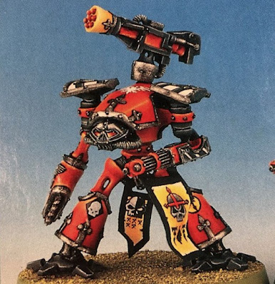
+ Heraldry and battered metal boilerplates +

+ The casting of propitious runes and god-engineering stumbles onwards as the time creeps closer to the Beachhead deadline. Today's inload looks at transfers on Titans, including bimblings on varnish. +
+++
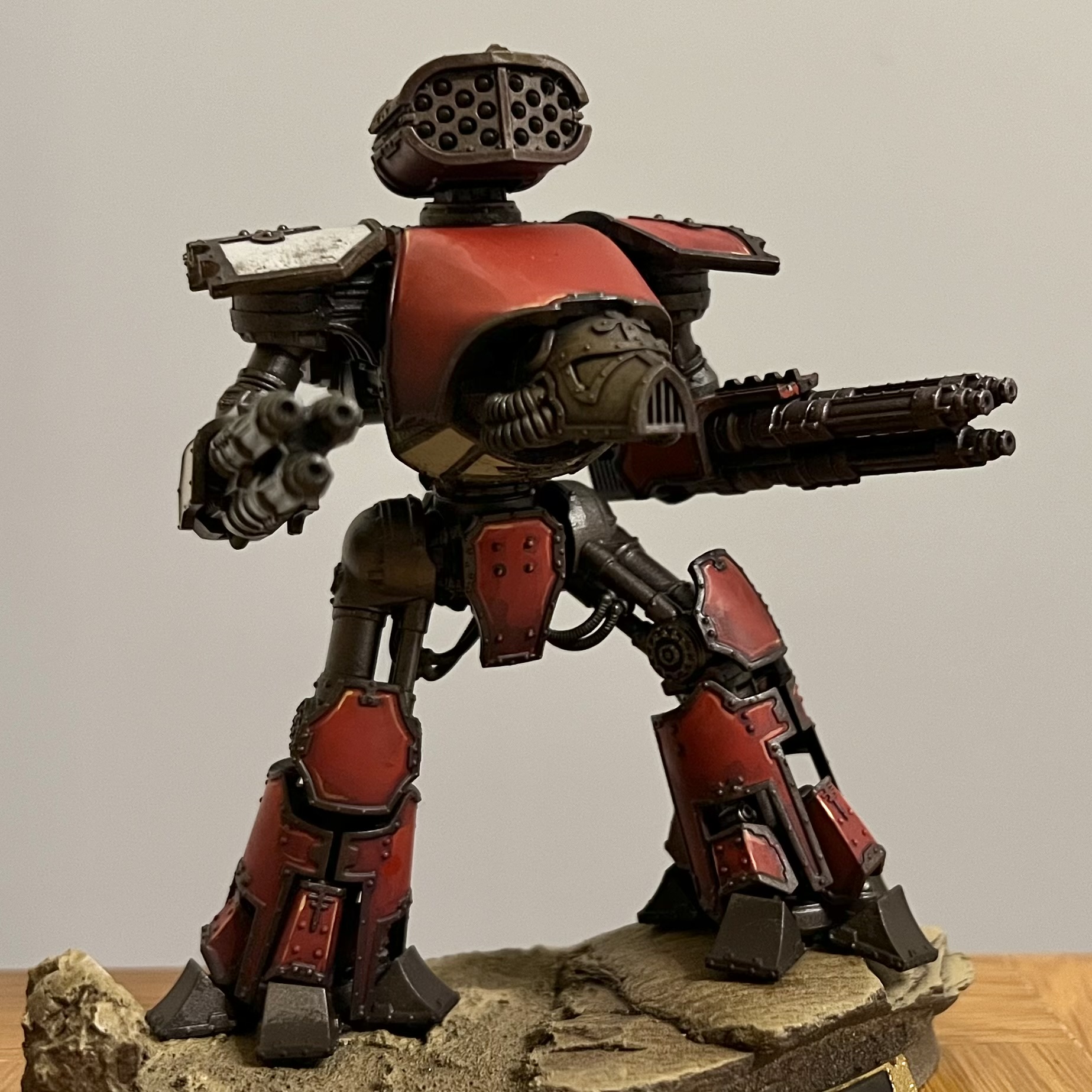
+ Titan Maniple +

They're getting there. Slowly but surely, every day brings completion that little bit closer. I just hope it's in time! One weekend and sixish evenings to go, and still plenty to do to get them as I want.
With that said, they're at least playable at this point, so let's push panic to one side and enjoy the last steps. This inload [+noosphericinloadlink embedded+] has struck-through text to indicate which steps I've completed since then, and as you'll see it's mainly the banners left to go – though those will be finishing touches done after the oils washes are in place.
 |
| + Transfers in place on the shoulder, ready to be softened in and integrated. + |
+++
+ Adding transfers: theoretical +
I've used transfers here and there on different models and units, but generally prefer to freehand markings, as I enjoy the focus it brings me. For this project, however, I wanted to shake things up and try something new – and combining transfers and oils is something that I've rarely if ever done.
Having decided I was going to do it, I then needed to choose whether to use the iconographic or hyper-realist designs from the Metalica transfer sheet. I was really torn on this. On the one hand, the simpler icons seem more akin to practical markings to be used on an engine of war... but the more complex, detailed versions are more akin to devotional artworks that might appear on religious icons.
Since a Titan blurs these roles, I decided that it made sense to use the simpler stuff for more practical purposes: squadron marking and faction equivalents, which would be consistently placed lower down the Titans, so allies can quickly assess things in the fog of war. More complex, realistic artwork would be reserved for higher up the Titan, where such finery primarily serves decorative and heraldic purposes rather than practical ideas.

+++
+ Adding transfers: practical +
The process of getting transfers on is fairly simple:_i +Preparation+ Paint your model to a finish you're happy with (e.g. highlighted and shaded).
_ii +Protect+ Apply a varnish – I used Winsor & Newton Professional spray varnish (matt finish) [+noosphericexloadlink embedded+]. Gloss is probably better for this stage, as it creates a smooth, glassy finish that means the transfers lie as flat as possible. However, I didn't want to splash out for a second can of varnish, and I want a matt finish eventually.
_iii +Wetting+ Cut out the transfer (including the backing) and dip into the water pot. Let it get soaked, then place it on your palette while it loosens itself from the backing.
_iv +Solution+ Use a brush to paint Microscale's Microset solution [+noosphericexloadlink embedded+] over the area you want to apply the transfer.
_v +Placement+ Bring the transfer and backing up to the area, and use a clean damp brush to gently slide the transfer across into the correct position. Try to avoid any bubbles.
_vi +Patience+ Allow to dry thoroughly. The transfer will now be in position, but will look glossy and the edges will often be obvious.
 |
| + Transfer in place after stage vi – note the reflection of the light, and the circular shape of the transparent backing. + |
_vii +Repetition+ Apply a second coat of Microset, working outwards from the centre of the transfer, and leave to dry. The solution softens the transfer and helps it adhere to the surface.
_viii +Integration+ Once completely dry, use a clean brush to apply Microscale's Microsol solution [+noosphericexloadlink embedded+] over the transfer. This partially dissolves the transfer, helping it to settle onto the surface and look painted on.
_ix +Sealing+ Once that's completely dry, apply a second coat of W&N spray varnish, and allow to dry to finish.
+++
+ All over bar the shouting +
That brings us to this stage (well, step 8), and as you can see, the transfers now look more settled in. Of note here is the effect that varnish has on the metallics – the matt sheen kills the reflectivity of the metallics. The result's not unpleasant, but it's worth bearing in mind if you've spent ages working on the metals. For these, they've deliberately been left as basecoats so that I can develop them later on.

It's worth noting that transfers and freehand painting aren't mutually exclusive, and nor are you restricted to the designs on the sheet. The example above is a very simple example of this – before the transfer on the left knee (right of picture) was applied, I painted on a yellow circle that would fit within the cog shape. Since part of the transfer is clear, the yellow shows through and looks like an integral part of the design.

Key to my plan is that the designs evoked (or even matched) the original inspiration – another reason why I went for the simpler, more iconic designs from the sheet for these parts.

For the larger areas on the Warlords – the big shoulder plates – I've instead gone for the more detailed versions. Still in two minds about the decision, but he who hesitates is lost, and all that. Steel Hammer, above, has this large Legio symbol on his shoulder, and a similar variant on the other side.

+++
+ Painting nameplates +
But it's not all transfers. I've also been doing some building and painting. First off, I built Fors Clavigera an alternative missile launcher to better evoke the Barrage Missile Launcher of the original.The old models used the same weapons for carapace and arms (rather than having specific mounts for each), so as you can see below it's quite ungainly. I wanted to ensure it evoked the idea of the original, while having a similar feel to the other modern weapons.

I built it with a bits box dive. At the base is a magnetised Apocalypse Missile Launcher connector, so I can still swap it out if necessary. The mounting is from Battle Bling, and the larger parts are from the new Imperial Guard big artillery piece – one of the super-lascannons. This was trimmed down and carved into a shape to evoke the original.
The upper armour is from a Reaver Power Fist – I cut the central part away and married them together, while the part with a cable near the front is a Reaver close combat weapon upper arm. Finally, the missile piece itself is a Leagues of Votann (new squats) piece, given to me by TrojanNinja (thanks!).

I sprayed and basecoated it, then popped it in place to see how it looked. You decide – does it look about right?

Elsewhere in the maniple, Praeterita Carnivorus (Carnivore to his friends) has had the armour and lenses of the cockpit painted, ready for oils and trim:

You'll also note here that I opted to add a yellow transfer rather than paint his groin completely yellow (as in the original). Just like the alterations to the carapace stripes, I thought this was a better, less distracting compromise between the original and the retrohammer remake.

And I also spent an enjoyable few minutes painting the chequers on Old Three Skulls' Power Claw:

This involved little more than thinned Scorched Brown paint, a fine-pointed brush, and time. I'm still in two minds on whether to continue the chequers over the 'knuckles' or not. What do you think?
+++
+ Painting nameplates +
I also started putting the base paint down on the nameplates. These are from Obsidian Forge [+noosphericexloadlink embedded+], and will sit on the magnetised terminals that I made for the force, so it's easier for both me and the other players to track which Titan is which.
The first stages I've taken to paint them are:
_i Apply a brown undercoat – this gives a nice warm undertone.
_ii Stipple Balthazar gold over the whole surface. Make sure you get a nice thin coat over the whole surface, including in the recesses within the text.
_iii Work Seraphim Sepia wash into the recesses, leaving large areas clear.
 |
| + End of stage _III + |
More to come soon!