+ Flow, rhythm and composition: building for impact +
'I love the smell of Calth in the morning. Smells like... victory.'
+ What makes Space Marines look awesome? Puny hu-mans next to them. But why? In this inload, we're going to have a look at (artistically) composing your figures – and how that can relate to the (structural) composition of your army. The idea is to make an army that not only plays well, but looks cool. +
+ As an illustration here, the next three Word Bearers are on the painting blocks, and accompanying them are some 'blessed' unfortunates. We'll kick off here with discussion of composing a squad. +
+ Framing figures +
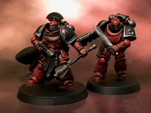
+ When building squads, I always have to restrain myself from making every model very different and individualistic. Such an approach works well for disparate bands of specialists (such as Inquisitorial henchmen) or ragged rabbles like orks, but with Space Marines, you risk making things look too busy. For this reason, it's usually worth including a few figures in fairly restrained poses, like those above. These work as a frame for your more eye-catching focal figures. +
+ Note that restrained doesn't necessarily mean boring or dull. While these two figures share a basic pose – advancing and attacking – one is reloading on the move. A simple addition that adds some flavour without grabbing the attention. +
+ Note also the variety in helmet and pauldron styles. The figure on the left is showing the incipient signs of the corruption that will envelop his Legion; two teeth emerging from the bottom of the pauldron. This is to provide a visual link between the cleaner lines of the plainer Astartes to the full-bore monstrosities of the Gal Vorbak-based figures [VISREF: Below]. I don't mind a little gap – after all, these are meant to be collections of survivors that have made it into the tunnels, so some distinction between members is fitting (not to mention more interesting to make and paint). +
 |
| + Word Bearer ripe in his corruption + |
+ Focal figures +
+ Of course, a frame's pretty boring on its own, so a good squad will have two or three focal figures. I think people tend to have favourite models; generally created without much conscious thought – some combination of bits just seem to work better than others. It's common to load up the sergeant or specialist with extra bits or otherwise lavish more time and energy on them. These are focal figures, they're the ones that the framing figures serve. ++ If I have a 'trick', it's simply that I'm just as likely to lavish time and attention on regular grunts as specialists. This fella's a good example. There's nothing inherently different about this figure, but I've selected the parts a bit more carefully, perhaps used some more unusual bits, and generally spent a bit more time composing him. As a result, he's more eye-catching and interesting. +
 |
| + This command group serve to frame the focal commander – but the framing figures aren't boring; just equal in impact to each other, and less than the commander. + |
+ Proportions are important here. For a disciplined-looking force, I'd suggest a ratio of 1:4 focal to framing figures – that is, for every focal figure, you should have four framing figures. For more rambunctious-looking forces – orks, harlequins and the like – a ratio of 1:3 or 1:2 is more likely to get the idea across. +
+++
+ Focal, frame and contrast +
+ Having looked briefly at how to make a striking group by distinguishing between framing and focal figures – now let's take that a stage further, and consider how that applies beyond the squad: across the army as a whole. ++ Contrasts, in hue or tone or size or shape – or any of a thousand other options – are what catches people's attention. Too much is overwhelming, too little is dull. When building a squad, we decide that some figures are going to be the focal points, and others will play a supporting role. There is a sense of contrast created between the two groups, but there's enough similarity between them to create a blend so they look coherent. +
 |
| + No framing/focal figures: All created equal – and thus no-one in particular grabs the eye. The group is elevated over the individuals – perfect for a team. + |
 |
| + It's clear here which are framing models, and which are focal. + |
+ Now, this is nothing new, and you probably already compose things unconsciously – those favourite models we mentioned earlier, for example. When building your army, we can just apply those same principles. Thus, when building a squad, we include some focal figures that are just a little different from the framing figures; and when building an army, we include some focal units alongside framing units. +
+ Composition and scale: Less is more +
+ Centrepiece HQs and tanks are a common concept – and they're an illustration of how the same compositional principles can be applied across an army. By including different squad types along with vehicles and characters, you create visual contrast. + |
| + The infantry and vehicles contrast with one another. + |
+ The same applies at 40k scale. Here, the Ultramarines squads have both framing and focal figures (an example of the latter is Holion sheltering Cassie at the bottom right) within them at a micro level. At a macro level – that is, considering the platoon as a whole – the infantry all become framing figures, letting the Predator tank and Dreadnought sing out. +
+ Of course, if you look more closely, you'll pick out the focal members of the infantry squads again – but the thing to take away is that the army works on two levels: micro and macro. The principles are thus scaleable, and this can be borne in mind to make a more striking army. By holding something back when creating framing elements, you naturally make more of the focal elements. Less becomes more. +
+++
+ Composition and rhythm +
+ Repeated elements form patterns. Frames turn out to contain focal features of their own. This concept can be thought of as 'rhythm'. A good painting – or army – has rhythm. +
+ Lucifer216's stellar Adeptus Mechanicus force is a great example of what I mean. Tanks and characters stand out from the infantry, but note that the infantry themselves are varied. Look closely (micro) and you pick out different squad types; but from tabletop (macro), the common palette helps them work together to frame the focal tanks and characters. Look at the tanks and characters as a group, and you'll see that the Dunewalkers cease to be the focus and instead frame the Archmagos. These overlaying points of view are an example of rhythm, and how it can be successfully applied to an army. +
+++
+ Theoretical: illumination +
+ Compare the two forces below. One is more carefully composed than the other. Beyond that, they're very similar – both include Primarchs, walkers and infantry, there's roughly the same amount of figures... but one definitely looks more striking – and it's nothing to do with the colours or quality of the paintwork, but simply how they're arranged on the table. ++ Low impact +
+ The Ultramarines here appear as an almost undifferentiated mass. There's no space between the figures on the board, so it's hard to pick out different groups. The naturally-focal figures – the Contemptor Dreadnought and Primarch – fail to stand out. +
+ Little rhythm is created, because there are no gaps; and little differentiation between frame and focus. Where focal figures do appear, they're swamped by the imbalance of framing figures, so the eye doesn't hop back and forth. +
+ A general sense of uniformity is created. Nice for certain effects, but it's not giving the drama we'd hope a game or display should have. +
+ High impact +
+ Rhythm is created by repetition – six groups of infantry; three robots; two rapiers. Within each group, there are points of interest. There are different types of infantry; differences in pose and armament of the robots. The eye hops, and lingers, and moves again. The mind recognises patterns and repetition. +
+ Whether in-game or simply for display, having a nicely composed army will improve the look of our collection. +
+ Practical: application +
+ All very well in theory, but what are some practical steps to we take to use this information? Here are some starting points for you to consider.- When planning your army, think in terms of focal and framing rather than 'normal' army composition rules.
- Decide what the main focus will be (i.e. pick a particular focal unit to be your centrepiece).
- Leave your centrepiece unique – don't have a competing figure.
- Maintain a proportion of at least three framing units to each focal unit. It's hard to have too much framing, but easy to have too many focal units competing for attention.
- Remember that framing units doesn't mean boring – they can be exciting and varied within themselves, too.
- Include a variety of sizes of figures – infantry, medium vehicles and large vehicles/infantry, cavalry, war engines.
- Within each group, aim to create internal variety, rhythm and repetition.
- Look at each unit from a micro perspective, and your army from a macro perspective. Does the balance feel right?
+ As in any analysis, these terms – rhythm, repetition, focus, frame – are simply aids to understanding. They're ways to help you identify and discuss things we often already know instinctively. There's no need to get caught up in them; but if you're trying to work out why your collection of beautiful figures doesn't quite hang together, you might look at your army composition. +


