Friday, April 19

+ inload: Third Company returns to base +

 + Blood Angels back on manoeuvres +


+ Had the happy surprise of receiving an email asking whether I'd be willing to put my Blood Angels [+noosphericinloadlink embedded+] on display up at Warhammer World again, as part of the White Dwarf issue 500 celebration. Needless to say that I'm delighted to do so, so keep an eye out for a squad or two appearing there shortly. +


+ While they're out of the case, and before I post them up, I thought I'd snap a couple of shots for the Ashes of Armageddon project – which, after all, was the storyline that hung around the force. +


+ I'll be posting up just a squad or two, so need to work out which ones would be most suited. Any thoughts? +

Wednesday, April 17

+ inload: Building Epic Land Raiders +

+ Notes on the Epic Land Raiders +

+ A box of the grandly-titled 'Legions Astartes Land Raider Proteus Explorator Squadron' arrived safely at my door yesterday, and I couldn't resist getting building. These are fun little tanks, but as I found a few little quirks in the build, I thought I'd flag them up to help forewarn other intrepid Enginseers. +

+ SCRAPSHUNTERRORABORT +

+ The key thing to note is that there are a couple of errors in the build instructions. Rest assured that these aren't at all difficult to overcome, but since it affects the numbers of some tiny fiddly bits, it's worth knowing. +


+ The error occurs in step 2a [+VIZREF: above+], where you're directed to put the tank's drive wheels into the side of the tank. To save you some searching, the part marked '8' does not exist (and nor does the corresponding piece on the other tracks). Presumably this component was adjusted to be built into the track unit at some point, and the instructions have not been updated. +


+ The numbering on the sprue and instructions therefore diverge from this point on. Component 7 (the Land Raider's left track section) is correct; but the Land Raider's right track section is actually component 8 on the sprue. Components 8 and 10 in the instructions do not exist. +

+ You can ignore steps 2a and 2b entirely. +

+ Once you're aware of this, the rest of the build proceeds as directed, except that you need to deduct two from each reference in the instructions to get the correct component number. Below is a marked-up copy of the final steps, with the correct numbers in red. +

+++

+ On the bright side +

+ The mistake is undoubtedly a minor annoyance when building, but shouldn't overshadow what is a lovely litle kit. The components are wonderfully engineered and go together well; the two-part top being a particularly interesting construction that literally locks together in a way I've not seen before from GW. +

+ Leaving the mistake in the instructions aside, these tiny Land Raiders are a treat to put together, with far fewer fiddly bits than the Rhinos and Predators, whose separate exhausts are a chore. The lascannon sponsons are also arranged on the sprue better, with the joins avoiding the most delicate parts, helping to avoid putting strain on the gun barrels when removing them. The only other thing that I would flag up is component 3 on the sprue (the odd radiator thing that sits at the front of the chassis), as I nearly bent the side parts in removing it from the sprue. +

+++

+ The completed model, lascannons and exhausts drilled out and commander perched waving merrily to his mum vigilantly scanning for greenskins. +

+ It's a pure guess, but I presume that the change must have happened quite late on in the process, and that the drive wheel components were replaced on the sprue with extra hatches and gunners, because  the silver lining of the error seems to be that you get an absolute pile of crew members and hatches. +

+ Every sprue contains three tanks, but four identical gunners plus a commander. Unlike the Predator and Rhino sprues, which have a single pintle-mounted gun (a multimelta and heavy bolter for each kit respectively), each Land Raider sprue gives you three pintle-mounted heavy bolters plus a single multimelta. While this is more than you can use for the Land Raiders themselves, these extra crew members and guns are useful both in game terms (as Rhinos, oddly, can take in-game multi-meltas), and for visual variety. +

+ If you're picking up a box alongside other kits, you'll end up with some useful spares, so bear that in mind. +

+++

+ The Salamanders are having a tough time of it on Armageddon, so doubtless they'll appreciate the arrival of some heavy armour! Come read more about the ongoing campaign through the noosphericexloadlink below, and remember that all you need do to get involved is to use the tag #ashesofarmageddon +

+ THE ASHES OF ARMAGEDDON: HADES DEFIANT +


Thursday, April 4

+ inload: Notes on finished Epic Salamanders +

+ Battlefield ready +

+ Permission to make planetfall requested. +

Phew – over the finish line with a little grace to spare. There are some further refinements that could be done, but I think my Salamanders army is ready to spend the weekend searching for Archaeotech on Nabed-Palae, the Forge-throne of Legio Maximal. +

+++

+ Markings and details +

+ As well as polish off the tanks and transport, I've finished the Thunderhawk and big guns – and spent a few minutes adding some banner detail to this Command stand, too. +

+ Being themed around Armageddon, I took a little inspiration from the boxed game cover [+vizref: below+] and used the shoulder pad on this marine as a prompt for the banner. +

+ Detail from the Battle for Armageddon box set front +

+ It's easy to just go with the most modern reference for a sense of accuracy or canonicity, but early references often include really cool details that have been lost or forgotten over the years as the aesthetic of 40k in general, or a faction in particular has developed. Apart from anything else, moving away from the studio standard is a great way of setting your army apart, while still fitting well into the universe. +

+ The heraldic patterning here is a perfect example – chequers are still 'peak 40k', but the interesting wobbly lines at the bottom ('shallow nebulé' in heraldic terms, so I understand) not only look great, but evoke the patterning of real-world salamanders. The idea of Salamanders  might have moved away from the mythical fire-amphibians towards GIANT VOLCANO DINOSAURS in modern 40k, but they both evoke the period and look fittingly knightly. More importantly, they're fun to paint. +

+++


+ Another old reference here, a couple of friends, online and off, suggested I use the Salamanders markings from an old White Dwarf article [+noosphericinloadlink embedded+]. I have slightly adapted things – Assault squads can no longer go in Rhinos, and I've used the spades suit device rather than hearts, but the yellow on black doors show how effective simple symbols are. Good advice is good advice, even if it's twenty-odd years old. +

+ Of course, a few late nights meant that I wasn't concentrating perhaps as hard as I should have been, and so I've got seven of one icon and nine of the other... If I get a spare minute or two, I'll repaint one of the diamonds to a spade, just to make the niggle in my head go away! +
+++

+ Thunderhawk inbound +

+ Perhaps my favourite bit I polished off last night was the Thunderhawk, which needs a suitable name. The base isn't very visible here, which is a bit of a shame as I was pleased with it. It uses a Maximal Fire crate, as a bit of a nod to the event at which it'll get its blooding. Anyway, I'll get some better pic-captures another time – for the moment, suffice to say that it's a 90 x 52mm oval, rather than the standard 40mm base supplied. This might have some game effects, so I'll keep a spare 'proper' base handy. The reason I went for a bigger base was primarily visual appeal (a bigger base gives a bigger canvas), but also for stability. I glued some tupenny bits to the underside to give some weight, too. +

+ Finishing the Thunderhawk was an exercise in speed against effectiveness. I like the weathered, painterly feel of the rest of the army, but as a focal point, I wanted this to look a little cleaner and take it a little further. Besides, as an aircraft (even a 40k one), the same sort of dusty weathering wasn't as appropriate. This had to be balanced against the time available. +


+ To that end I added some tighter, harder edge highlighting. For panel-laden Space Marine vehicles, I find the challenge is in knowing which edges to highlight. Too many make the model appear to be glowing; while too few, or in the wrong places, simply look odd. +


+ The zenithal basecoating I'd applied helped here – anywhere that had deeper recesses naturally created bigger contrasts, so these prompted me to push them a little more. I also looked at reinforcing the overall 'outline' of the Thunderhawk, so you can see that parts within the form are emphasised less than the leading/trailing edges of the wings, or the pointed prow (is that the right term for the front of a Thunderhawk?). +

+ You'll also spot the marine leaning out of the open hatch. Observing? Preparing for landing? Simply taking in the view? Who knows – but he adds both a little narrative and draws the eye to the Battle Bling open hatch. You can read my review and step-by-step on this upgrade set in this inload [+noosphericinloadlink embedded+]. +

+ The marine is a spare Apothecary left over from sprues. You'll probably end up with a little pile of extra Command models, and adding them to add flavour to focal points in your army is a nice way to make use of them. I trimmed off his sword so he could be gripping the edge of the hatchway. +


+ Visible in this picture is the 'club' symbol of Assault Squads – while I don't want to treat this as a dedicated transport, it seems most likely that it'll be used aggressively to deploy troops. This, along with the black bars and bronze/gold trim, helps to tie it in with the rest of the army, despite the slightly different painting treatment. +

+ The blue plasma glow of the upgraded turbolaser didn't come out as clean as I'd like – and that's down to me putting on blue contrast paint too early. The white hadn't quite dried, which meant I had to start again. The lesson here is 'more haste, less speed'. A few extra seconds waiting would have saved minutes repainting, and given a better result. +


+ The front shows the white flame markings – an attempt to move the model a little away from 80s hot rods – and the lenses of the targetting systems above the cockpit. +


+ I was pleased with how the cockpit glass came out. I used orange, which always works well with green, and painted a very simple landscape on each pane. Two things to remember for this effect:
  • The sky is dark at the top and gets lighter towards the horizon, while the land is darkest at the horizon and lightest in the foreground.
  • The glass is at different angles, so (unless you've modelled it in a very steep dive!) the front panes won't be reflecting the horizon halfway up the glass, but rather near the bottom. Likewise the top panes of glass won't be reflecting the ground at all, but instead show the darkest tone of the sky across nearly the whole panel. 
+ Ultimately, what is being reflected is a single continuous thing: the surroundings. Each pane of glass is reflecting just a portion of it – so make sure that's all you paint. +

+ If you're unsure, I suggest starting at the panes at the side of the cockpit. Not only are these slightly less obvious if you make a mistake, but they're also near perpendicular to the ground. This will allow you to establish the horizon, and the tones you're using. Treat the other panes as extensions of that – so you can continue the line of the horizon round to the front, for example, or use the tone at the top of the side panel as your starting point for the upper panes. +

+++

Tuesday, April 2

+ inload: Tips for painting Epic-scale models for Legions Imperialis +

 + Lesson from painting Epic models +


+ I thought I'd scribble down some notes on painting Epic models;  perhaps they'll be helpful to you – or at least let you avoid my mistakes! +

+++

+ Detailing Epic models +

+ Theoretical +

+ Epic-scale models present different challenges to larger scales, and offer a good lesson in simplification. The new Epic Legions Imperialis models are quarter of the size of their 40k counterparts, and unlike older Epic models, are minimally adapted to the new scale, without the exaggeration of the Epic 40,000-era amodels, such as the Dreadnoughts here [+noosphericinloadlink embedded+]: +

Even in death I still serve (as an example of stylistic changes in sculpting).

+ Techniques and approaches that work at 40k don't necessarily translate well. Subtle highlights and shading get lost or look muddy, and if you try to replicate what you did for your larger models, you're effectively painting with a brush four times the size you'd use for their larger counterparts. +

+ I've found it better to take a step back and re-assess. Depending on the effect you want, of course, the key points I'd flag when swapping to Epic scale are:
  1. Lost light  Small models reflect less light – so need to be treated differently.
  2. The crowd effect  As a mass, Epic models show less individuality than their 40k equivalents. Differences clear at 40k scale might be lost entirely for Epic models at table distance.
  3. Space for variation  Mass models are more visually coherent, so variations in painting and finishing offer opportunities for personalisation that won't 'read' at typical distances.

+ Practical +

+ Lost light +
+ Highlighting on models is intended to simulate the amount of light reflected from the full-scale object – that's what makes a model look like something big at a distance, rather than small and close up. +

Highlighting and shading on the Rhino add visual texture and detail that make the surfaces look more distant than the flatter planes of the base-coated Thunderhawk.

+ In other words, a full sized Space Marine would need no highlighting, because the surfaces would naturally reflect the right amount of light. A 40k-scale model requires you to artificially exaggerate the highlighting and shading through use of paint. +

+ At quarter of the size of the 40k Space Marine, the contrast between light and dark areas of an Epic model needs to be pushed that much more to get a similar visual impact. +

Of note is that this might not be the style you want – loss of detail and reduction in saturation and contrast are real world signifier of distance, thanks to aerial perspective. As a result, you might want to simulate this for a particular effect – in which case you need to steer clear of edge highlighting and surface modelling.

+++

+ This is where techniques suitable for 40k don't necessarily translate. The reasons for this vary by technique. To take layering as an example, each layer of paint you add is proportionally four times thicker; the brushstrokes four times more obvious. This means you should be careful with the number of layers – you might not notice it on a 40k scale tank, but an Epic one will start to pick up texture four times faster. +

+ The answer to this? At its most simple, use a light touch. The good news is that because the areas you are covering are smaller, it's easier to get good coverage with fewer layers. Be sparing, and avoid overworking things. +

+++

+ Surface tension is another consideration. Whatever the size you're working, the surface tension of water is going to be consistent. When using thinned paints, you'll need to adapt to working in small areas. At Epic scale, there are fewer large, smooth areas, and relatively more greebling that means fluid paints won't necessarily behave in quite the way you're expecting. +

+ You can use flow improver medium to help adapt to this (I recommend this anyway), but it's also important not to treat this change as inherently problematic. It's as much an advantage as anything, as the smaller surfaces mean less puddling and pooling. +

+ Contrast paints really come into their own here, and while I've only used Black Templar for these models, I thoroughly recommend their use for Epic in general – they're ideal for turning all the points above into advantages, naturally giving richer, more saturated and cleaner results than on 40k models. +

+++

+ The crowd effect +

+ What do I mean that Epic-scale models show less individuality than 40k-scale models? Simply that at typical working distances, Epic-scale models are far less visually distinct from one another, which you should be aware of. The combination of there being more of them, and each individual figure or tank being smaller (and thus giving less space for conversion work than their 40k equivalents) means that they'll tend to blend into one another more. +

+ Uniformity isn't necessarily a bad thing – indeed, massed ranks of similar models is a key part of the appeal of Epic scale gaming. Nevertheless, it's worth being aware of it both for display and for gaming reasons. +

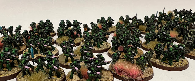
+ The image below shows my Salamanders infantry. See how quick you are to identify the various different types in relative close-up:

+ Included here are Tactical stands, Missile Launcher Devastators, Terminators and Command stands. +

+ ... and again, at roughly half the size; something closer to tabletop distance. +

+ Included here are Tactical stands, Plasma support stands, Missile Launcher Devastators, Terminators and Command stands. +

+ As I hope this demonstrates, at table distance all these different types tend to blend into one another. You might, of course, rather like this – the sea of infantry is definitely a look I favour – but if you want immediate identification, consider exaggerating the differences. You might paint plasma weaponry in a more strongly-contrasting accent than at 40k scale, for example. +


+ Gun casings are a good place to add an eye-catching marking, or even paint different types of weapon with different colours. This would probably look a bit too obvious at 40k scale, but Epic-scale can stand a little less consistency in such details, in favour of being easier to 'read'. +

+++

+ Markings are also worth thinking about. Space is at a premium, and  since you have so many more models, identification becomes more important. The work-in-progress armour below shows models prior to the markings being added. +


They're perfectly servicable, and you could happily game with them at this stage, but markings will both add character and help draw the viewer's eye. This is beneficial whether you're intending them for display or gaming. For display, such details stop the eye drifting over the mass (the crowd effect) and serve as visual punctation. For gaming, markings will help you and the other players to identify particular detachments or formations – particularly useful to spot where one group starts and ends. +

+ As a nod to a 2nd edition Space Marine article and the artwork to The Battle for Armageddon boxed game, I'm intending to use the symbols from a deck of cards for my army. This will also be handy on the army list, as I can put the relevant symbol next to the infantry each group of Rhinos is carrying – little touches like this can help speed of comprehension and avoid misunderstandings. +


+ Make sure they're readable! This test model shows the importance of checking things and practice. Just about visible here are 'club' symbols. For a 40k-scale model, I think they'd work well, clear but not too over the top. For these Epic models at table distance, however, the markings are nothing more than blobs. For future models, I'll take up much of the top hatch with the appopriate symbol. +

+ When choosing symbols, I suggest that you keep things clear and simple. Numerals, letters, Codex markings... all will work well. +

+++

+ Space for variation and personalisation +

+ The flip side of things being lost at small scale is that you can have lots of fun with extra detailing, if you want! As there's less stuff at the right size, and a smaller range overall, there's less opportunity for easy kitbashing than at 40k scale. +

+ That's not to say it's impossible, of course. As with any army, it's worth spending a little time personalising your characters – as with the Captain here, who's had a weapon swap and his Mark VI helmet exchanged for a Mark II one from a spare Rhino gunner. +


+ However, such details are almost certain to be lost – even to an interested observer – unless you point them out. Does this make them not worth doing? Of course not! Such customisation is fun – and that's really the key thing to take away from painting Epic models. They're quick, and fun, and surprisingly different from painting 40k-scale models. +


+ The scale does necessitate some compromises. The banner here, for example is a simplification of the 40k-era 2nd Company banner (as my army's themed around the Second War for Armageddon) – and while I've taken more time on this stand than the others (eye lenses on the models, for example), I've consciously avoided getting sucked down a rabbit hole of trying to superdetail such tiny figures. While it's possible, it's beyond my current skill level, and my priority is to get a gaming army together. +

+ This picture also shows another good example of simplification: the Salamanders' Chapter badge – visible on the Tactical stand on the right-hand side of the picture. At this scale, it's clear that it's a super-simplified version of the icon – but even this is unnecessary.  +

+ Decide before you begin what you want to simplify; and whether you want to include such detail at all. There is no shame at all in a simple approach – as we've seen above, you can spend a great deal of effort in gilding the lily, and creating detail that will be seen only vanishingly rarely, even on the display shelf. +

+ In summary, my advice is to concentrate on that mass of figures – get the impact through simplicity and leaning into the inherent advantages that Epic scale gives you. +

+++

+ The Corsair Gambit +

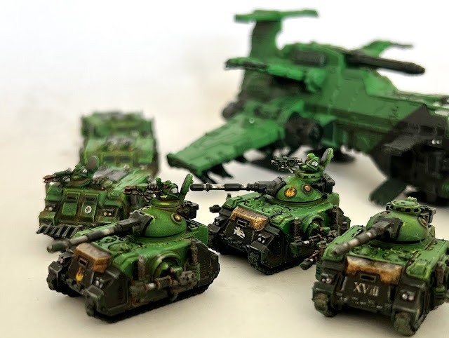
+ Time is closing in for me to complete my Salamanders in time for this event, but painting is progressing. Above you can see the first three Predators of Destructor Squadron, which I polished off after getting a bit bored with batch painting the remaining tanks. +


+ The list from this inload [+noosphericinloadlink embedded+] details what needed to be done; so here's an update:

+ Completed since +
  • One additional stand of Terminators
  • Two stands of Assault Marines
  • Support: Four Dreadnoughts
  • Support: Four Dreadnoughts
  • Battle Tank: Three Predators
  • Transport: Eight Rhinos
+ Still to do +
  • Air Support: Thunderhawk Gunship
  • Bastion: Four Tarantulas
  • Battle Tank: Six Predators
  • Transport: Five Rhinos.
  • Transport: Five Rhinos.
  • Three objectives
+ Aside from the objectives, which are primed at best, the remainder has had the black and metalwork picked out, and is ready for washes, highlights and detailing. I'm hoping to have that all done after Wednesday night, giving me a day's grace in detailing. +