Showing posts with label Goliath truck. Show all posts

Thursday, May 11

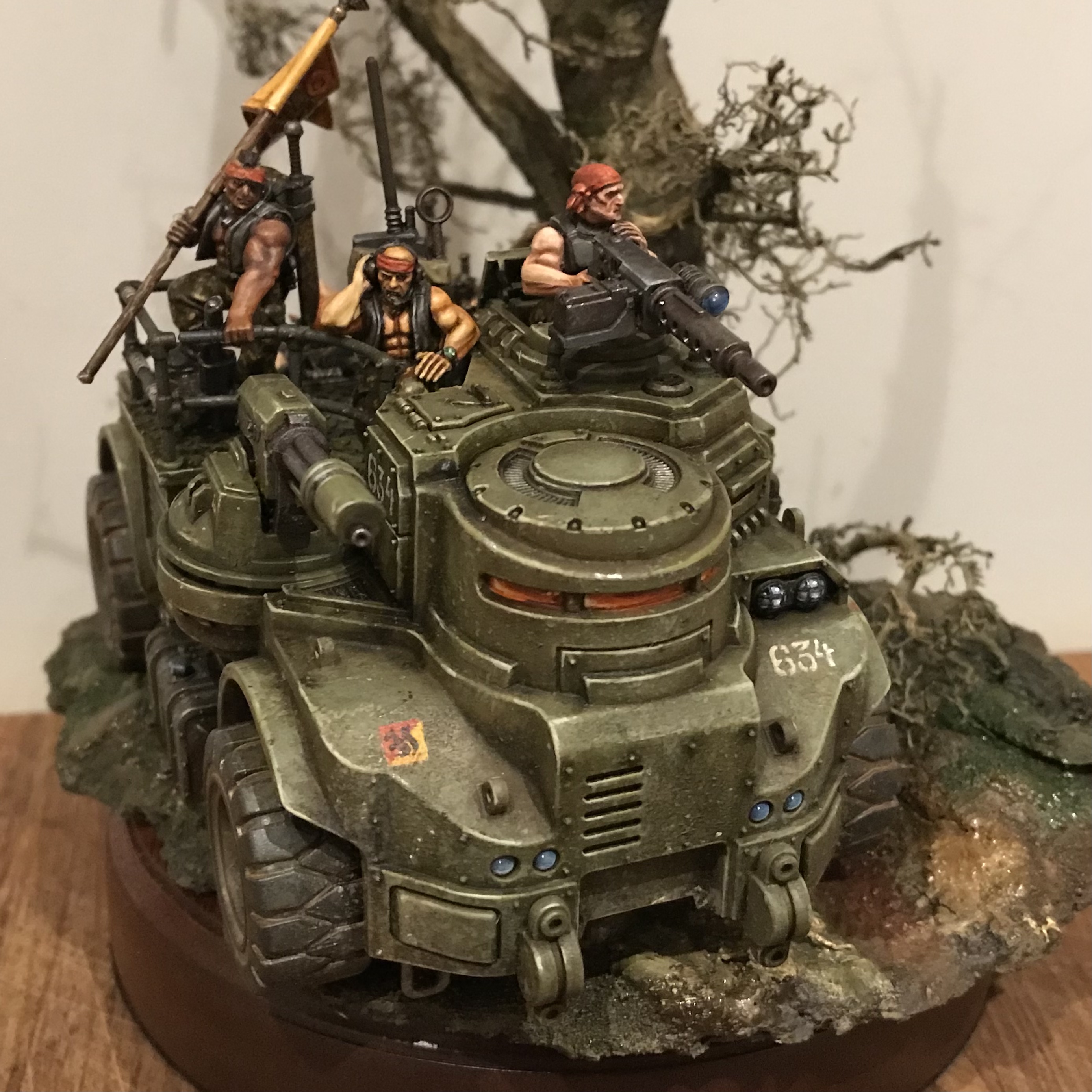
inload: Catachan Goliath Guntruck complete

+ 'Nutcracker' + 


'The Leman Russ Company? Yer talkin' about using a sledgehammer to crack a nut, Colonel.'

'You have a better idea, Captain?'


+ All polished off +

+ Like Judith Kerr's Mog being given an egg for breakfast, I am very pleased to have this fun project at a stage where I'd be happy to show it off. +


+ Most of last night's efforts were turned towards the banner and the base. I repositioned the awkward branch that was obscuring the technpriest, then got to work with static various grasses, fluffy flock to represent lichen, and birch seeds to look like fallen leaves. These were variously secured with superglue and PVA. For the drifts of birch seeds, I painted on watered-down PVA and sprinkled them in. I'm sure there's a better/more secure way of attaching them, but it's eluding me. I should probably do some research and experiment for future projects. +


+ Perched precariously on the too-small plinth, I'm still hoping the bigger one will both {answerAVL='a') arrive in time, and {answerAVL='b') be the right size. I don't fancy trying to trim the base to size after the fact! +

+++APPENDEDIT – it has arrived. Woot!+++

+++


+ This shows how the moving the branch has opened up the space a bit. I'm a little conflicted on this, as I really liked the look of the tree before – but ultimately, the base needs to serve the content, not the other way round. +


+ I'm still not delighted with the banner, which is annoying as it's one of the focal points, so perhaps I'll refine it a little further. I'm also wondering if those bumps below the rear lights are also intended to be lights. I'd interpreted them as some sort of metal blister or access port, but do they look weird? I don't want them to look like traffic lights... +

+++

+ 2nd Company Command Squad – the crew +

+ In the famed understatement of Mustermaster-General Klous fon Saynt of the Adeptus Munitorum, 'Catachans don't work like other Regiments'. The name of their infamous Deathworld on an Army docket is as likely to be met with groans of frustration as sighs of relief as the Navy or Guard Commanding Officers realise that they will be working with these incredibly capable but frequently truculent – and often deliberately antagonistic – soldiers. +

+ The 634th are an unremarkable Catachan Regiment, combining some 15,000 soldiers that operate across various specialisms. Now designated a 'mixed infantry' force, the 'Ever-Readies' have been fortunate in operating close enough to Catachan to have been reinforced on a number of occasions and remained largely homogenous – never a certainty for an Imperial Guard force. This has meant that the Regiment has benefitted from an intake of – amongst other groups – specialist combat engineers. These Catachan men and women built on their own experience of trapping and wayfaring, and have received specialist training and equipment since induction into the Guard. +

+ The 2nd Company began as a standard Light Infantry force, but has since been equipped to operate as Armoured Cavalry – that is, entirely mounted. Its relatively large cadre of Combat Engineers also means that it is able to function as a pseudo-siege force, and it is to the 2nd Company that the Regiment turns when defence is required. +

+ In charge of these warriors is Colonel Carl Oakland, a number of whose relatives are dotted throughout the 634th. Beneath the Colonel, command is split amongst the Majors and Captains of the various Companies – which are then so diverse as to exclude useful categorisation. +


'The things I seen out there in the green, man... You wouldn't believe half of 'em.'


+++


Wednesday, April 26

inload: Warhammerfest T-2

+ Finishing touches – T-2 days to Fest +

+ I'm working on a Catachan guntruck as my maiden entry for Warhammerfest, and – wonder of wonders – I think I'm going to have it finished in time, rather than scrambling at the very last second. +

+ Above you can see a detail of the Goliath's nickname – I took the idea for the rather swanky style of handwriting – and speech marks – from photographs  of tanks from the Second World War. I've used a lot of real-world reference for this project; for the Imperial Guard in particular I think it suits them to have clear antecedents – it's how these are swathed and blended into the 40k milieu that makes them interesting. +

+++

+ What's new? +

+ Since the last inload, I've added the squirrel marking I explained there – shown in the pict-capture above prior to oil glazes. Besides that, most of the changes were to the crew – fairly subtle additional detailing and refinement of their equipment. The major addition is the base. +

+ A scenic base is, I think, very important to give some context and narrative to the vehicle, so I've created a section of jungle trail. It was with some trepdiation that I approached this, as I don't have much experience with this aspect of modelling. Still, the best teacher is experimentation, so I got stuck in. +

+ The underlying structure of the base is layers of corkboard overlaid with Polyfilla. While wet, I added fine sand and embedded some small twigs and debris. I also added a large root that I fortuitously dug up while gardening a few weeks ago. It makes a good basis for a nice twisted jungly tree. This was secured to the cork using superglue before adding the Polyfilla. +

+ Once it had all dried, I painted a layer of watered-down PVA over the whole thing to seal it. Once that had dried, I sprayed it successively with black, and brown spray, then used some more directed khaki and olive touches – the former for the trail, and the latter for the surrounding undergrowth. I was aiming for a fairly subtle modulation +

+ After polishing off as much of the vehicle and crew as I could (I'm still waiting for the oils on the flag to dry to add the finishing touches), I attacked the base with a variety of earthy brown and green oil paints to vary the broad areas of colour that were in place after the spraying. +

+ This was a nice quick job – lucky, as it was getting late, and I'm determined not to be dead on my feet for the actual event! Before turning it, I couldn't resist getting a couple of shots of everything in place. The plinth base is a temporary one – a larger one is (rather nail-bitingly) in the post, so I'm crossing my mechadendrites that it arrives in time. +


+ Not only is it a treat to see your model looking more as it'll appear, this stage is proving very useful, as it will give me a chance to make some tweaks. The base is not yet finished; I want to add lots of static grass to brighten things up, add a sense of life and bring in some tonal contrast to make the vehicle pop. +

+ If time allows, I'd also like to add some little details like a skull-headed bird, some evidence of an enemy (perhaps a sunken skull or an Eldar soulstone?) or a signpost, to give some sense of purpose to the piece. Then again, perhaps we're edging into diorama territory here... + 


+ For the moment, I'll leave you with these work-in-progress shots. Here you can see the idea of the base – to give a sense of speed and forward motion, with the vehicle just about carrying itself over the lip of the textured area, and into space. +


+ Note here how the multilaser and flag lead the eye back in, and up towards the tree. I'm also pleased with the contrast between the wet, churned-up dark red-tinged mud on the trail and the dried, grey-yellow mud between the rutted tracks. I've used the same colours on the ground, tree and rocks – forest routes like this tend to merge into similar colours, and having everything so cohesive ensures the eye isn't drawn away from the vehicle. +


+ I always think it's a good sign when you find yourself grinning at a piece you've done. It's far from perfect, but I really feel like I've pushed myself and learned a lot in the process (with more to come!). Most importantly, I've genuinely enjoyed it. It's been a really engaging, enjoyable and engrossing project for me. I'm glad I spent all this time, thought and energy on it, whatever the result. +


+ *Vroom vroom beep beep!* +

+ This shot's a good example of how important it is to balance the markings. Too subtle initially, and they'd be lost when subsequent glazes are added. Too bold, and they'll stick out like a sore thumb. Too many, and you'll create a confusing finish; too few and it'll be a bit boring. Have I struck the magic balance? I dunno – but that's why it's good to have a day or two to ponder and consider in the cold light of day. +


+ Deciding something's finished is always a tricky call to make. You can keep on refining and tweaking and fixing – but these aren't always improvements, and it's possible to overwork the piece. Let me be clear that I don't think that's the case here – I can see quite a few little bits and bobs that could do with tidying up... + 


+ This shot shows my major concern at this point – the banner. It's just not coming together. At root, it's because I don't like the raised symbol on it. It's obtrusive, a bit (dare I say?) clichéd, and not particularly cleanly sculpted – the leaves of the laurel wreath in particular are blurry and soft. I should, perhaps, have cleaned it off earlier in the process, but you live and learn. +

+ It's perhaps too late to sub it out, so I'm going to have to adapt and overcome. The second problem with it, which is entirely self-inflicted, is that I've gone for a yellow field, which means I've made a rod for my own back in terms of colours. At the moment, I'm leaning towards adding some chequerboarding freehand and a black heralcic pale (that is, a vertical stripe down the centre) to give the skull and company sigil some contrast. + 


+ The other concern is that the big branch is obscuring the view of the techpriest. I do like the branch, but perhaps I need to move it elsewhere on the tree so it's less obtrusive. +


+ So, there we are. This is likely to be the last inload before Warhammer Fest, so wish me luck in getting this finished, and I'll see you on the other side. If you're planning to make the trip up, do let me know – would be great to put some faces to names. +

+++


Monday, April 24

+ inload: Cracking nuts the Catachan way +

+ 634th Catachan 2nd Co. Command Vehicle 'Nutcracker' +


+ T–4 days 'til I set off for Warhammer Fest, and I'm on the closing stretch with the Catachan Guntruck I'm taking along. Last night I started polishing off the details: things like the various lights and wires, as well as the markings. + 


+ The lighting's a bit stark (an unusually bright morning!), but perhaps the most obvious addition here is the multilaser, which came from the new Sentinel. More subtle bits include the wiring leading up to the multilaser turret, and the hazard marking on the turret itself. One of the things I'm weirdly pleased with is the blue cap on the reserve promethium tank (the grey box behind the front wheel). I've been keeping an eye out for little details like this on real-world vehicles to add some verisimilitude to this boxy truck filled with space muscle-men +. 

+ Theoretical +

+ I took a trip to the Tank Museum a few years back, and remember the various organisational markings being bold and simple and clear. They seemed a great thing to add – and offered an opportunity to add some colour and interest to what is otherwise a muted green box. It would also allow me to make clear this is a 40k vehicle, not a real-world one. +

+ The aim, then, for these markings is to give the impression that the vehicle is official, standardised and part of the grinding greater Imperial organisation – but have enough 'pop' to look good at scale. +


+ I've tried to apply the markings with some sense of how people of the same scale would interact with them. From the point of view of realism, there's little point in having these markings unreadable to someone at eye level. Equally, this has to be balanced against the fact this is a model meant to be judged, and so the markings have got to not be hidden away from the judges. +

+ The round squad marking on the door, shown above, is a good example of having the marking at the right placement for the crew. The only people who need to refer to this marking are the various squads who are assigned to Goliaths, so it's relatively small, and only appears on the door. In the company mustering point, anyone from squad 1 (for example), will know this isn't their ride – but that's not particularly important in a battlefield context. +


+ Things that do need to be immediately identifiable during combat are the Regimental and Company markings, as these are what will help friendly forces identify them at distance and at speed. These are therefore larger and more prominent than the squad marking. The big red and yellow square on the front here is also present on the back – whichever way it's travelling, friendly forces will immediately know not to fire. +

+ Partially hidden behind the multilaser's flash suppressor (or whatever the thing at the front is) above is the Regiment's number – 634. This is repeated on the front left of the cab, as shown below; though unfortunately the terribly over-exposed pict-capture here makes it almost invisible... I promise it's there! This is rendered in a simple white stencil-style effect, because it's not particularly necessary for it to be legible for anyone in the field: it's more for the Quartermaster or similar. +


+ Annoyingly washed-out in these pictures, I also painted the various lights and lenses, and am pleased with how they look. I opted for a blue-grey for these, as a balance between real headlights where they're turned off, and being interesting to look at as a model. The blue-grey also complements the orange used for the reinforced armourglass windscreen and windows. +


+ With slightly better lighting here, you can see the start of the leather effect on the knife holster and gunstrap, too. These will be built up with repeated layers of washes and stippling. Note also the company marking on the rear left-hand side, visible from the back and from the left of the vehicle. +

+ The banner remains one of the things to tackle, and I'll likely start on that tonight. I really wish GW did blank banners again, even if just as an option. It's annoying to have the sculpted-on detail force you in a certain direction. I'll use the red and yellow of the Company marking on the pennant banner, but probably as a red top and yellow bottom because a diagonal will look odd on the swallow-tail shape.+

+++

+ To do +

+ All of the markings need to be bedded into the scheme, and this will be achieved with oil washes. Before that, however, I'm going to make the Company marking a bit more interesting with some freehand – and this is a good example of how I've tried to balance having a plan with actually having fun while painting. + 

+ While I knew any such marking would need to be simple and iconic, I haven't really had a strong idea of what would go on there. Consulting the old Imperial Guard tank marking guide threw up some ideas of swords or skulls, but these are so iconic as to almost be meaningless. I wanted mine to stand out a little more. +

+ Taking some inspiration from the Regimental nickname, the 'Ever-Readies', I did some research on animals that symbolised readiness, and have decided to go for a squirrel. Not a particularly fierce creature, perhaps, but it has lots of cultural resonance – variously as a messenger or as a symbol of preparedness, alertness, wit and initiative – all qualities that well-represent the Catachans. +

+ From what little I've read, it seems certain Native American groups see the squirrel as quick-witted and energetic. Given that the Catachans are clearly a 40k pastiche of Vietnam War-era US marines, it seemed fitting to have an oblique nod to America without taking the viewer out of 40k – and the squirrel icon will allow me to include a wonderfully retro 40k Easter Egg – the ptera-squirrel – and give me a dreadful (and fittingly coarse) pun of 'Nutcracker' as the crew's name for the tank itself. +
+

+ Pict-credit: Flaticon [+noosphericexloadlink embedded+] +


+ The image above is going to act as the basis for the icon, which will be applied to the red and yellow square below (and the one at the front). +


+ Here's a last shot of the techpriest in position, mainly because I really like him as a detail of the overall composition, but also because it better shows the in-life appearance of the lights on the back (note here that the lower brake lights are in red, rather than the blue-white of the others). +

+ A quick checklist:
  • Banner
  • Leather
  • Develop the company markings
  • Glaze of oil
  • Flak jackets
  • Gun casing and equipment highlights on the crew
  • Weathering
  • Polyfilla and texture on the base.
+ Actually, yikes – that's quite a lot to do! +
+++

Monday, August 9

+ inload: Goliath truck +

+ Catachan transport +

+ The Goliath truck, released for the genestealer cult army, was far too good not to pinch for my Imperial Guard. Not a hugely involved conversion, this was really a case of getting the posing right on the passengers and crew. +


+ Exploration and trying things as they occur to me – or 'playing', as it's generally known(!) – is a really important part. It's all very well having a precise plan, but sometimes it's fun to have a general idea and explore with the parts you've got. +

+ The gunner here uses parts from a Catachan Command Squad and heavy weapon team. I could have simply done an armswap with the Brood Brother crew body from the standard kit, but it just felt right to make him all Catachan. The body armour is a specific thing I wanted to include; made him distinct from the others. Perhaps Goliath trucks have air conditioning, or perhaps they just suffer from spalling when hit – either way, this chap has decided wearing his standard issue flak jacket's a good idea. +


+ Flags and banners, when added to a diorama or vignette, need careful attention. It's very easy to forget that cloth, hair etc. need to flow in the appropriate direction. Posed on the side, this standard bearer pose reminded me of being on a ferry - a pleasingly carefree contrast with whatever hellhole this group's heading to. +


+ On the back, one guardsman points something out to another. Getting some interaction between the figures is key to making it believable and interesting. (The massive mouldlines on the scabbard, however, are not). + 


+ The heavy bolter is a conversion, combining parts from the Goliath with parts from (surprise!) the Catachan heavy weapon team. An autocannon would have been easier to do, but I do love me my heavy bolters. Much more 40k. +

+ Indirect interaction is possible, too. Note the banner bearer's head is tilted over to the comms-man; as though eavesdropping, or waiting for the radio man to report. I was pleased with getting the hand gripping the railing convincingly. Note also that each guardsman has his rifle close-by, even out of direct combat. Obviously paid attention to their training. +


+ A few final shots to close off the post; hope you like it. +