
+ Deskactivity update +

+ One of the few downsides to running the sister blog +Some Things Are Best Left Forgotten+ [+noosphericexloadlink embedded+] is that I made the decision to base it purely on finished miniatures. As a result, there's not any space to post thoughts on painting and modelling, experimenting and (rather importantly!) failing. +
+ Fortunately, the +Death of a Rubricist+ blog here is a lovely place to show my working; hope it's interesting! +
+ #Killthefalseprimarch +
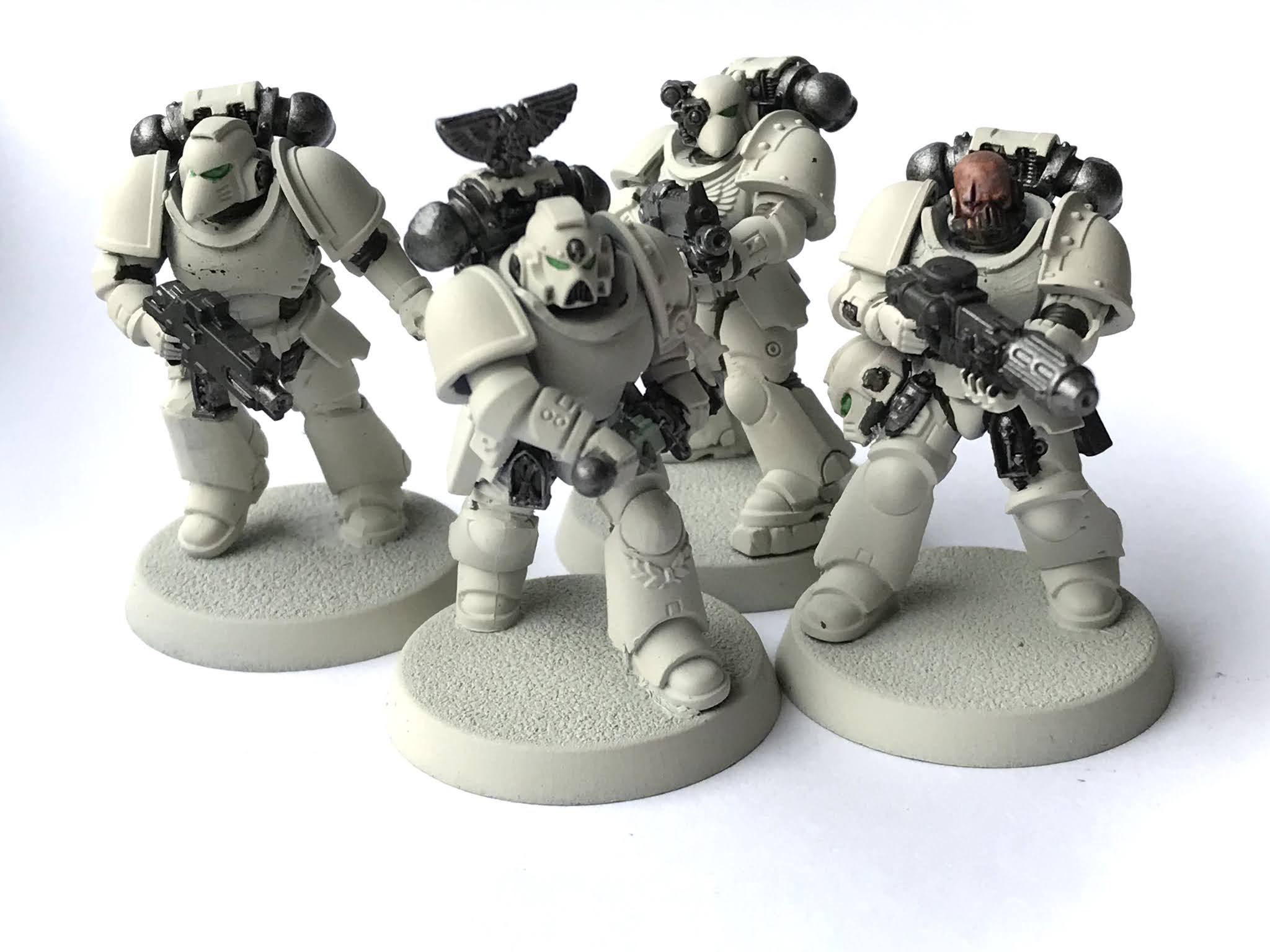
+ Pictured above is the Kill Team I've put together for the Kill Team challenge currently running – which you can read about here: [+noosphericinloadlink embedded+]. +
+ While the challenge is mainly intended simply to give people a road into the broader project, it's also proving very useful in giving some of the less-developed Chapters some of the spotlight. Death Eagles (II) – that is, the black and white ones – have been few and far between. I suspect it's because the scheme is an unfortunate combination of:
- Involving both black and white, colours perceived as hard to paint well
- Not as unusual as the magenta and white of their older namesake Chapter
- Easily confused with the more famous Black Templars.
+ The #killthefalseprimarch challenge gave me a perfect excuse to build and paint a squad to use to illustrate things. It'll also give me a Pentarchy group to use for any Kill Team gaming, too. +
+ Theoretical +
+ At the risk of sounding lazy, I didn't want to get too involved with converting these – six weeks sounds like a long time, but I just knew that I'd get carried away and end up not finishing. Better to set realistic goals for a deadline, particularly when you're organising the event! +
+ A thing I like a great deal about the grey-on-grey civil war setting of the War of the False Primarch is that the sides are so arbitrary. It'd work just as well with (say) the Void Barons as part of the Pentarchy, or the Charnel Guard joining the Partisans. Part of that is in the aesthetic – the core silhouette of an Astartes is universal, and the colour scheme therefore does a lot of work in bringing character to a model. +
+ While I knew I definitely wanted to do Death Eagles, as I was short on contributions for both Death Eagles I and II (though I hasten to say that those I have received have been absolutely stunning!), I wasn't sure which of the dual-named Chapters I'd end up doing. Both are broadly standard in appearance – that is, they're not as varied in appearance as (say) the Wormwood Sons or with the non-standard kit and accoutrements of the Marines Saturnine. This meant that I could build 'em and decide on the paint scheme later. +
+ Practical +
+ The building was very straightforward. Besides a bit of trimming away of details like the ankle bobbles, chest eagles etc., they're largely standard Primaris marines. Swapping out the backpacks, weapons and heads really does the heavy lifting for you in back-dating these to M34. +
+ I primed the squad with white; something I do relatively rarely. This would be useful if I opted for the magenta and white scheme, and would also help the black and bone scheme. Still undecided on how to paint them, I decided to start by tackling the soft armour (Charadon granite) and the metals. +
 |
| + Primed and with the metallics and darks picked out. I also worked up the unhelmed marine's head + |
+ The choice of Mark VI and VII bits was intended to suggest the time period. The beakie helms also help to differentiate from Black Templars, which rarely use this style of helm. Along with the pointy Mark IV helm (from the old Blood Angels Death Company kit) on the melta specialist, there's also a 'birdie' feel to hint at eagles. To hedge my bets on which Chapter of Death Eagles I would paint, and to add a little character to the squad, I gave them all a reinforced left pauldron. +
+ I was then forced to make a decision, so taking a bit of advice from the PCRC, I settled on the one that I felt would benefit the project more, rather than the one that – in all honesty – appealed more: the black and bone Death Eagles II. +
+ Why would it benefit the project? Well, the magenta and white Chapter have a couple of very talented hobbyists working on them, while I had to go asking for permission to use the few black and bone examples I could find. Having my own little squad would give me a few models to pop in the background of battle scenes and things. +
+ Secondly, my primary force in the project is, of course, the Silver Stars. While I like the magenta and white Death Eagles (and intend to paint one up at some point), it struck me that having white, turquoise and rose marines fighting magenta and white marines was not going to be as visually striking as white versus black. +
 |
| + WIP boltgun marine. The Assault Intercessor bodies are – unsurprisingly – great for suggesting movement. + |
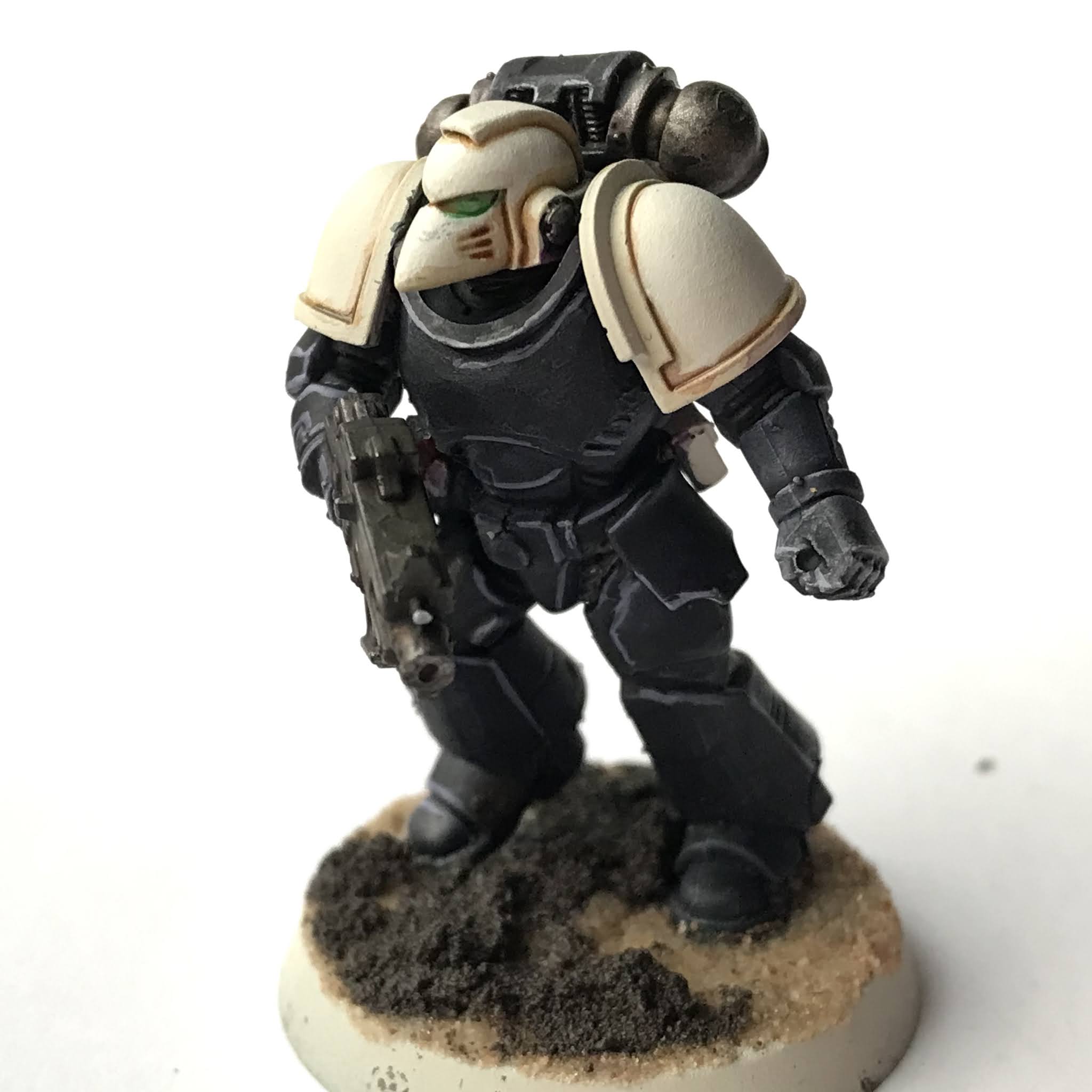
+ The figures are still work-in-progress, but the white and black are largely in place. Small squads like this offer a great opportunity to experiment with painting techniques, as you rarely need to replicate them. For posterity, and if you fancy having a go yourself, I used a mix of:
- 1 size 1 brushload of Citadel The Fang paint (a dark blue-grey)
- 3 drops of FW Payne's grey acrylic ink
- 3 drops of flow improver medium.
+ The result is a very fluid cool dark paint. I think pure dead black is seen as a hard colour to paint because it doesn't allow you anywhere to shade. There's nowhere to go down in terms of tonal scale. Using a dark like this still leaves you a little breathing room to add shadows and definition. +
+ Now came the fun part. In order to avoid them looking like Black Templars, I wanted to add some subtle colour, so used two layer of Drukharii Violet wash to build up depth of tone and add a little purple hue. +
 |
| + Note the double-headed Aquila icon on the backpack; a little addition to reinforce the Chapter's loyalty to the High Lords. The slightly patchy finish on the black needs some attention; but that may well be a case of emphasising it for weathering rather than hiding it with overpainting. + |
+ The same violet wash was used alongside Seraphim sepia. This combination of yellow and purple washes neutralises each other when allowed to mix on the surface, giving an interesting grey hue. If you don't mix them thoroughly, but apply them more loosely wet-in-wet (that is, applying a dab of one, them a dab of hte others nearby and allowing them just to touch, rather than thoroughly mix), you end up with what I find a very attractive variegated effect that gives a more visually interesting result. +
 |
| + Details like a bionic eye add a hint of variation to the unit. As well as adding character, such easy-to-add details might perhaps suggest a little narrative for an otherwise undistinguished 'third spear carrier to the left', and help differentiative models in-game. + |
+ Being neutral, the yellow/purple wash can be used anywhere that you want to knock things back a little, but I suggest you avoid using it all over – you'll end up with a murky result. For the white here – the helm and pauldrons – I used Vallejo off-white, blending it with a hint of yellow ochre (Desert yellow?) away from the light. Once dry, I added three layers of fine 'pin-washes' for definition where the pauldrons meet the trim, working down from the yellow ochre through Scrag Brown (a warm brown) to Scorched Brown (a deeper tone). +
 |
| + CHOMPH! The melta gun sound effect from the Space Marine game came to mind here. + |
+ From here, I need to develop the highlights and shading a little further on the black and white, then it's onto the fun finishing touches. The trim is likely to make the most impact – I'm going to run with pure black. That should provide contrast both with the chromatic black and the bone, adding a visual break between both. That decision, however, raises questions on how to highlight it... +
+ Spot colours +
+ The sergeant shows a couple of early colour experiments – I've used green as a spot colour, which seems to work well and is very different to the typical Black Templars scheme, which tends to use red as an accent. +
+ It's worth noting that the green adds me a third colour to the palette: alongside yellow, which is underlying the white, and purple, which is underlying the black. As noted above, it's sometimes tricky to approach white or black, but when you simply treat it as a very dark shade or very light tint of a familiar colour, you'll find it much less intimidating. +
+ In any case, I'll probably pursue a few further experiments with green. Little details like eye lenses are a shoe-in, but I'm going to try using green to highlight the black on the pauldrons. Normally I'd avoid mixing blacks on a Space Marine – that is, once you've decided to use blue-black or brown-black or whatever, it's usually best to stick with it – but here I've got the problem that I want to differentiate between the two black areas. Changing the underlying hue is worth a try here. +
***
+ Catachans +
+ I've been using Catachan models as palette cleansers (ho ho) between other projects. Being the kits that I played games with against my brother's orks, the metals hold a lot of fond memories for me, and I've idly been looking on eBay for select favourite. This comm-link model was always one of my faves, and he's painted up a treat. +

+ If you haven't tackled a classic metal model in a while, I thoroughly recommend it. The unique details of a hand sculpt are always fun to explore one-off, and since they largely lack undercuts, they're very relaxing to paint compared with multi-part plastics. +
+ This sculpt always reminded me a little of Die Hard-era Bruce Willis, for some reason. Need to sort out a base, but haven't yet decided on 25mm or 32mm. Any thoughts? +

+ Mentioning Catachans in passing on a chat, my ever-generous friend Omricon sent me a little care package of Catachans – thanks again, chum! +
+++
+ Some Things Are Best Left Forgotten +
 |
| + Jade Talon + |
+ Next up were intended to be Mike F's Red Fish and Cole C's Riven Lords, but I've got something very specific I want to do for the Red Fish and haven't been able to source the parts as yet. As a result, the Jade Talon (a Chapter by Adam S) has infiltrated the queue. I'll write more on him when I come to develop him a bit more. +
***
+ I'll work up an article on how I painted models of both of these charismatic Chapters once I've finished... er... painting them! +
+ In the meantime, here's the WIP Riven Lord, with bronze and green in place. +


+ I really like the Riven Lords descent from bluff but honourable Astartes to increasingly desperate marauders by the end of the war, and wanted to capture some of the rough-and-ready mid-war feel. This marine has supplemented his armour with flak skirting – allowing mortal serfs to advance behind him with some element of protection – and a motely collection of weapons. +
+ He's captured salvaging a much-needed boltgun magazine, presumably from a defeated for. His slung primary armament is hanging from his shoulder, devoid of a magazine – hence his use of a back-up astartes shotgun. +

+ The #killthefalseprimarch Kill Team challenge +
+ Small narrative elements like that on the Riven Lord above are at the heart of the appeal of Kill Team, where every figure you build can be treated like a character. +
+ Equally, however, there's no need to do so – as the quickly-bashed together Death Eagles above show. The challenge is intended to allow you an easy way into the project, so even if you get just one or two models done, you'll be able to hold your head high! +
+ There are still three weeks to go on the challenge, which finishes on 11th October at 02:11pm GMT. Hope to see you on the other side! +
Fantastic work on the Death Eagles II team. Can't wait to see them finished.
ReplyDeleteCan you ask K0rdhal or @duckcalledsue how they painted their Wormwood Sons marines? I'm particularly curious about the red parts of the armour. Do you have any plans on making another article about Partisan iconography and paint schemes?