
+ Clanking Destroyer +

+ When this model came out, I remember thinking that it was about the best thing since sliced bread. And with the super-killy buzzsaw, it could also slice bread! +
+ Okay, so the second part might not strictly be accurate (unless...), but this really was one of those model kits that niggle at the back of your head. Eventually I crumbled and bought one, and it's been a fun build and paint.
+ As part of The Alien Wars project, I took my inspiration from the card dreadnought that came with the second edition boxed set. Just as with my Blood Angels [+noosphericinloadlink embedded+], it's an homage rather than an exact match. I hope enough of the details are present to give retrohammerers a grin. +


+ Lacking a banner, I replicated the glyphs on the front armour plate, for example. Similarly, I've retained some of the red detailing, though not quite so much as the original – it has to fit in with my very muted army, after all. +

+ The kit's absolutely awash with great little details, like the functional-looking pistons, heat-sink plates and pressure dials. When tackling complex metal areas like this, it's easy for them to get lost in a mass of similar tones, so I aimed to break up the shapes by treating each main part separately. Some are oily bare metal, others rusted, and the top plates are painted black. Rather than starting from a black underlayer and weathering with metallics, I painted them all metal, then painted the black on top, using a stippling technique. This is a quick and easy way to get a sense of wear and tear – you've just got to be careful to work the paint into the recesses away from the edges (such as the 'lee' of the spikes). +
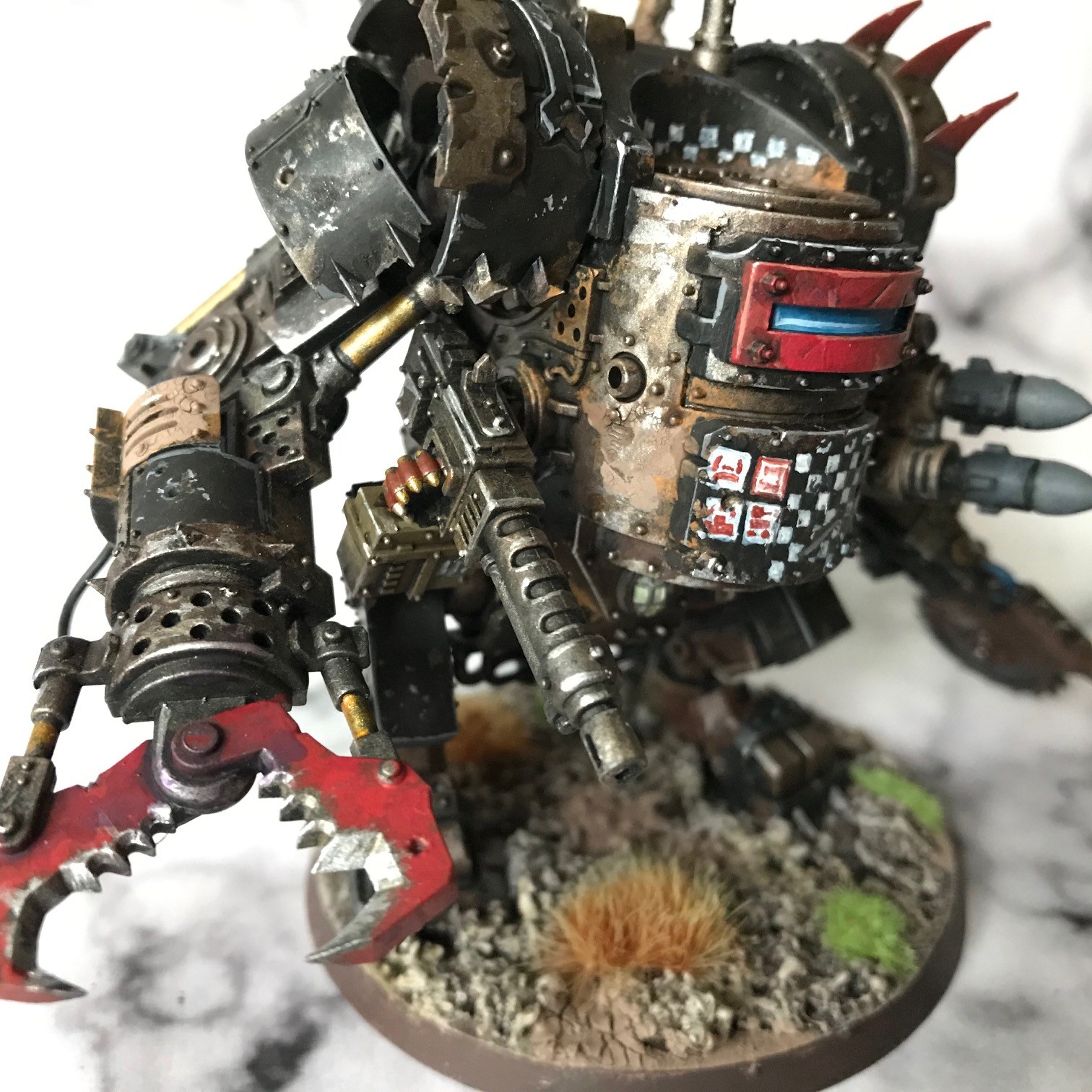
+ The concept of heavy wear was extended to the weapons – note the shearing claw has lost its red paint from the working surfaces, and one of the plates near the elbow is particularly old and worn: I used Agrellan Earth to give a heavily textured craquelure effect. +
+ As with the armour plates, some variety on the weapons helps give a sense of scale and realism – the ammo feed on the heavy shoota, for example, is painted with the same green (and regimental number) as my Lamb's World force, suggesting it's looted from a previous battle. +

+ I used the same conceit on the back, with a military drab green used for the petrol tank, and decorated with an Imperialis (the winged skull used as one of the Imperial Guard symbols). The trick to this sort of model, if there is one, is to ensure similar parts are treated differently. Having really rusty, battered exhausts nearer newer-looking ones suggests the model is a working warmachine, with a history. +
+ What's on the blocks? +

+ As in the background, so in real life. Gretchin don't seem to get much of a look-in when it comes to gaming, and so I'm making a concerted effort to get enough of these characterful little creeps painted and based to re-play the 2nd edition introductory games. I think I need thirty... +

+ The finished grots above were tackled in smaller groups, but I really want to get a motor on before I lose impetus. As a result, these are just a simple coat of Gretchin Green (who would have thought?) and washes of either Seraphim Sepia or Leviathan Purple. To get some variety in skintones, I used the washes in different proportions, both alone and mixed wet-in-wet on the model. Just 'cause you're batch-painting, it doesn't mean you can't add some variety, after all. +
Retro Hammer grin confirmed! :-)
ReplyDeleteI like your comments about your ideas for painting the large areas of metal parts. I usually go for picking out alternating metal bits with bronze and boggling metal and then washing and highlighting with the respective brighter tones from those lines. I will have to give your stippling technique a try next time.
Love the grots, Ere We Go was my birthday priority way back at age 14 so I miss the attention the sillier sides of the Ork universe used to get. Keep up the awesome work, the blog is always a highlight to read.
That was supposed to be boltgun metal, damn autocorrect! Although I'm fascinated to wonder what color boggling metal would be...
ReplyDeleteWhat a fantastic take on the Dread and the Grots. I really think you nailed it, the Dread definitely has the vibe, your paintjob turns it into the perfect update of the classic model. I love what you achieved here!
ReplyDeleteBeautiful Dread, love the card one and this is very reminiscent of that classic. The skin of the Grotz look good too.
ReplyDelete